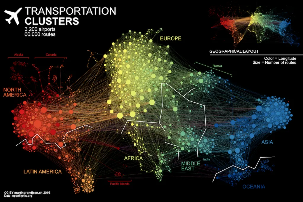
Everyday 100,000 airline flights take place around the world. This means that every second there is a plane taking off from one of 3,275 airports on the planet. Martin Grandjean a researcher from The University of Lausanne, Switzerland decided to analyze the network created by these flight routes.
He took a data from OpenFlights.org and generated a graph that visualizes 37.153 single flight routes. Martin points out that although global transportation maps that represent the flight connections are beautiful pieces of art, they do not represent the data itself, but rather some idea of the complexity and quantity. We can read in a blog post.
This map is an attempt to make explicit the network behind air transport. The structure of the relationships has an impact on the spatial distribution of nodes in a graph. Let’s see how this landscape is reorganized without geographical constraints.
The visualization has been created in an open source graph visualization software: Gephi (gephi.org). It’s not a GIS but it has some basic mapping functionality. The overall effect is truly amazing!


