
The Planet as a Dataset
Every city leaves a fingerprint on the Earth’s surface. The density of its roads, the geometry of its rooftops, the texture of its parks, the thermal signature of its industrial zones. All of it recorded – in reflected sunlight, in microwave radar pulses that pierce clouds and darkness, in thermal infrared – by a constellation of satellites orbiting a few hundred kilometers overhead. For decades, these signals were interpreted by hand. A GIS analyst would load a satellite scene, apply band combinations, and methodically classify what they saw: urban fabric, agricultural fields, wetland, and bare soil. Rigorous work, but painstaking, expensive, and impossible to scale across the 510 million square kilometres of Earth’s surface.
AlphaEarth changes that.
What is AlphaEarth?
AlphaEarth is Google’s foundation model for Earth observation: a deep neural network trained on petabytes of multi-source satellite imagery to produce a universal, 64-dimensional semantic embedding for any point on Earth’s surface.
The underlying dataset (GOOGLE/SATELLITE_EMBEDDING/V1/ANNUAL) integrates multispectral optical data from Landsat and Sentinel-2 with C-band SAR observations from Sentinel-1, combining long-term historical coverage, higher spatial resolution, and all-weather structural sensing into a unified annual embedding.
From these inputs, AlphaEarth distills a single 64-dimensional vector – a numerical fingerprint – for every 10-metre pixel on Earth, updated annually. Think of it as a coordinate in a latent space where similar-looking places cluster together, regardless of where they are on the globe.
This is the core EO breakthrough: geography becomes geometry. Distance in embedding space becomes a proxy for land-use similarity. You no longer need to classify a pixel as “residential” or “commercial”; you can simply measure how close it is to pixels you already understand.
Case-study: City Similarities Using AlphaEarth
The pipeline used to generate the city similarity analysis follows a straightforward but powerful sequence:
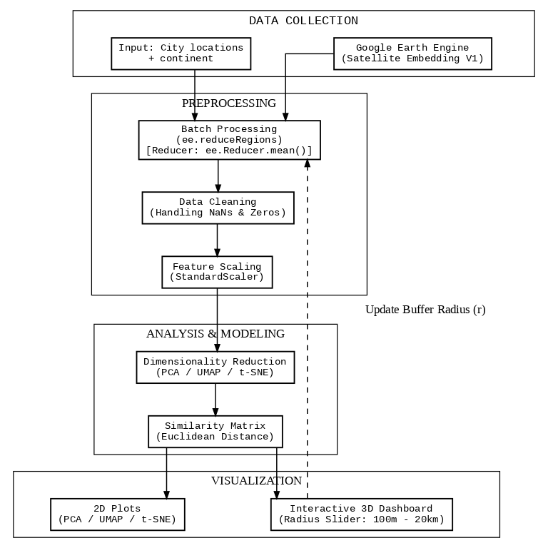
For each city, embeddings are extracted by buffering the city centre by a radius r (tested from 100 m to 20 km) and computing the mean embedding vector across all pixels within that buffer. This single operation – image.reduceRegions() – runs in parallel across all 250+ cities on Google Earth Engine’s infrastructure, replacing what would have taken weeks of local computation.
The resulting matrix is a 253 × 64 array. Each row is a city. Each column is a latent dimension of satellite-derived urban character.
What Does Similarity Actually Mean?
In the embedding space, two cities are “similar” if their satellite footprint looks alike: comparable urban density, vegetation cover, built surface geometry, spectral signature of materials, and structural patterns detectable by radar.
This is not cultural or demographic similarity. It is the similarity that a satellite sees.
Which makes the results both surprising and revealing.
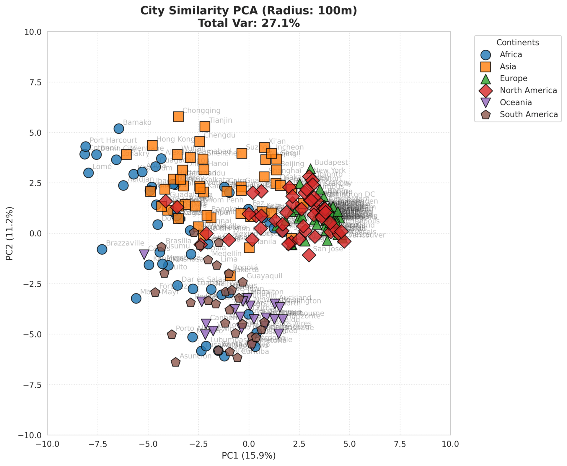
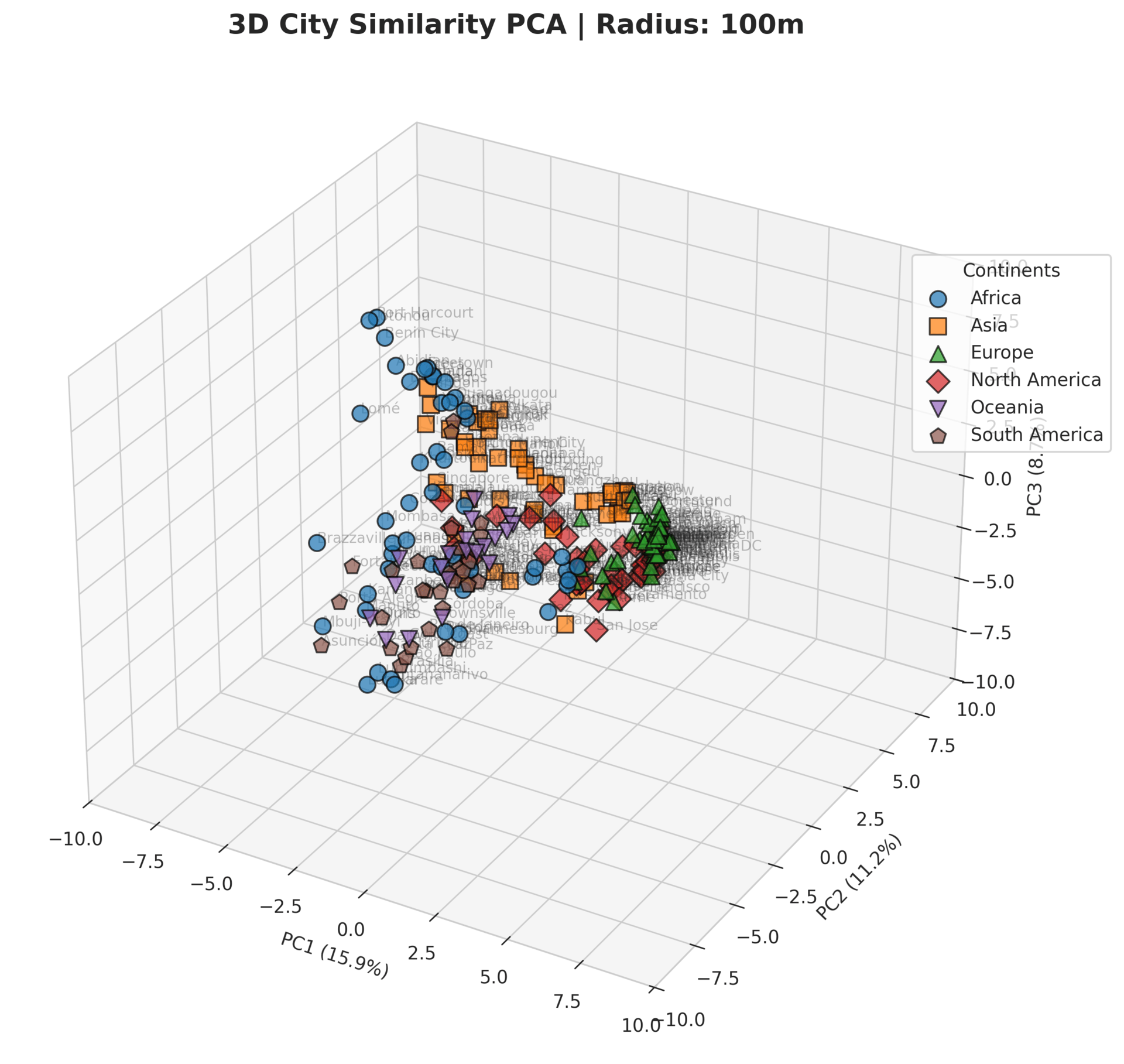
The PCA View
Principal Component Analysis compresses the 64-dimensional embedding space into two (or three) axes that explain the maximum variance across all cities. The resulting scatter plot represents the dominant modes of variation in urban form, derived purely from the learned feature space and independent of geographic coordinates.
The PCA reveals a clear continental separation, but with telling overlaps. Europe and North America cluster tightly together on the right side of PC1, their dense, planned urban fabrics registering as remarkably similar from orbit. Asia spreads broadly across the centre and lower half. Africa occupies the left; dispersed, with significant internal spread suggesting heterogeneous settlement patterns across the continent. South America and Oceania sit between Europe/North America and Africa, gravitating toward the upper-left. The most striking finding is not separation but convergence: European and North American cities are nearly indistinguishable in this embedding space, while Africa’s variance alone spans almost the entire vertical range of the plot.
The PCA explained variance curve reveals something important: the first two components capture only a fraction of the total variance. The embedding space is genuinely high-dimensional. Urban form is complex.
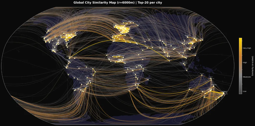
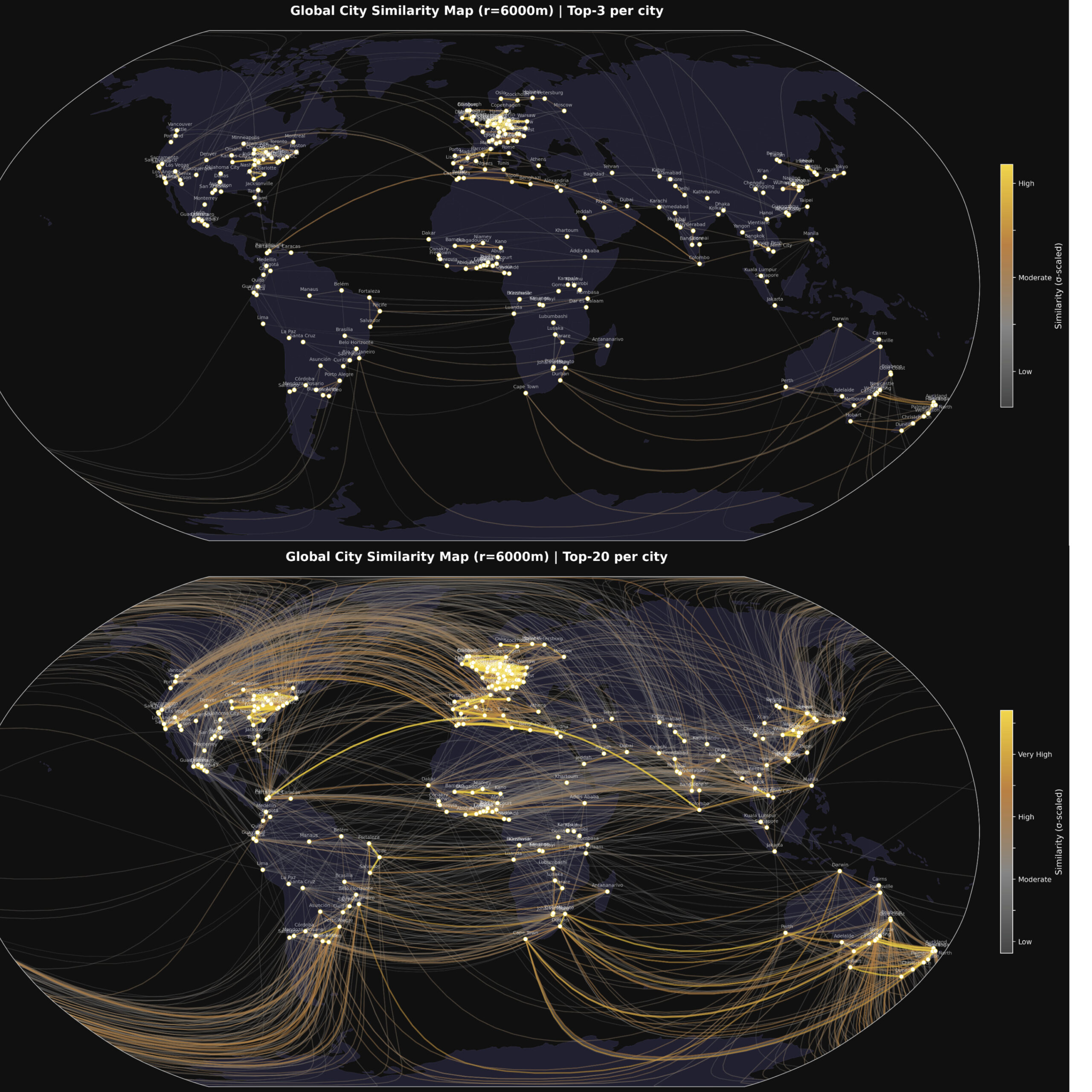
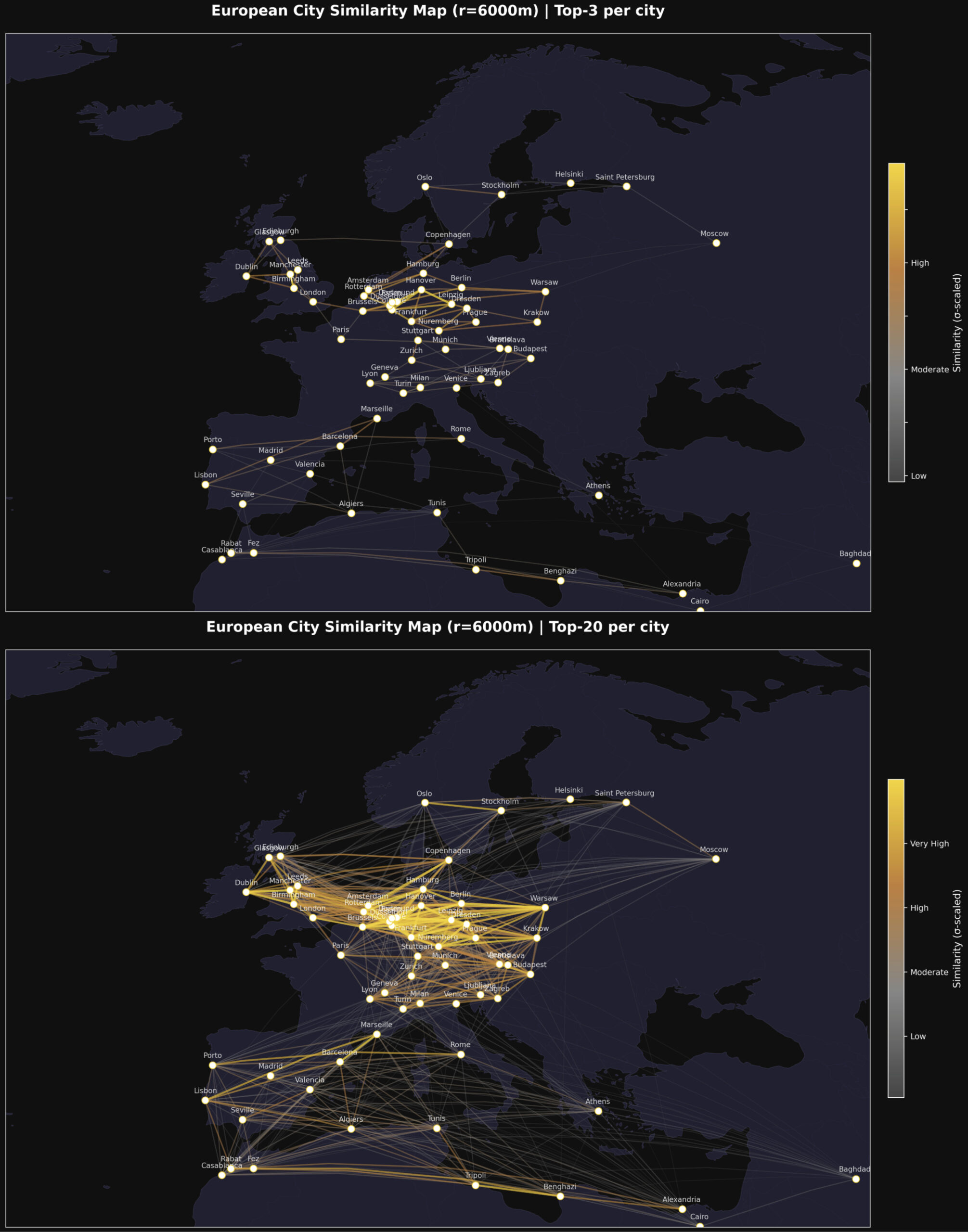
The Connection Maps
The connection maps translate pairwise similarity scores into geodesic lines drawn on a globe. Stronger connections — cities that look more alike from orbit — are rendered in gold. Weaker ones fade to grey.
At r = 6,000 m, a radius that captures the full urban core of most cities, the maps reveal a consistent pattern: European cities connect predominantly to other European cities and to parts of Latin America and East Asia. African cities form tight, internally coherent clusters with notable cross-continental connections to South and Southeast Asian cities sharing similar settlement densities.
The “Top-3 connections per city map” is particularly clean — it shows the skeleton of global urban similarity without visual noise.
“The Paris of…” — Similarity as Cultural Metaphor
One of the oldest clichés in travel writing is the comparative city nickname. Beirut was “the Paris of the Middle East.” Bruges is “the Venice of the North.” Edinburgh is “the Athens of the North.” These labels reflect an intuition that cities can resemble each other across vast distances — that there is something structurally, atmospherically comparable between them.
AlphaEarth lets us test that intuition empirically, from orbit.
The hub map, centred on Paris, with geodesic lines radiating to every other city in the dataset, shows which cities are most similar to Paris in their satellite fingerprint. Lines are colour-coded by similarity strength: grey for distant, bronze for moderate, and gold for the closest matches.
The results are not always what you might expect. The cities that “look like Paris” from space are not necessarily the ones travel writers had in mind. The metric is ruthlessly physical: built surface density, vegetation geometry, and spectral reflectance of urban materials.
That tension — between the cultural intuition and the satellite measurement — is precisely what makes this analysis interesting. Where they agree, it validates the intuition. Where they diverge, it invites new questions: What does it mean for two cities to be similar? And similar to whom: the resident, the visitor, or the satellite?
Why This Matters: Applications in GIS and EO
The city similarity analysis is a demonstration use case, but the underlying capability has significant real-world applications.
Urban change detection at scale. By comparing a city’s embedding at t₀ versus t₁, analysts can flag anomalous shifts in urban character – new development, deforestation, post-disaster damage – without manually reviewing imagery.
Cross-city policy transfer. If City A and City B have similar satellite profiles, interventions that worked in A (flood mitigation, green infrastructure, transport planning) become strong candidates for B. The embedding provides an evidence-based basis for comparison that goes beyond GDP or population statistics.
Training data augmentation. Machine learning models for land-use classification, building footprint extraction, or road detection can use embedding similarity to identify geographically distant but visually similar scenes – expanding effective training sets without additional annotation.
Climate risk stratification. Cities with similar land surface temperature signatures, vegetation indices, and impervious surface fractions face similar urban heat island dynamics. Embeddings can cluster cities by shared climate vulnerability.
Humanitarian response. Identifying settlements with similar structural profiles to areas where ground surveys have been conducted allows rapid inference of conditions – population density, infrastructure quality, informal settlement extent – in unmapped or conflict-affected regions.
The Radius Question
One of the most revealing aspects of the analysis is the sensitivity to the extraction radius r.
At r = 100 m, the embedding captures the immediate block — a single street corner, a park edge, a rooftop cluster. Cities that share a particular microurban typology appear similar, but the signal is noisy.
At r = 1,000 m, the embedding captures a neighbourhood. Patterns of density, green space, and road geometry stabilise. Cross-continental clusters begin to emerge.
At r = 6,000–10,000 m, the embedding captures the urban core. This is where the similarity maps become most geographically coherent, and where the “Paris of…” comparisons carry the most interpretive weight.
At r = 20,000 m, the embedding is averaging over metropolitan regions that may include peri-urban and suburban areas with very different characteristics. Distinctiveness begins to wash out.
The optimal radius depends on the question being asked. For city-centre character analysis, 5–10 km works well. For metropolitan-scale comparison, 15–20 km is more appropriate.
Conclusion
AlphaEarth is not a map. It is a language – a way of describing the Earth’s surface in terms that a machine can reason over, compare, and cluster. The 64-dimensional embedding is a compression of everything that satellites can see: texture, structure, density, reflectance, radar backscatter, and seasonal phenology.
The city similarity analysis is one small demonstration of what becomes possible when that language is applied to a curated set of global urban centres. The connection maps, the PCA clusters, the hub-and-spoke visualisations.
The next time someone calls a city “the Paris of the East,” there is now a way to check.
Analysis performed using Google Earth Engine, AlphaEarth Satellite Embedding V1 (GOOGLE/SATELLITE_EMBEDDING/V1/ANNUAL), and open-source Python tooling (scikit-learn, Plotly, Cartopy). The dataset covers 253 cities across 6 continents, embeddings extracted at r = 6,000 m.
Did you like this post? Check another article on the AlphaEarth foundation.

#GeoAI


Next article

For most of human history, maps were made for people. They were visual, interpretative, and selective. A cartographer decided what to show and what to hide. Abstraction was not a limitation, it was the essence of the craft. But something fundamental is changing.
Today, some of the most advanced maps in the world are not designed to be read by humans at all. They are built for algorithms.
This shift, from human-oriented cartography to machine-oriented spatial infrastructure, is at the heart of a fascinating research paper by Prof. Dariusz Gotlib, a leading Polish cartographer, my scientific mentor, and a long-time family friend along with Prof. Georg Gartner (President of ICA) and Krzysztof Miksa (long-time employee of TomTom and Stellantis). Their recent publication, “HD Maps for Autonomous Vehicles: Implications for Cartographic Theory and Practice,” asks a deceptively simple question:
What happens to cartography when the primary user of the map is no longer a human, but a machine?
From Navigation Maps to Machine Maps?
Traditional navigation maps, whether paper atlases or digital road maps, were designed to support human cognition. Even Google Maps, despite its algorithmic backend, ultimately presents a visual representation optimised for human perception.
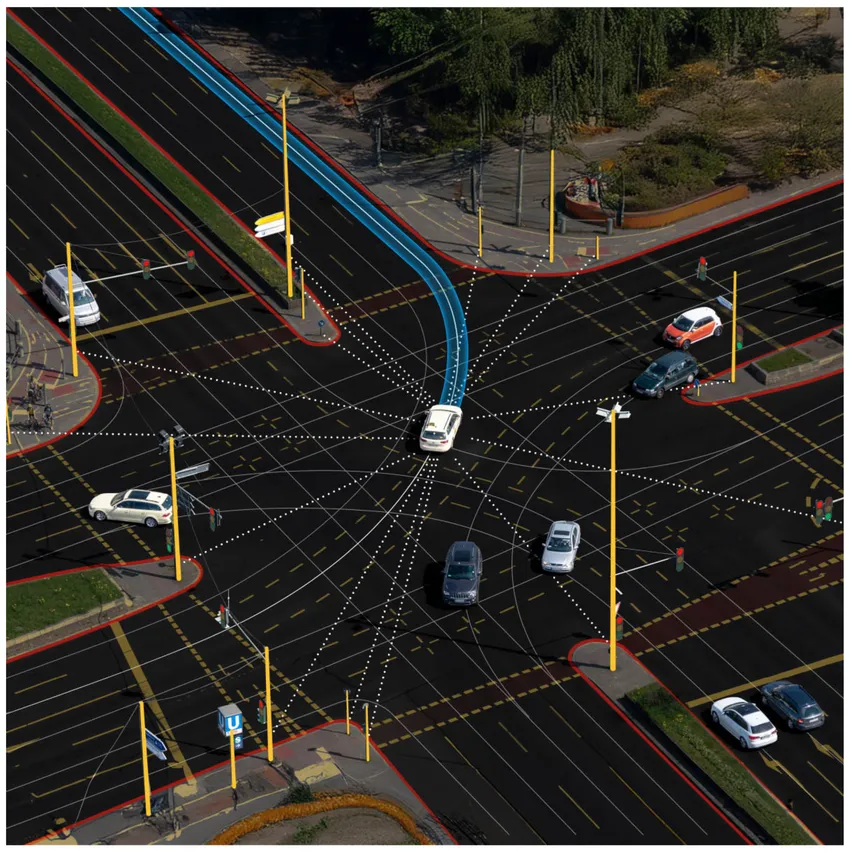
HD (High-Definition) maps are different. They operate at centimetre/decimeter-level precision. They include:
- Exact lane geometries
- Road curvature and elevation
- Sign and signal locations
- Curbs, barriers, guardrails
- Semantic attributes relevant for driving decisions
They are not meant to be looked at. They are meant to be computed.
For autonomous vehicles, HD maps serve as a prior model of reality — allowing the vehicle to localise itself precisely, anticipate road features beyond sensor range, and make safe decisions. Sensors perceive the present. HD maps provide structured spatial memory.
And this is where the argument becomes powerful. The paper suggests that HD maps are not just a new product category. They represent a paradigm shift in cartography itself.
When Abstraction Changes Meaning
In classical cartography, abstraction was about simplification. You generalize features to make them readable at different scales. In HD maps, abstraction serves a different purpose. It is not about visual clarity. It is about machine interpretability.
Instead of symbolization for human eyes, we now design data structures optimized for algorithms. Instead of choosing colors and line weights, we define semantic layers and topological relationships.
The map becomes:
- A spatial database
- A structured model of the road environment
- A component of an AI system
Cartography shifts from visual communication to spatial systems engineering.This challenges long-standing definitions of what a map actually is.
Is a map still a map if it is never seen?
HD Maps as Infrastructure
Another important insight from the paper is that HD maps should be treated not as static products but as dynamic infrastructure.
Autonomous driving requires continuous updates:
- Roadworks
- Temporary closures
- Construction changes
- Updated traffic patterns
HD maps are therefore:
- Versioned
- Continuously maintained
- Integrated with real-time sensor feedback
In many ways, they resemble digital twins of road networks. And this is where the topic goes far beyond autonomous vehicles.
HD maps are becoming foundational layers for:
- Smart mobility ecosystems
- Cooperative perception between vehicles
- Urban traffic optimization
- Future AI-enabled infrastructure systems
The implications for geospatial professionals are enormous.
A Blind Spot in Cartography?
Despite their growing importance in industry, HD maps have received relatively limited attention within traditional cartographic theory. This gap is precisely what the paper addresses.
It argues that the academic field of cartography should not leave HD maps entirely to automotive engineers and AI developers. Instead, cartographers bring unique expertise in:
- Spatial abstraction principles
- Representation models
- Data harmonization
- Multi-scale thinking
- Conceptual frameworks of space
In other words:
Cartography still matters — perhaps more than ever. But it must evolve. The question is:
Are we witnessing the redefinition of cartography itself?
The paper suggests that we are.
Maps are no longer only communication tools.
They are operational components of intelligent systems.
For those of us working at the intersection of drones, Earth observation, AI, and geospatial technologies, this shift feels familiar. We are increasingly building spatial datasets not just for visualisation, but for automation. And that is a different mindset. We are not abandoning human-centric maps.
Instead, we are entering a hybrid era:
- Maps for people
- Maps for machines
- And increasingly, maps for both simultaneously
The future likely lies in interoperable systems where HD maps, digital twins, and human-oriented interfaces coexist.
But recognizing this transformation is the first step.
Final Thought
HD maps are more than detailed road datasets. They are a signal that cartography is entering a new phase, one where maps are no longer primarily visual artifacts but active, machine-interpretable infrastructures shaping how autonomous systems perceive and navigate the world.
For geospatial professionals, this is not a niche topic.
It is a strategic frontier.
And it is only the beginning.

