
3D mapping is a great product for visualizing geographic data, allowing us to explore landscapes more interactively. By combining the capabilities of geospatial software (QGIS) and a 3D creation suite (Blender), you can create stunning 3D maps that bring historical and elevation data to life. In this guide, we’ll walk through the process of creating a 3D map using Digital Elevation Models (DEMs) and an old city map of Kraków and Budapest.
3D Maps by Geo-enthusiasts
BlenderNation – Owen Powell Maps Terrain Models: This page highlights Owen Powell’s work on creating terrain models using Blender, particularly focusing on his innovative methods for rendering complex landscapes.
Wesley Barr’s Blog – How to Make a 3D Map in Blender: This guide provides a step-by-step tutorial on creating 3D maps in Blender using GIS data, covering everything from importing elevation data to rendering realistic textures.
TJukanov’s Blender Maps: This site showcases the collection of 3D maps created in Blender by a cartographer named Tjukanov, featuring examples of his work and insights into his creative process.
Workflow: How to Create a 3D Maps?
Step 1: DEM Layers
For 3D visualization, you need height components. For instance, Digital Elevation Models offer information about height above sea level. Find the area of your interest and download the necessary data, taking into account the geographical extent of the historical map. You can use OpenTopography website in search of your height map. Merge all DEM layers, if necessary, and make sure the final DEM raster overlaps with the historical map.
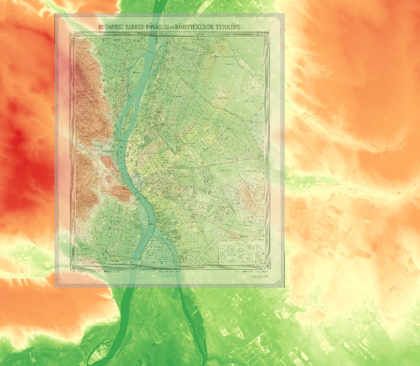
DEM extent
Step 2: Georeferencing the Old Map (optionally)
This step is to align the historical map with the DEM using QGIS’s Georeferencer tool. This process ensures that the map accurately overlays the terrain based on real-world coordinates. It’s necessary if your historical map doesn’t contain georeference.
- Load the historical map: Open the Georeferencer tool (found in QGIS under Raster > Georeferencer).
- Adding Tie Points: Tie points are crucial in georeferencing. These points link known locations on your old map to their corresponding locations on a base map (such as OpenStreetMap) or the DEM. The first task is to select a point in the historical map, and then to choose the same location in the base map in QGIS. What we suggest in this step is to try to distribute your tie points evenly in the historical map and be aware of Residual error. The smaller it is, the better the results of georeferencing are.
- Transformation Settings: After adding sufficient tie points, it is high time to choose a transformation method (such as Helmert or Polynomial) and apply the georeferencing. At last, you have to save the output as a georeferenced image.
QGIS Georeferencer allows you to check your transformation precision by calculating Residual error in pixels and presenting spatial error of georeferencing. In the image below you can see how poor precision of selecting tie points can influence the overall error.
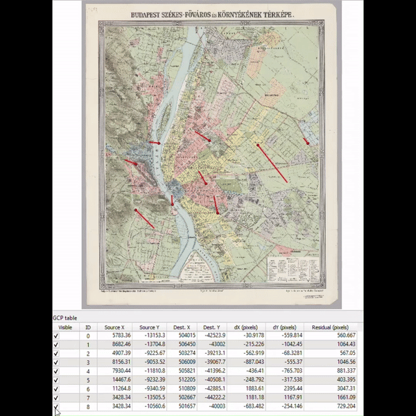
Georeferencing residuals
Step 3: Exporting Images to .jpg
For this step, we recommend using QGIS Layout Manager. Set up paper properties and the resolution of output .jpg file. Here we set up the paper size to 210×210 mm and export resolution to 600 dpi (page width and page height set up to 4960 px).
Export two images: one with elevation data and the other with a georeferenced historical map.
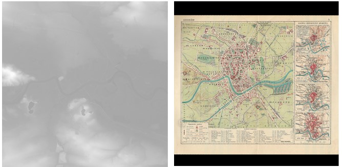
Output from QGIS: elevation map and georeferenced historical map
Step 4: Generating the Mesh & Applying the Texture
Blender software offers plenty of tools for creating a 3D mesh and model texturing. In this tutorial, we used settings similar to this workflow. You can manipulate the with the ‘Strenght’ and ‘Level Viewport’ to increase and adjust the topography appearance.
Final results
3D Map of Kraków
3D Map of Budapest
Creating 3D maps using QGIS and Blender is a way to visualize both historical and topographical data in an engaging format. By carefully preparing your DEM, choosing a historical map in QGIS, and crafting the 3D terrain and textures in Blender, you can produce detailed and visually compelling maps that bring the past and present landscapes together. This integration opens up new possibilities for 3D map creation.
Did you like the article? Read more and subscribe to our monthly newsletter!


#Contributing Writers

Next article
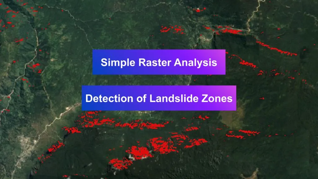
Landslides are catastrophic geological events that cause significant environmental and economic damage worldwide. Effective assessment and management of landslide risks rely heavily on accurate geospatial data. Why monitoring landslide events is so important? Well, such events occur more frequently in 2024 due to climate change and more frequent heavy rains.
NASA Landslide Viewer
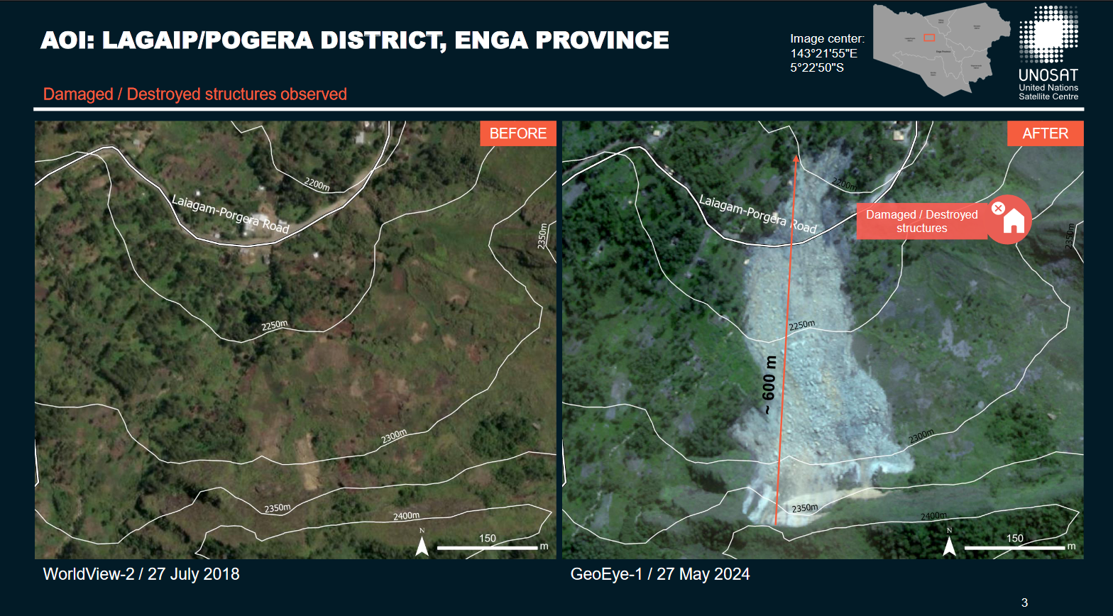
This article discusses a basic methodology for analyzing raster data in detecting landslide risk areas. Moreover, a post-event analysis of one of the recent landslides in Papua New Guinea was undertaken to showcase the impact of such incidents on the environment. This landslide, in Lagaip/Pogera District on May 24th, 2024, left a scar of 9 hectares and stretched 600 meters, damaging several buildings and Highland Hwy road.
The case of Lagaip/Pogera District, Papua New Guinea. Source: Reliefweb
Methodology
Collected Datasets:
- The 12.5m DEM from the PALSAR Radiometric Terrain Corrected high-res collection.
- The annual sum of precipitation data sourced from the Climate Hazards Group InfraRed Precipitation with Station (CHIRPS).
- Post-event images captured by Sentinel-2, available through SentinelHub in various spectral compositions.
- Vector layers from the website data.humdata.org include polygons representing landslide area and point layer marking buildings damaged by the mentioned event.
Data Processing & Visualization
- Raster datasets were processed to extract slopes greater than 40 degrees from the DEM data, identifying the steepest terrain sections most susceptible to gravitational pull and potential landslides.
- The aspect data layer was analyzed to isolate northern-facing slopes, which, depending on regional climatic conditions, can be more prone to moisture retention and less sunlight exposure, affecting soil stability.
- The precipitation raster was filtered to highlight areas receiving more than 2500 mm of annual rainfall, a critical threshold that significantly increases the likelihood of soil saturation and subsequent landslide occurrences.
- By overlaying these processed conditions—steep slopes, northern aspects, and high precipitation—the analysis pinpointed the zones with the highest risk of landslide, providing vital information for targeted risk management and mitigation efforts.
Raster analysis in QGIS: aspect, slope, precipitation, output layer
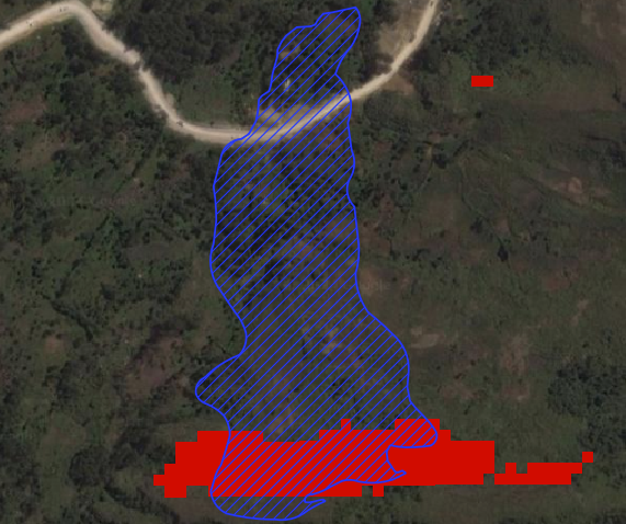
Overlap was found between the area of the specific landslide, mentioned (blue), and the results of the GIS analyses carried out -detected landslide-prone zone (red).
Post-event look
Spectral compositions represent the topographical changes resulting from the earth’s movement – loss in forest areas or reducing the moisture index. Vector layers help better assess the extent of damage and provide additional information in the attribute table.
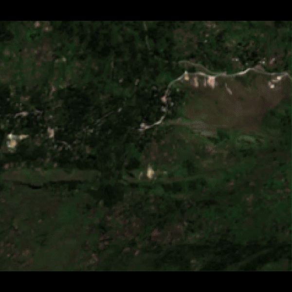
The landslide visualized in spectral compositions
Discussion
This study highlights the efficacy of simple raster analysis in detecting landslide-prone areas, using a combination of DEM, precipitation data, and spectral imagery. The case of the Lagaip/Pogera District in Papua New Guinea illustrates how these methods can effectively identify high-risk zones and assess post-event damage. By focusing on factors such as slope, aspect, and rainfall, this analysis provides crucial insights for proactive landslide risk management. The integration of geospatial data and raster analysis thus proves to be a valuable tool in mitigating the devastating impacts of landslides.
Did you like the article about detecting landslide zones? Read more and subscribe to our monthly newsletter!

