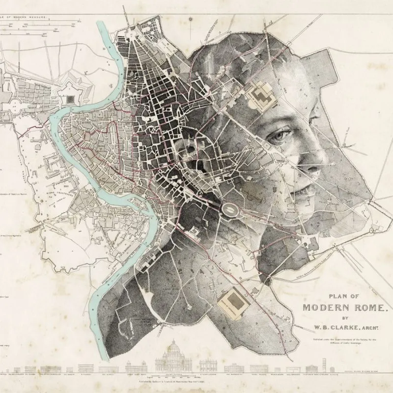
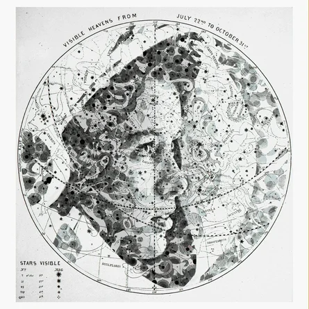
Maps are usually tools. They help us navigate cities, plan journeys, and understand geography. But sometimes maps can become something else entirely: an art, a canvas for storytelling. British artist Ed Fairburn has built a unique artistic career by transforming maps into portraits. At first glance, his works appear to be ordinary vintage maps. Roads, rivers, and topographic lines form familiar patterns of geography.
But step back—and suddenly a human face emerges from the landscape. Fairburn’s work sits at the intersection of cartography and portraiture. It reminds us that maps are not just representations of space. They can also tell stories about people, identity, and place.
A Fascination with Maps
Fairburn’s artistic journey began with two simple interests: collecting old paper maps and drawing portraits. Eventually he realized that the two could merge into something entirely new. Instead of drawing on blank paper, he began experimenting with maps as a base layer. At first this meant using everyday materials—road atlases or topographic sheets. Over time, it became a defining part of his style.
Vintage maps are especially appealing to him. Their aged colors, intricate symbols, and complex networks of roads and rivers provide a rich visual structure. Rather than fighting these elements, Fairburn embraces them. He studies each map carefully before starting a drawing, sometimes spending hours analyzing the terrain and patterns. The goal is not to impose a portrait on the map, but to allow the map to guide the composition. In his words, the artwork should “feed the composition instead of fighting it.”
The Technique: “Topopointillism”
Fairburn describes his artistic method as “topopointillism.” The term combines two ideas:
- Topography — the representation of landforms and landscapes
- Pointillism — the artistic technique of building images from small dots or strokes
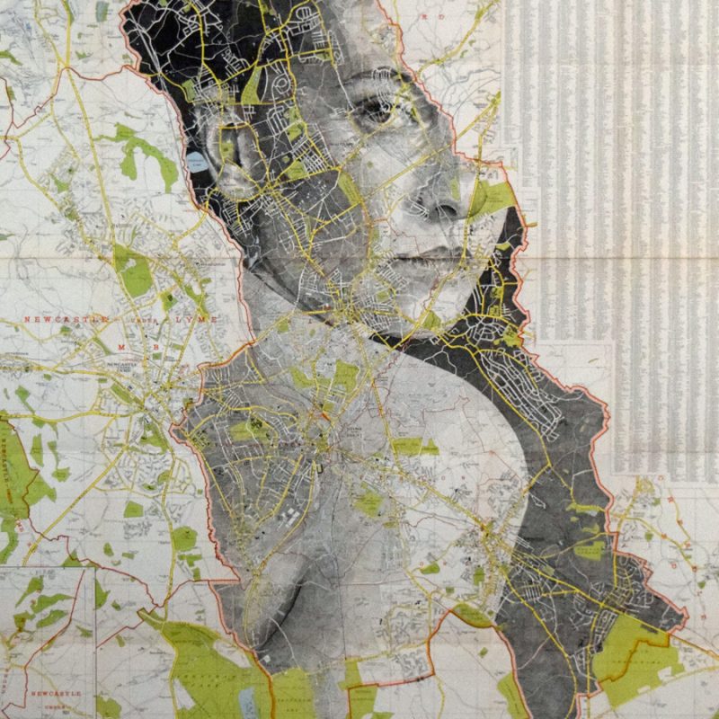
Using ink, pencil, and cross-hatching, Fairburn gradually transforms the patterns already present in the map. Roads become the lines of a jaw or brow. Rivers may form the curve of a cheek or shoulder. Contour lines become shadows and textures. The process is slow and meticulous. Dense layers of cross-hatching create the illusion of depth, light, and skin texture. From up close, the viewer sees an abstract network of lines. But from a distance, the portrait suddenly becomes clear. The result is a fascinating visual paradox: the closer you look, the more the portrait dissolves into geography. Step back, and the landscape becomes a human face.
People and Places
A key idea behind Fairburn’s work is the relationship between people and the landscapes they inhabit. In many of his portraits, the geography of a place subtly shapes the subject. A city’s road network might guide the orientation of a face. A coastline might form the edge of a shoulder. Rivers and highways act almost like the veins of the human body.
Fairburn often explains that these similarities between landscapes and anatomy inspire his work. Roads resemble arteries, waterways resemble veins, and the structure of cities mirrors the structure of living organisms. Through this approach, the artwork suggests that people and places are deeply interconnected. The environments we live in shape who we are—and in turn, we reshape those landscapes. It’s a poetic idea that resonates strongly with anyone interested in geography or cartography.
From Studio Experiments to Global Recognition
Fairburn began experimenting with map portraits around 2012, while studying illustration at Cardiff School of Art and Design.
What started as a creative experiment quickly gained attention online. The unusual combination of cartography and portraiture caught the imagination of audiences around the world. Since then, his work has appeared in galleries and exhibitions internationally. Collectors now acquire both original drawings and limited edition prints.
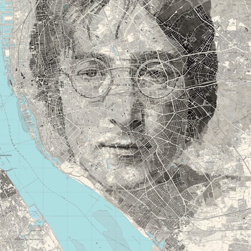
Fairburn’s artistic style has also attracted commercial commissions. His portfolio includes work for book publishers, film studios, and music projects. Among the most notable collaborations are artworks connected to the John Wick film franchise and a Grammy-winning John Lennon project, demonstrating how map-based art can extend far beyond traditional galleries. Despite these high-profile projects, Fairburn’s core practice remains deeply rooted in traditional techniques: pen, ink, graphite, and paper maps.
The Power of Analog in a Digital World
One of the intriguing aspects of Fairburn’s work is its analog nature. In an era dominated by digital mapping platforms—Google Maps, satellite imagery, real-time navigation—his art returns to the tactile qualities of cartography. Paper maps carry a sense of permanence. They show a snapshot of geography at a specific moment in time. Roads may have changed since then, cities may have expanded, but the map remains frozen in history. Fairburn uses this permanence to create artworks that feel timeless.
The portrait emerges from a document that once served a practical purpose: guiding someone through the world. The transformation is subtle but powerful. A utilitarian object becomes something emotional and expressive.
A New Way of Seeing Maps
For people working in geospatial industries, Fairburn’s work offers an interesting reminder. Maps are usually treated as tools for analysis, navigation, or decision-making. But they are also visual artifacts—carefully designed systems of symbols, colors, and lines.
Cartographers have always known this. The history of mapmaking is full of examples where functionality meets artistic expression.
Fairburn simply pushes that idea further.
He reinterprets the language of cartography—contour lines, roads, boundaries—and turns it into portraiture. His work invites viewers to look at maps differently. Not just as instruments for finding our way, but as images that contain hidden stories about human identity and the places we call home.
Did you like this post? How do you like connection of art and maps?
Read more and subscribe to our monthly newsletter!

#Fun

Next article
Why Earth Observation is Drowning in Data but Starving for Decision- Ready Intelligence

The Earth observation (EO) industry is navigating a mid-life crisis of utility. We have more eyes in the sky than ever, yet a persistent gap remains between the data we produce and how it is used in real-world decisions.
The disconnect is structural. Data is still priced and delivered under assumptions of scarcity that no longer reflect current reality. For decades, charging by the square kilometer made sense in a supply-constrained market. That logic is now breaking down.
The shift is already visible in the numbers. The EO sector reached $5.4 billion in 2024, with value-added services growing at 7-8% annually. Growth is shifting downstream, while standalone imagery is becoming less aligned with how the market creates value.
At the same time, the upside remains significant. Industry estimates suggest the total addressable market could nearly double by 2034. But that growth will not come from more satellites alone. It depends on moving beyond raw imagery to interoperable data streams that fit into operational workflows.
This is already reshaping competition. As medium- and high-resolution imagery becomes more widely available, differentiation based purely on spatial resolution or revisit frequency is narrowing. Value is shifting away from the image itself and toward the reliability of the information derived from it.
The Hidden Cost of Inconsistency
The legacy “tasking” model, where a customer pays for a specific capture of a specific coordinate, was designed for reconnaissance. It does not translate well to commercial use. Monitoring supply chains or carbon sequestration at scale requires consistent data over time. A single image is an observation, an anecdote, not a usable signal.
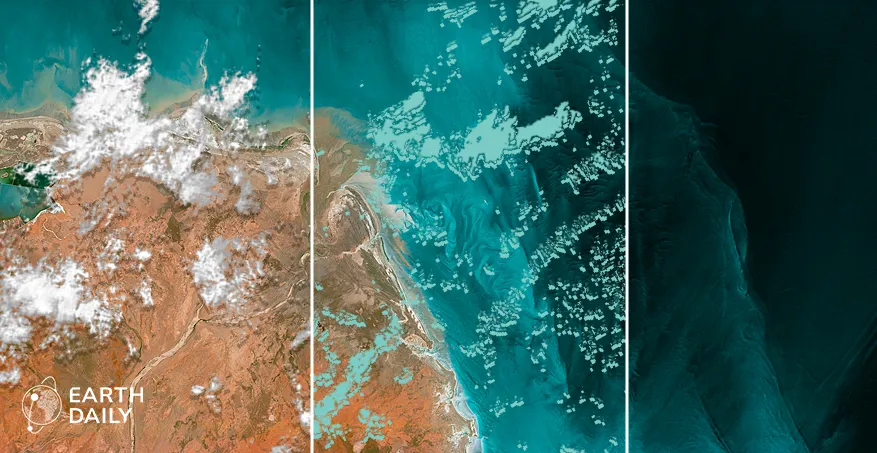
The problem is that imagery is inherently variable. It is shaped by sensor bias, orbital geometry, and atmospheric conditions. When the industry sells images, it transfers the burden of normalization to the customer. At an operational scale, it becomes a constraint.
Variations from atmosphere, illumination, and viewing geometry routinely reach several percentage points in radiometric difference—often rivaling the underlying signal in applications like vegetation monitoring or soil moisture estimation.
The idea of a “geospatial tax”, as described by Marc Prioleau, Executive Director of the Overture Maps Foundation, captures this hidden cost. In many enterprise workflows, preparing data for analysis now rivals or exceeds acquisition costs. When analysts spend 80% of their time on cleaning data, the result is an expensive image rather than decision-ready intelligence.
This friction helps explain why EO has struggled to scale commercially, despite rapid growth in data availability. It also exposes the limits of the legacy “price per square kilometer” model, which assumes that data is a fungible commodity. As multi-sensor datasets are combined and time-series extend, inconsistencies amplify rather than resolve, creating a compounding barrier to entry for non-specialized industries.
Analytics is a Symptom, Not the Solution
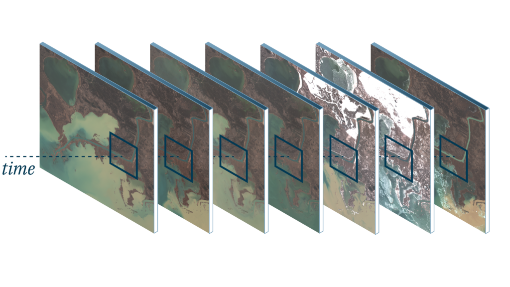
As any imagery analyst can attest, two images of the same location are not directly comparable without correction. As time-series grow and datasets from multiple sensors are combined, these inconsistencies build rather than disappear. More data does not solve the problem; it makes it harder to manage.
This matters because the fastest growth in the EO market is happening in analytics and decision-support systems. In sectors such as agriculture, insurance, and energy, imagery is used to feed automated workflows. The requirement is to track change reliably across time.
The industry often presents “analytics as a service” as a move up the value chain. In practice, it is a workaround. Users are not simply outsourcing interpretation, but the burden of making inconsistent data usable.
What appears to be an analytics problem is, in most cases, a data quality problem.
This is why frameworks such as CEOS Analysis Ready Data (ARD) have gained traction. Without radiometric consistency, geometric alignment, and traceability, scaling analytics becomes difficult. Artificial intelligence makes this constraint clearer. Machine learning models depend on stable inputs; when data varies, outputs drift or degrade.
From Imagery to Measurement
The shift underway is from imagery to measurement. Imagery captures how the Earth looks; measurement captures how it changes, and by how much. The distinction matters because measurement requires consistency across time, sensors, and conditions. Delivering that consistency demands system design that prioritizes calibration, signal-to-noise performance, and spectral depth over visual quality.
This shift is also reshaping where value sits in the market. As satellite capacity has expanded, standard optical imagery in the visible spectrum has come under increasing price pressure. What remains differentiated is not simply resolution, but the ability to extract physically meaningful signals.
That is where the “invisible” spectrum becomes critical. Shortwave Infrared (SWIR) and Thermal Infrared (TIR) bands provide direct insight into moisture stress, material properties, and heat signatures that RGB imagery cannot capture.
But accessing these signals requires a level of radiometric precision, calibration stability, and system-level consistency that is difficult to achieve at scale. This creates a meaningful barrier to entry and reinforces the shift toward systems built to produce stable, comparable measurements over time.
This transition is already underway. New orbital architectures are being designed not as imaging platforms, but as measurement systems, built to deliver consistent, analysis-ready data streams for AI-driven workflows and large-scale operations.
Trading Pixels for Proven Signals
As Earth observation becomes embedded in decision-making, its value is no longer defined by how much data is delivered, but how reliably it supports high-consequence outcomes. A $100-million decision does not depend on access to imagery; it depends on the integrity and consistency of the signal behind it.
Revenue models are evolving accordingly, with one-off image sales giving way to subscriptions, APIs, and analytics because imagery no longer functions as the endpoint in operational workflows.
The industry has largely solved for access, but it has not yet solved for trust. Producing consistent, comparable measurements at scale requires calibration, stability, and system-level coordination that are not reflected in legacy pricing models or in systems optimized for collection alone.
The image is no longer the product. The signal is.
Earth observation will transition from a niche data source to an indispensable utility only when measurement, not imagery, defines both the product and the price. Until then, increasing data volumes will continue to outpace the market’s ability to use them reliably.

