#Business

Wearables are all about fitness now!

Wearables are all about fitness now – the latest Apple Watch finally got a built-in GPS sensor + better software for tracking your exercise routine, Pebble is improving its software each week, pushing out additional fitness tracking features and Fitbit just launched two new products.

Its been a few years since the first smartwatch/wearable was launched and they are slowly but surely losing their “gadget of the nerds” status. In fact, they are getting good at being fitness trackers or to paraphrase Wired “Smartwatches are for fitness” (Read more: What If We Told You Smartwatches Are Actually Getting Good). Sure, but how does any of this impact a GeoGeek? The short answer is: “Health GIS & Geomedicine” (Related: The role of wearable tech and Internet of Things in Geomedicine).

Health GIS and Geomedicine 

Smartwatches maybe getting good at being fitness trackers but all that data about your health that is being collected is just lying idle in a server, waiting to be mined and made use of. For the first time today, I came across a smartwatch (on Kickstarter) that is promising to make use of your data to contact your doctor is something is wrong. SOWATCH (yes, its all capitalised) has already raised over $160,000 in the last 20 days of their Kickstarter campaign and has some really cool features and a blood pressure sensor.

As a GeoGeek, it is really interesting to see Wearable tech already getting to a stage where it can be integrated into our health records. Sooner or later, they are going to serve as the first step of diagnostics for doctors and Bill Davenhall’s TED talk “Your health depends on where you live” is going to get even more futuristic. Wearables are going to serve as a record of what we are doing + where and all this information is going to make Health GIS analysis all the other interesting and amazing!


Say thanks for this article (0)
The community is supported by:
Become a sponsor
#Business
#Business #Ideas
Urban Digital Twins in China: A Smart Gadget or a Decision Support Tool?
Nianhua Liu 03.28.2024
AWESOME 4
#Business #Featured
The Earth Observation Hub Report: 2024 Industry Trends and Analysis
Avatar for Muthukumar Kumar
Muthukumar Kumar 03.13.2024
AWESOME 4
#Business #Featured
Global Top 100 Geospatial Companies – 2024 Edition
Avatar for Muthukumar Kumar
Muthukumar Kumar 01.31.2024
AWESOME 10
Next article
#Ideas

Where is the good, where the bad air – interactive air pollution map by WHO

In 2014 over the half of the world’s population was living in cities. The dense infrastructure, elevated percentage of built up areas, traffic and a lack of natural air filter mechanisms often makes highly populated settlements to spots of poor air quality. More than 80% of people living in urban areas that monitor air pollution are exposed to air quality levels that exceed the World Health Organisation (WHO) limits. The impact of bad air quality is significantly higher in low-income cities. According to the latest urban air quality database, 98% of cities in low- and middle income countries with more than 100 000 inhabitants do not meet WHO air quality guidelines. In high-income countries, that percentage decreases to 56%. – The impacts of poor air quality rises the risk of stroke, heart disease, lung cancer, and chronic and acute respiratory diseases, including asthma, increases for the people who live in them.

Due to the importance of the topic, the WHO holds and updates a database of urban air quality assessment for now over 3000 cities in over 103 countries, a number that has doubled in the last two years. The database is visualized via an interactive airpollution map that can be seen on the web.

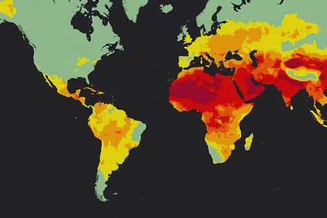
Global Air Pollution Map (interpolated)

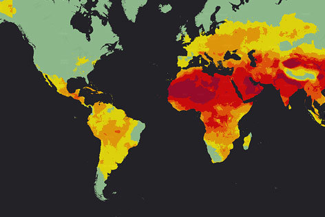
Global Air Pollution Map (interpolated)

The global airpollution map shows that over 90% of the worlds population is living in places where air quality levels are regularly exceeded. In other words, only 8% of the world’s population lives in places of good air quality. Regions with poor air quality are Northwest Africa, the Saudi Arabian Peninsula including the Golf of Persia, parts of India, Russia and China.  Interestingly these regions do not only coincide with places of low environmental specification for industry but often are located in zones where the purification of the air by natural filtering systems, for instance by forests/ vegetation or precipitation is low. The latter is well examplified by the Sahara as area of bad air quality. The most polluted spot in terms of air quality is not Peking ranking on place 153, but the city of Onitsha in Nigeria.

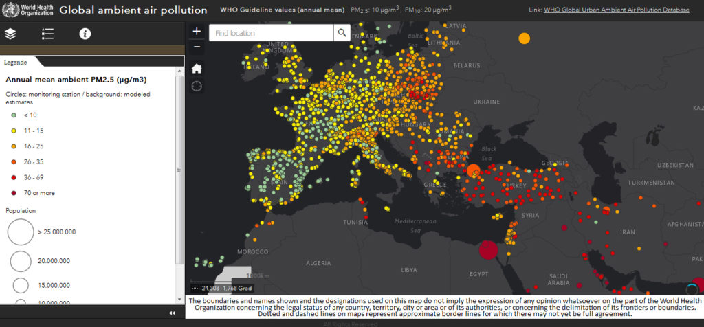
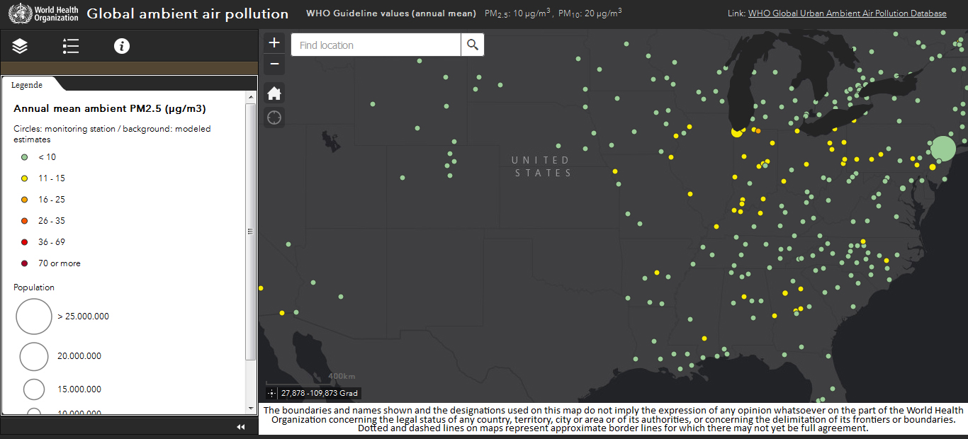
The situation in Europe is mediocre, whereas the air quality assessments are particularly low for Eastern Europe. Interestingly, the air quality in North America is thoughout most parts of the continent quite good, which can be explained by the presence of largly unpopulated areas and a modernized industry. To me, that is an obvious reason, why strict environmental regulations are important for a densly populated continent as Europe.

Have a look at the interactive map examples in the figures below or better, make yourself an own opinion about the air pollution map on its website (see link below).

Global ambient air pollution (interactive map), Europe.

Global ambient air pollution (interactive map example), Europe.

Global ambient air pollution (interactive map), North America.

Global ambient air pollution (interactive map example), North America.

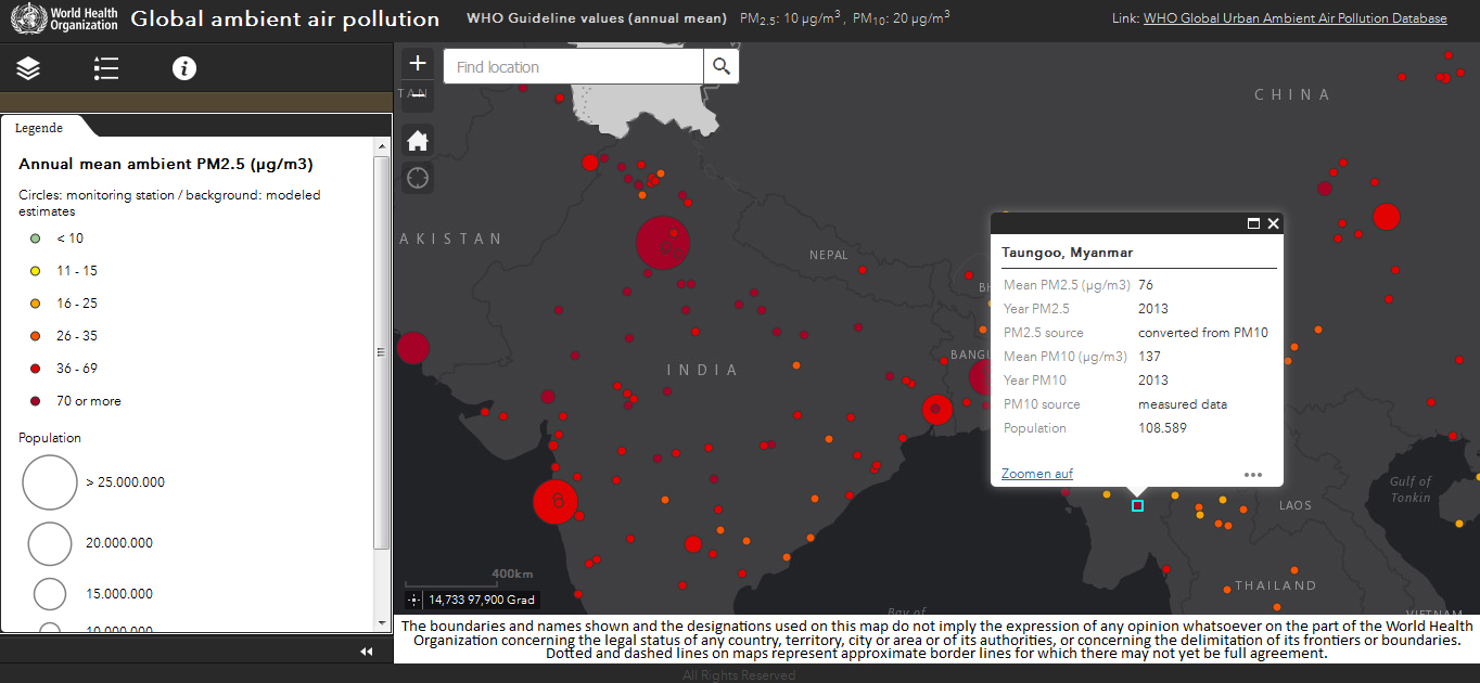
Global ambient air pollution (interactive map), India. The air quality details for each sample station can be opened.

Global ambient air pollution (interactive map example), India. The air quality details for each sample station can be opened.


Read on
Search