We know the results on the 2016 US Presidential elections for a few days. Now that the emotions calmed down it’s time to analyse it. These 23 maps and charts will help you understand it.
If you feel that something is missing please share it in comments.
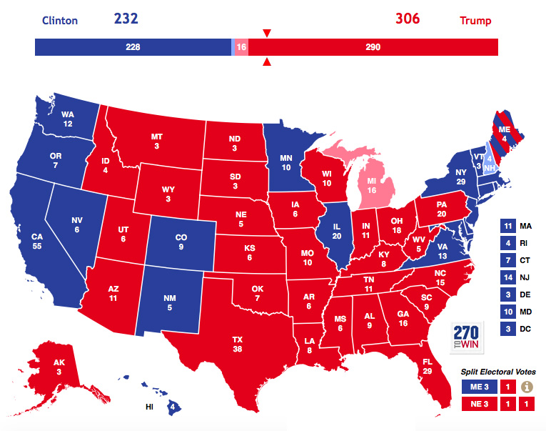
23. The results of the 2016 US presidential elections
source: 270towin.com
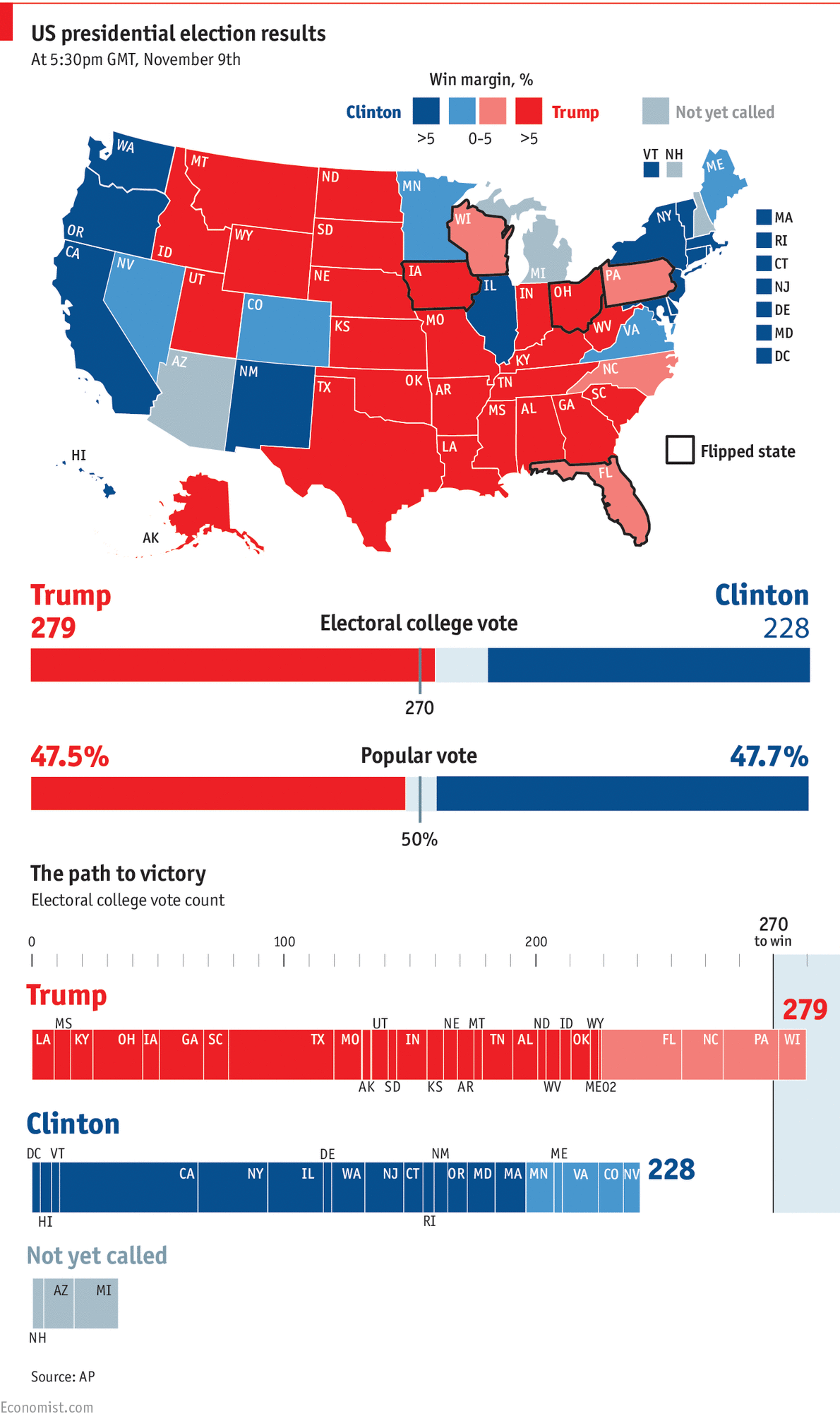
22. And some more details on the results
source: Economist
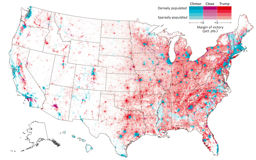
21. County-level results by population density
source: Wall Street Journal
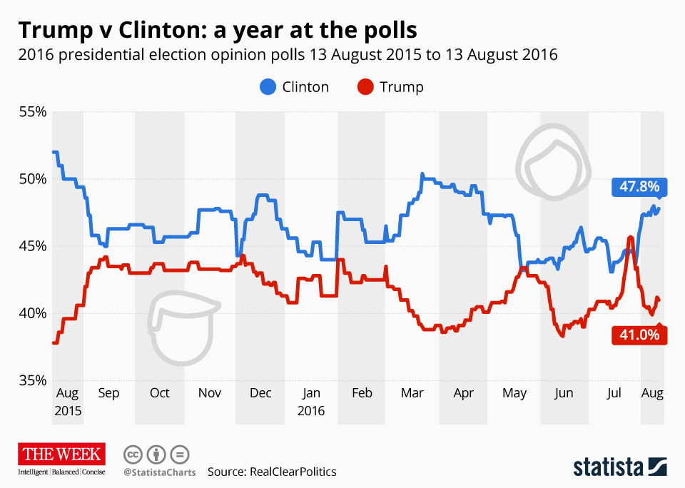
20. Trump vs. Clinton: a year at the polls
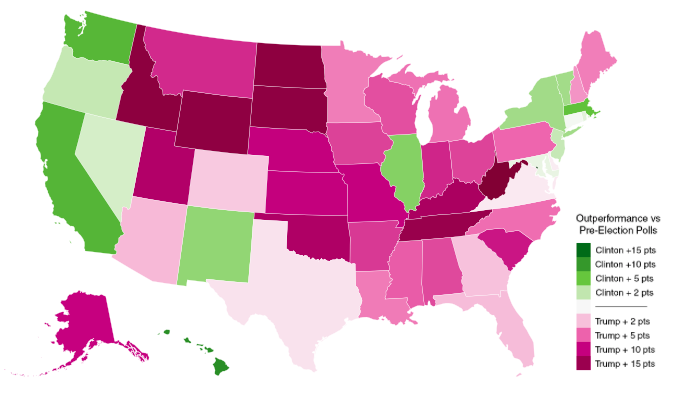
19. Where each candidate outperformed election forecasts
source: Metrocosm
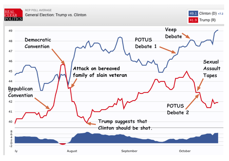
18. How have events shaped the Clinton-Trump race?
source: Scienceblog
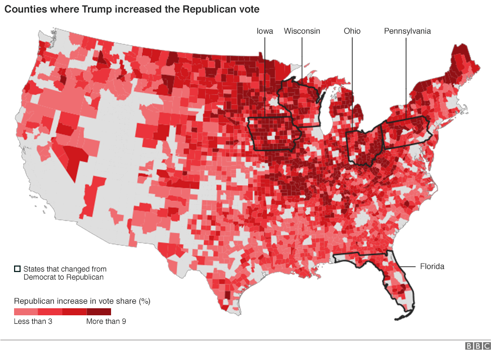
17. Counties where Trump increased Republican vote
source: BBC
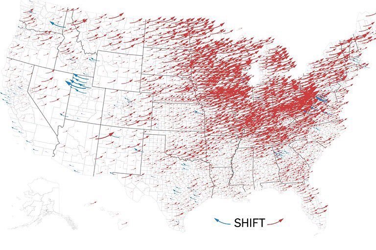
16. How Trump pushed the election map to the right
source: New York Times
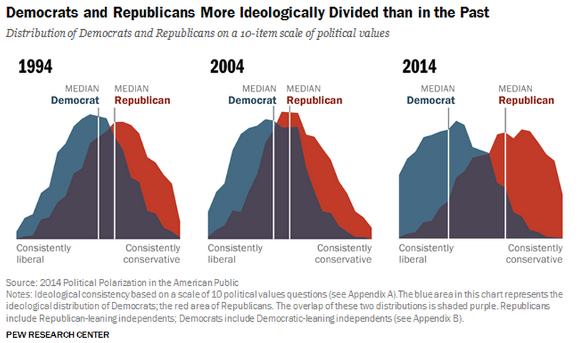
15. Political polarization in the US is worse than ever
source: Vox
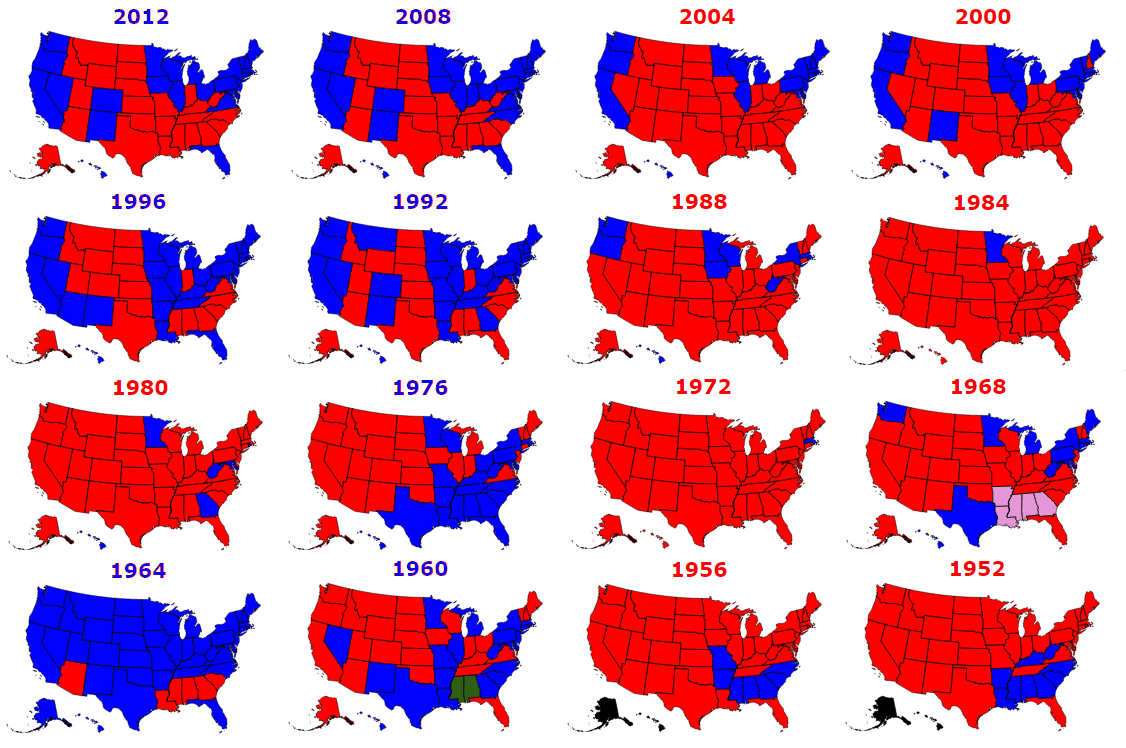
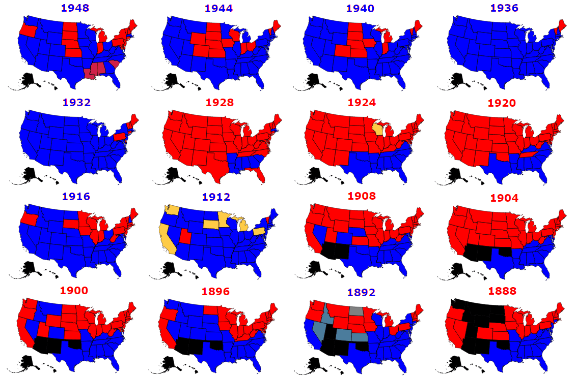
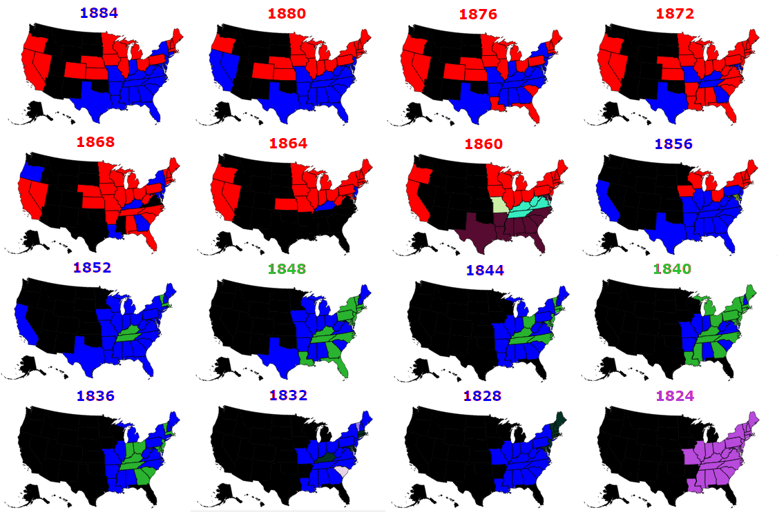
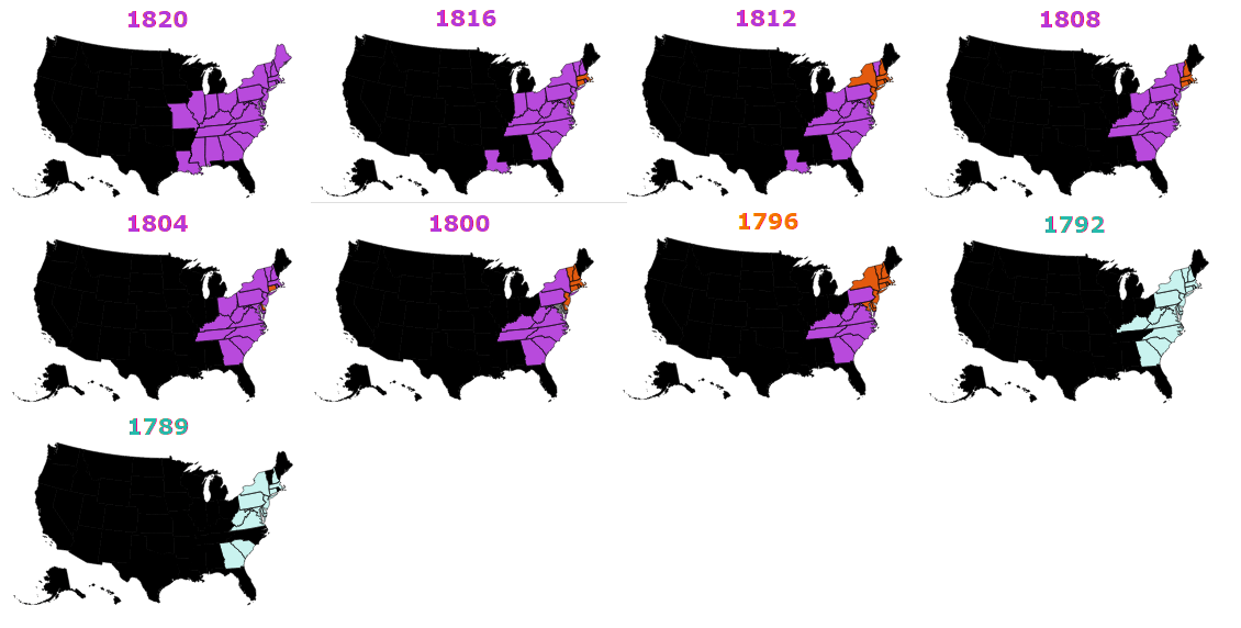
14. All Presidential Election Results 1789-2012
source: Metrocosm
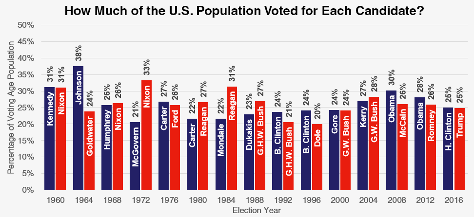
13. How much of the US population voted for each candidate?
source: Metrocosm
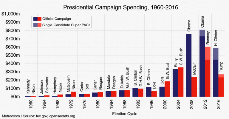
12. What Trump and Hillary Spent vs Every General Election Candidate Since 1960
source: Metrocosm
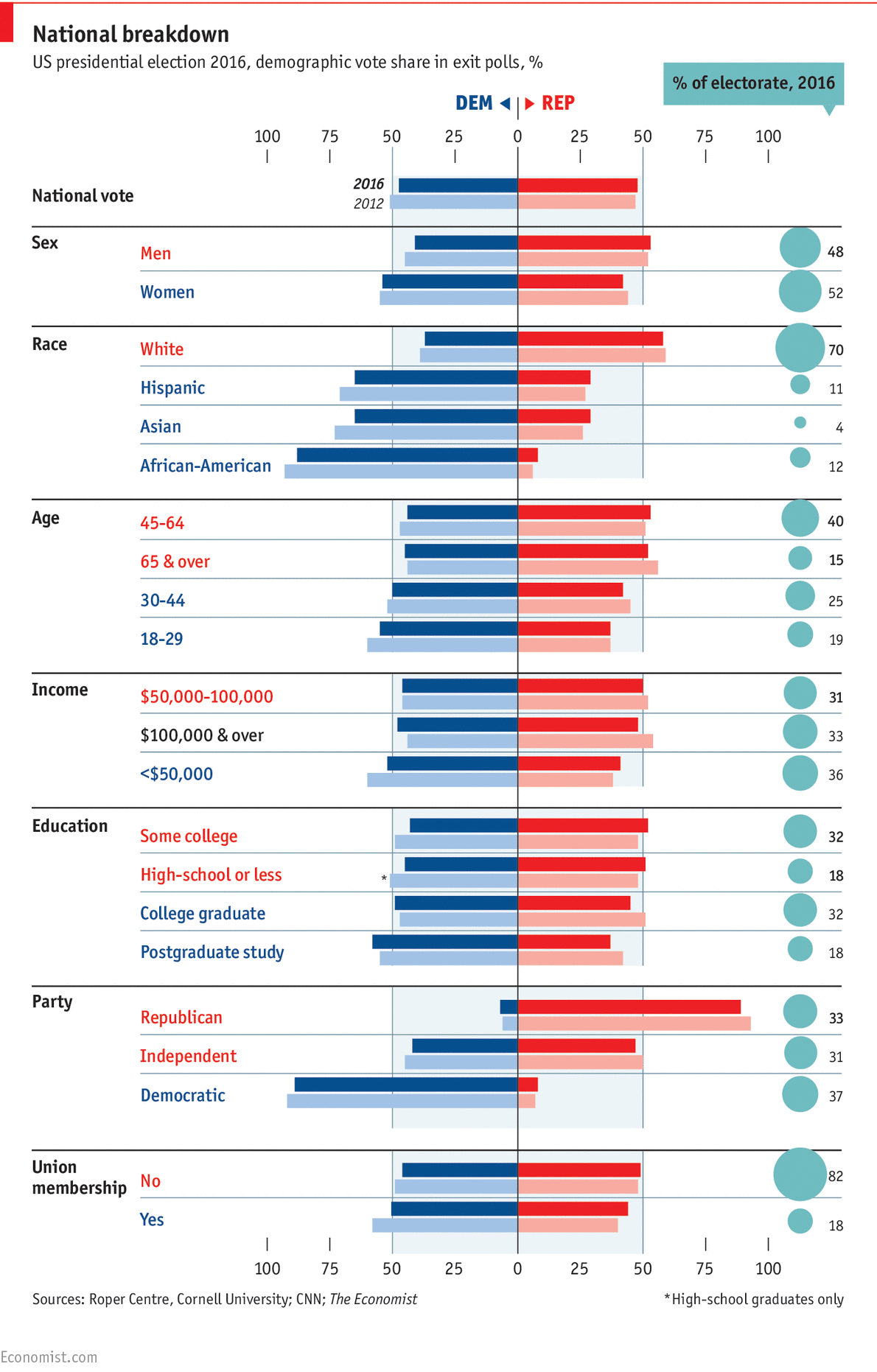
11. The demography of the votes
source: Economist
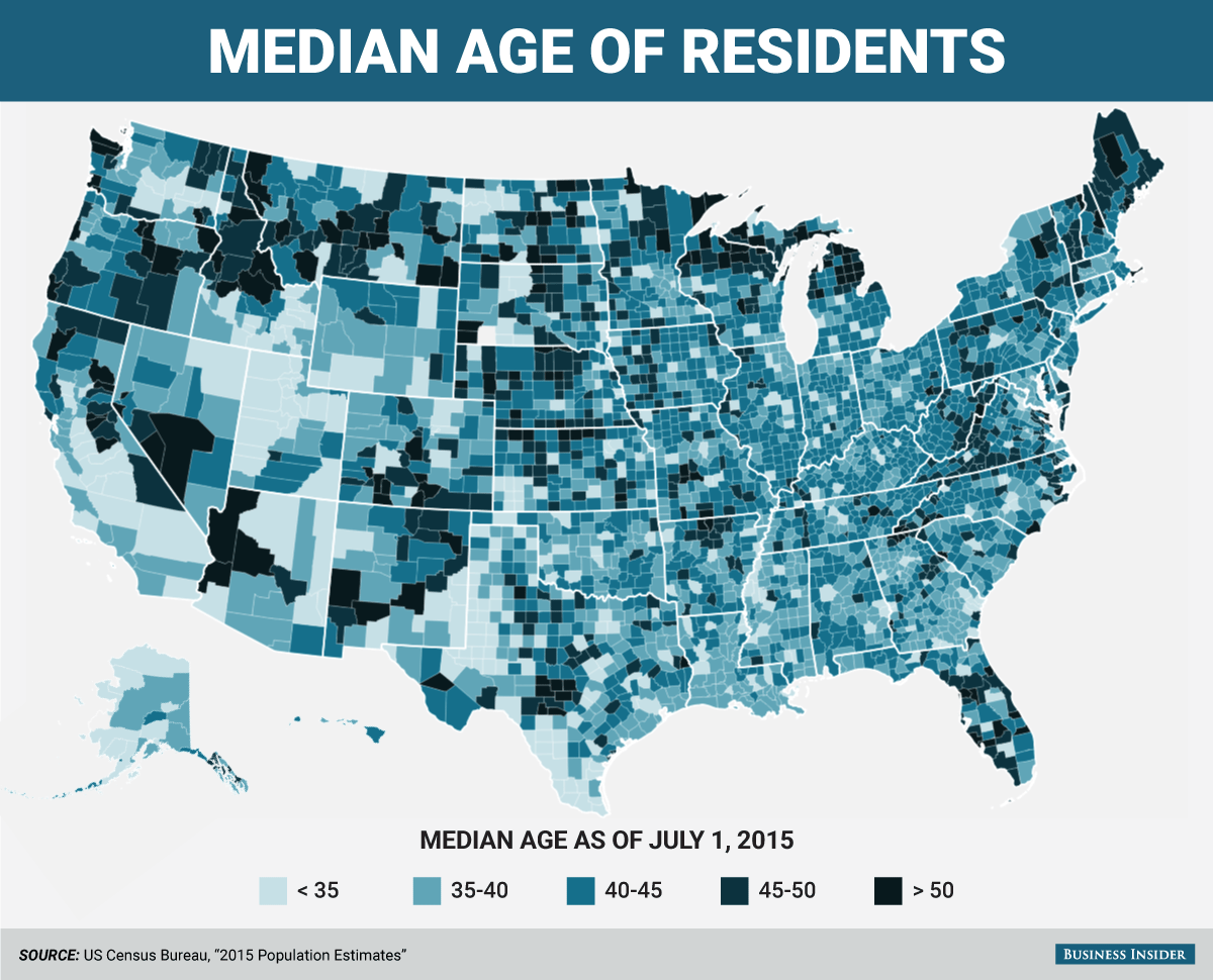
10. Median age of residents per county
source: Business Insider
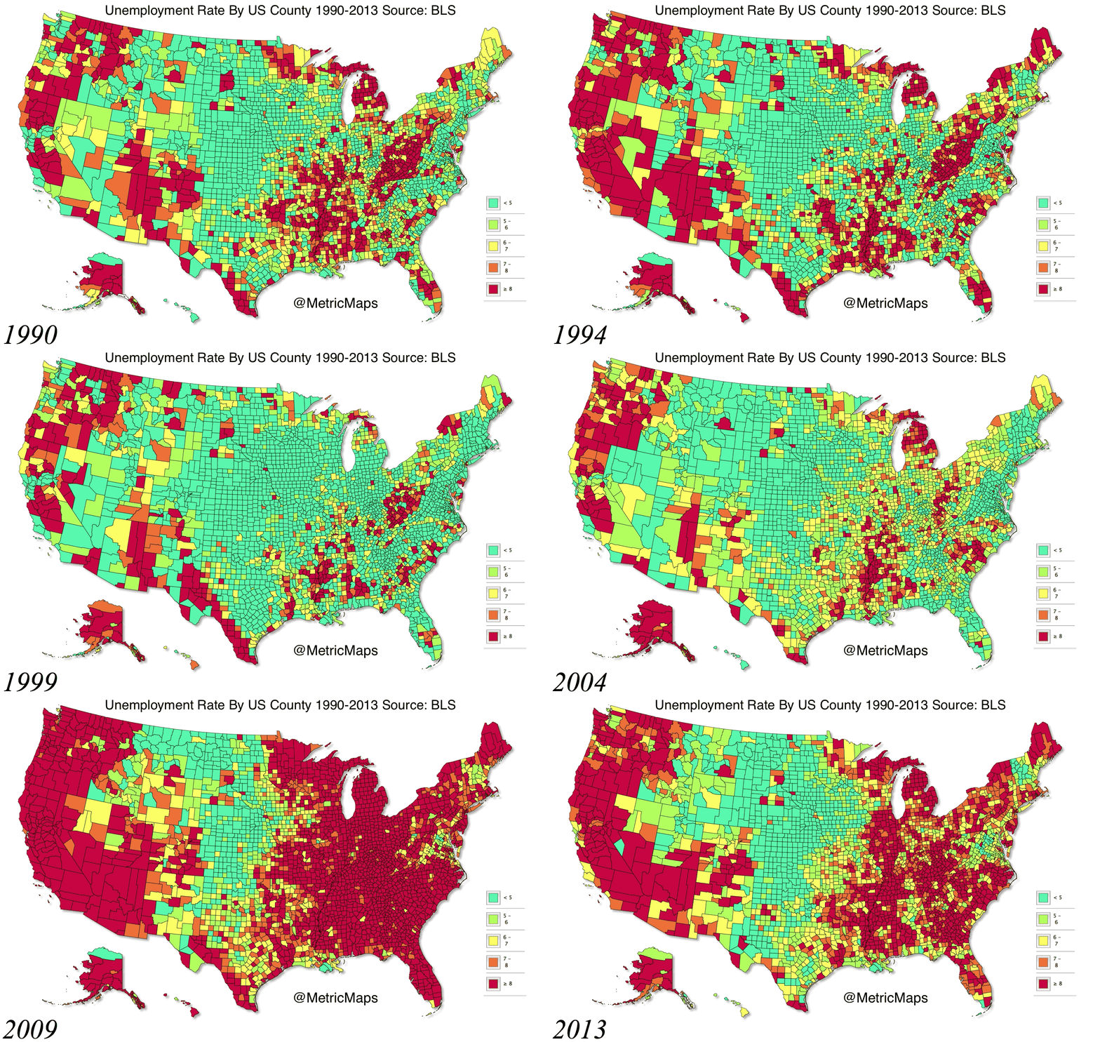
9. Unemployment rate per county between 1990-2013
source: Huffington Post
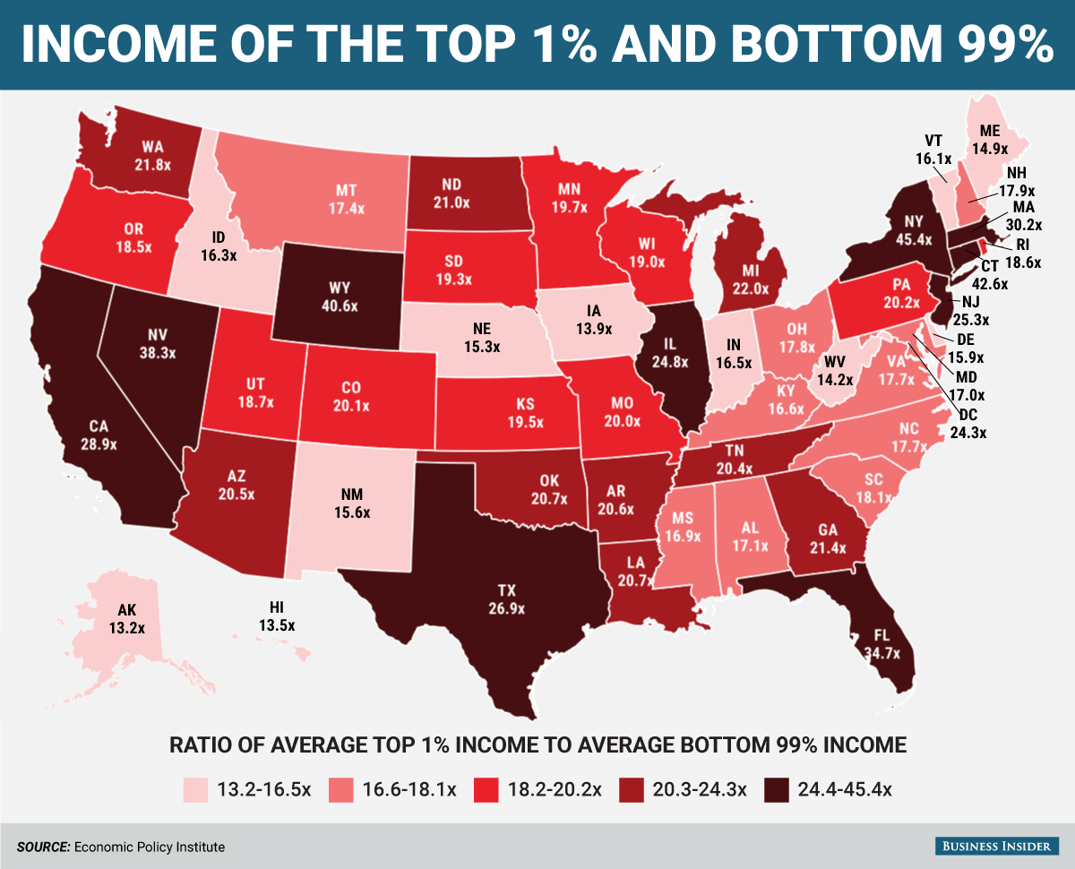
8. Income inequality per state
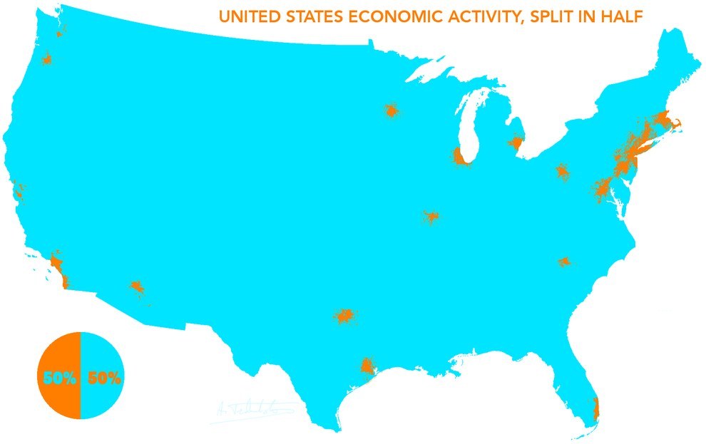
7. This how the US economy splits in half
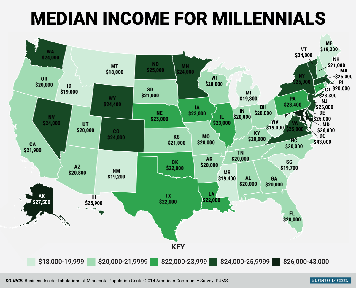
6. Median income for millennials
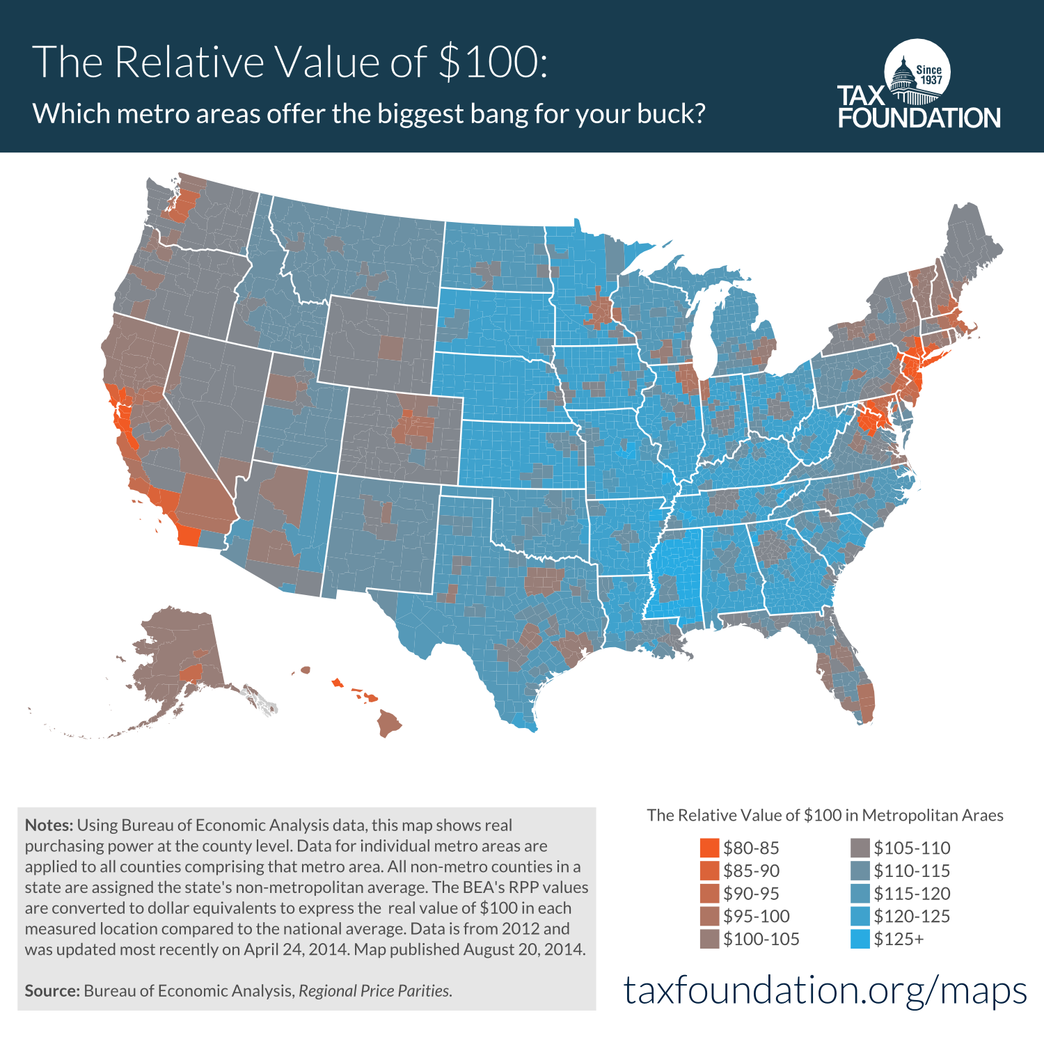
5. How much is $100 really worth in each state? (what is the cost of living in each state)
4. Racial composition of political parties


