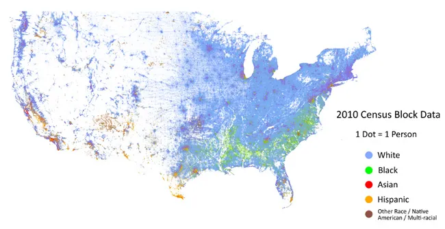
This map shows how American cities are racially segregated
At Geoawesomeness openness and tolerance are our key values. Our team members come from different continents, countries and cultures. And we are definitely proud of our diversity.
From a spatial perspective it is interesting to observe social geography of a diverse society like the one in the U.S. Although statistically the social inequality and segregation on a racial level is lower than ever before, the new interactive map created by Dustin Cable from University of Virginia shows that it’s for from being perfect.
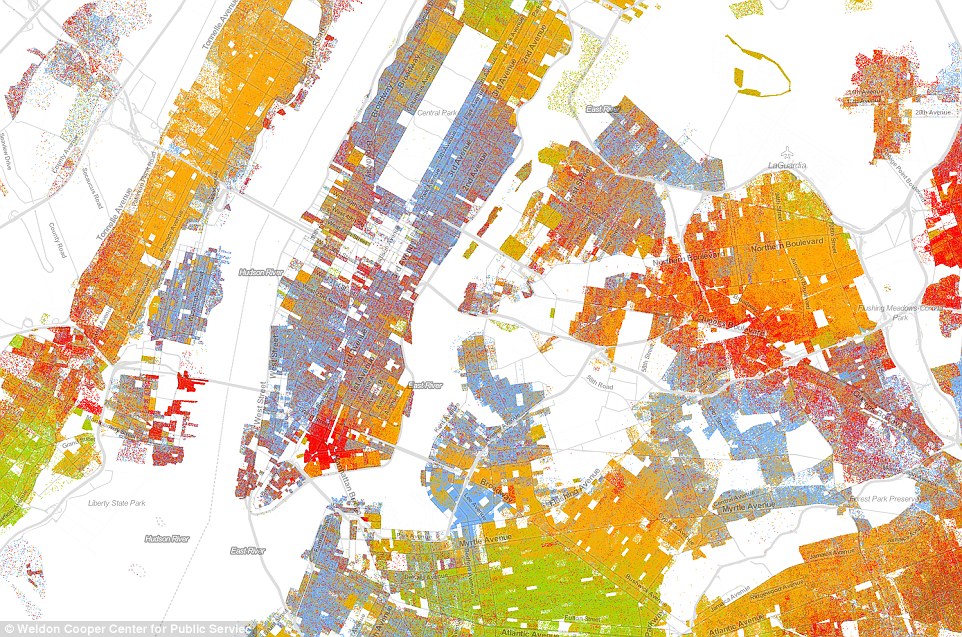
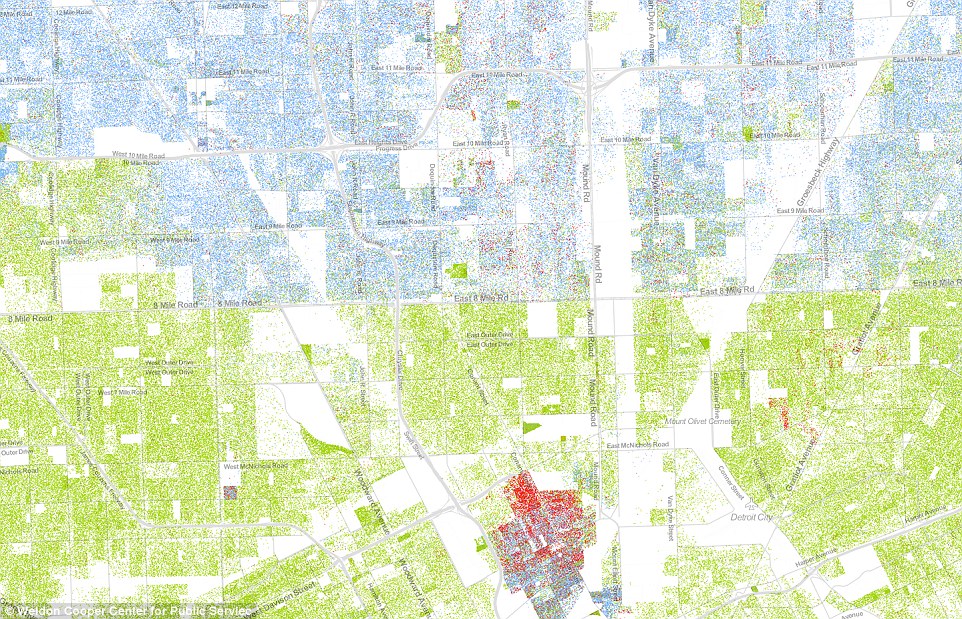
The map shows one dot per person, color-coded by race. In total 308,745,538 dots coming from 2010 U.S. Census. Blue dots are placed for people who identify themselves as white, green for black people, red for Asian, orange for Hispanic and brown for those who identify themselves as from another race, Native American, or multiracial.
Even on the small-scale map one can observe that there are some significant differences depending on the city and state. In New York for example we can observe a big diversity with a centres of particular race spatially mixed.
Some American cities, largely those on the East Coast, have a very clear division between white and black. The example below is Detroit, were we can see a clear line dividing the city on “8 mile”.
It isn’t the first map to show the country’s ethnic distribution, nor is it the first to show every single citizen, but it is the first to do both, making it the most comprehensive map of race in America ever created. Today when we hear about racial tensions among communities, police forces, and elected officials almost everyday understanding this local tensions is even more important… and again showing the spatial layer of the phenomena gives it a totally new perspective.
This is why we love maps.
source: Racial Dot Map


