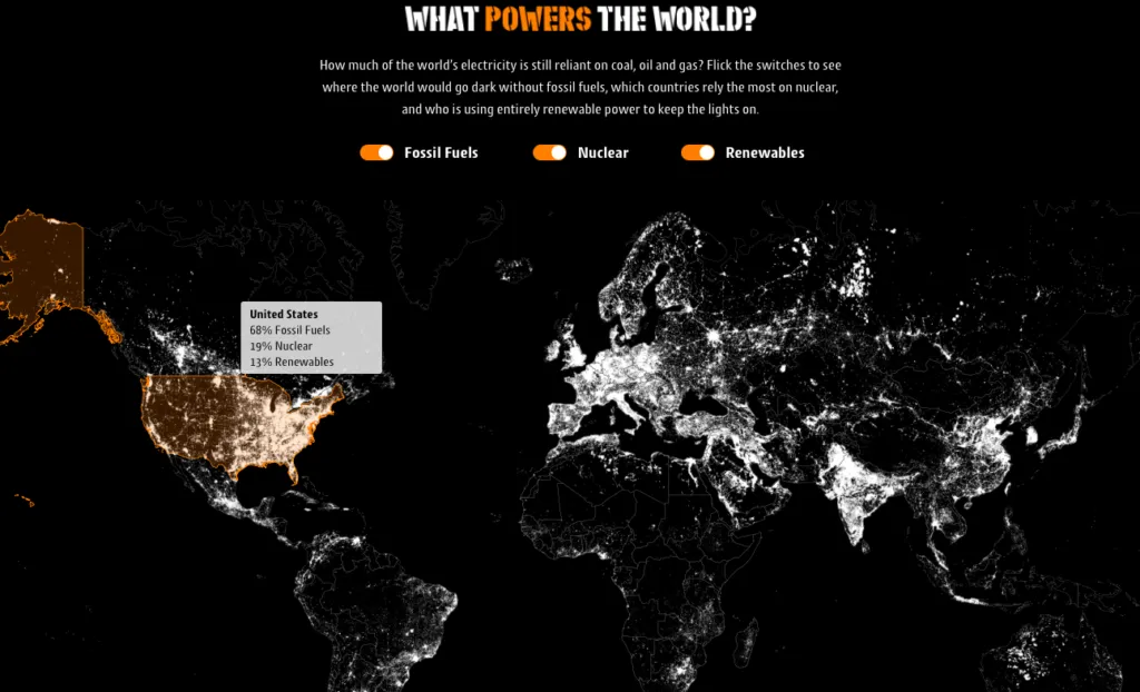
This cool map shows energy sources around the world
Really interesting map has been recently published by Gocompare.com. It shows how much of the world’s electricity is reliant on fossil fuels (coal, oil and gas), nuclear energy and which countries are using renewable energy.

In order to get the information you need to mouse over a particular country. Based on that we can learn that fossil fuels hold a 68% share of the US energy consumption needs. EU average on the other hand is 45%. Norway is a very interesting case. The country which is one of the largest oil and gas exporters in the world is actually covering its energy needs almost fully using renewable resources. Japan, which prior to the Fukushima tragedy of 2011 drew 30% of its electricity from nuclear power, has reduced that usage to just 1 percent. The map allows you to turn on and of one three listed energy sources. Once you do that, you unlock some additional information layers.
It’s a really good example of a simple mapping project that shows relevant data. From cartographic stand point a lot of things could be improved but the design and ease of use makes it a really solid map.


