#Ideas

The Topography Of Tweets – Elevation Map Of All Tweets Since 2009
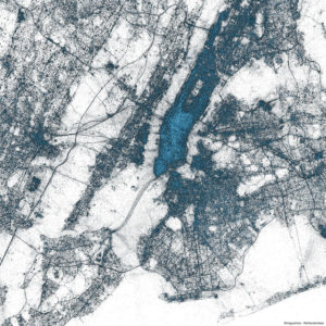
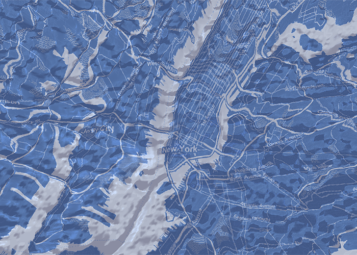
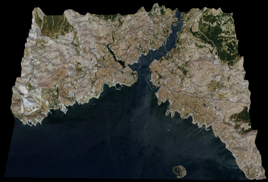
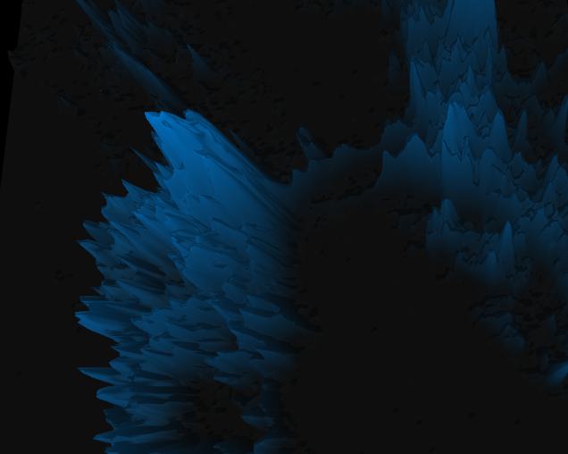
Tweets_New YorkDoes it sound familiar? Correct. Two weeks ago Twitter showed the map showing every geotagged tweet since 2009. This billions of points were enough to map in detail almost every larger city on the planet. It could be considered the XXI century land-use model, mapping roads, cites, rivers, seas etc. But how about tweet density? It is visible in a small-scale but Twitter though about a better way to visualize it – elevation.

Each ‘mountain range’ below is actually the density of geotagged tweets visualized. When you look closely at the New York maps you will see the Brooklyn and the Queensboro bridge but also some activity on the Staten Island ferry.

Potential of such a data? Cross analysis with census data and retail location could bring geomarketing and location intelligence fields into a new level. Where to locate a new store? How to geographically optimize outdoor advertising campaign? This only the part of the equation… such a data needs to be handled smartly and not revealed to the general public… Why? Imagine one more application: where to plan a terrorist attack to cause the highest damage…

New York

new york tweets geoawesomeness

Istanbul

Istanbul Tweets Geoawesomeness

San Francisco

San Francisco Tweets Geoawesomeness

You can play with the visualization of New York, San Francisco and Istanbul here.

Say thanks for this article (0)
The community is supported by:
Become a sponsor
#Ideas
#Contributing Writers #Fun #Ideas
From Digital Footprints to Urban Intelligence: Leveraging Public GPS Traces
Sebastian Walczak & Nikita Marwaha Kraetzig 07.25.2024
AWESOME 1
#Fun #Ideas
The Geo Geek Gift Guide: 10 Unique Ideas for Every Geospatial Enthusiast
Sebastian Walczak 12.9.2024
AWESOME 3
#Business #Environment #Ideas #Satellites
China’s Smart Agriculture Boom Has Tech Potential but Requires Affordable Solutions
Nianhua Liu 05.9.2024
AWESOME 3
Next article
#Ideas

All Map Projections Compared And Visualized

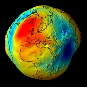
Geoid

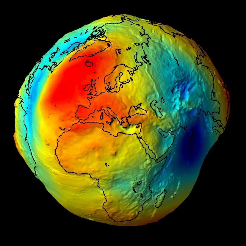
Geoid – the most accurate model of the Earth

Life of cartographer is not easy… How to map phenomena on the Earth which are 3 dimensional (and often dynamic – 4D) on the flat surface of a map? If you would like to have the most accurate map ever you would have to carry with you 3D-printed ‘geoid’ which is best-known model of the Earth based on pure gravity at perfect zero sea level… and it looks like a potato…

But if you want to show it on a flat map you need a map projection, which will determine how to transform and distort latitudes and longitudes to preserve some of the map properties: area, shape, distance, direction or bearing. And this is much more important than we might think. For example, sailors use Mercator projection where meridians and parallels cross each other always at the same 90 degrees angle. It allows to easy locate your self on the line showing direction in which you sail (loxodrome is a line crossing all meridians of longitude at the same angle), but the projection do not preserve the distances, so you know you are in the right direction but you don’t know how much time will it take you to get to your destination… It is said that many of great geographic discoveries from XV and XVI century happened accidentally because of that fact.

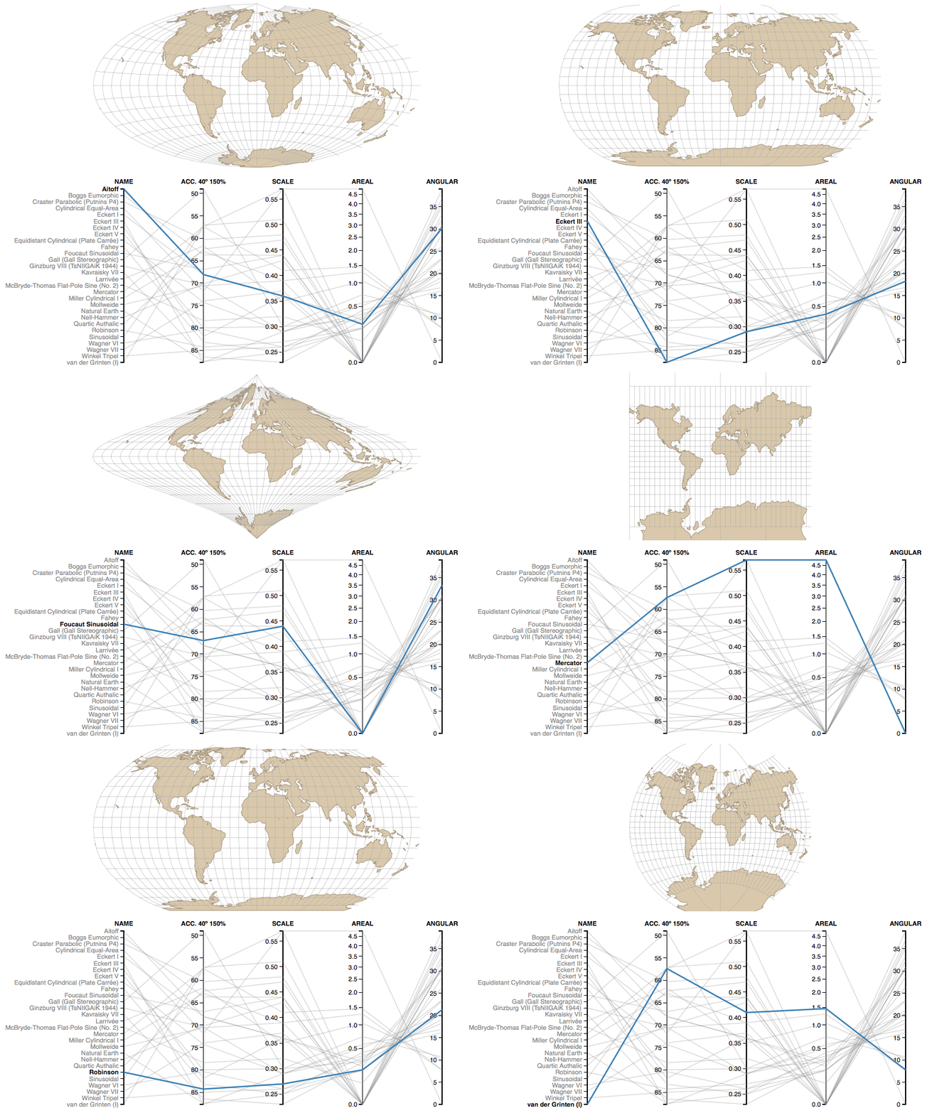
Ok…as a cartographer I could talk about it for ages but lets get back to Earth… ;). Map projects can be as well a nightmare, as they are in fact extremely complex mathematical transformations. Now there is web tool to visually compare properties of all major projections. Check this out:

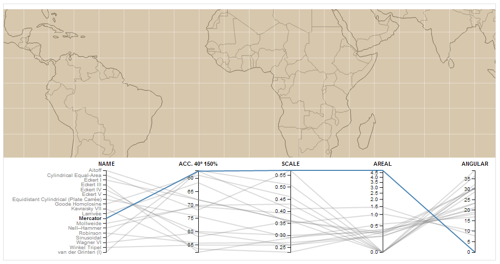
Mercator projection

Mercator

You can easily say that it’s a conformal projection (preserving the angles) as angular deformation index is zero.

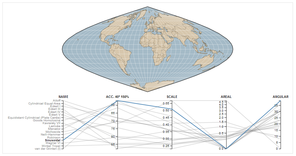
Sinusoidal projection

Sinuoidal

In the case of sinusoidal projection you see that it’s an equal-area projection as areal distortion index is zero.

The tool requires just a few comments as parameters are not well described on the website. Here is what these distortion indexes actually mean:

  • Acc. 40° 150% – The Acceptance index is a numerical measure that summarizes overall projection distortion, in this case with a maximum angular distortion of 40° and areal distortion of up to 150%.
  • Scale – The weighted mean error for overall scale distortion.
  • Areal – The weighted mean error for areal distortion.
  • Angular – The mean angular deformation index.

Have fun!

all-map-projections-compared-geoawesomeness

Read on
Search