#Business #Featured #GeoDev #Ideas

The future of mapping is living maps

Over the past few decades messaging took over communication, broadcast video shifted to on-demand video, and operating systems took on entirely new forms in a mobile world. Yet, mapping software tools remain mostly unchanged.  We built tools to make satellite-based maps faster, prettier, and easier to consume across web and mobile. Yet, the dominance of satellite imagery meant that innovation around mapping tools stagnated.

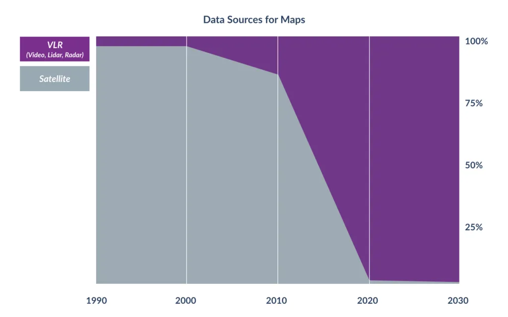
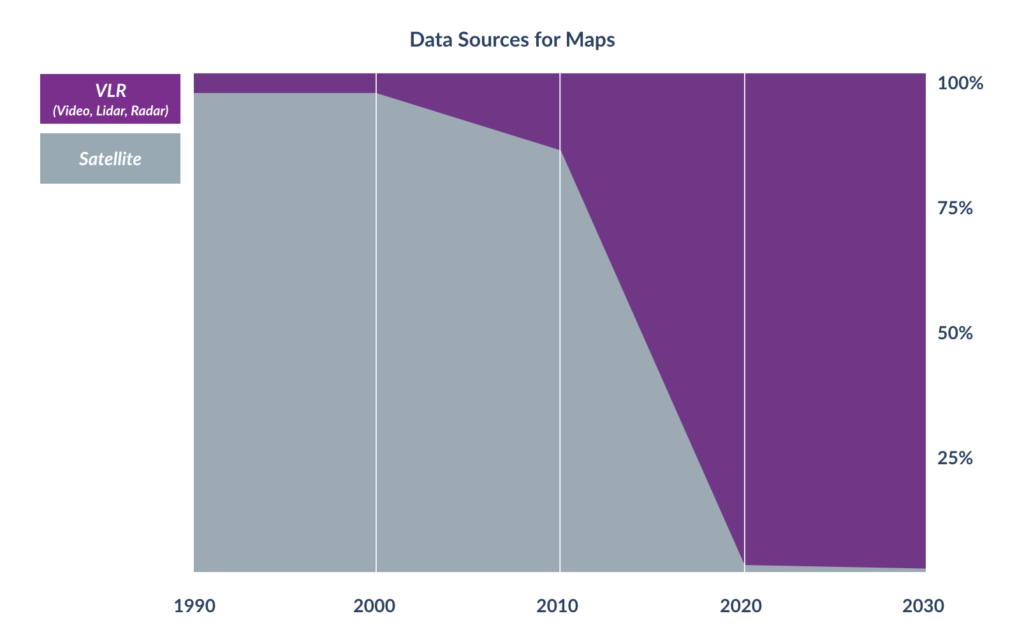
Mapping is changing because the primary mapping data source is no longer satellite imagery.  Video, LiDAR, radar (all together ‘VLR’) and derived Machine Learning data are becoming kings of mapping data.  Said another way, the eyes at the edge (VLR) are contributing the vast majority of mapping data with few mapping applications taking advantage of it. This means the mapping pipeline to ingest data from VLR sensors and mapping software tools we use for mapping and geospatial analytics must change.

Data sources for Maps in the future: Video, LiDAR, RADAR (VLR)

Data sources for Maps in the future: Video, LiDAR, RADAR (VLR)

Spreadsheet for chart above is here

As millions of new VLR sensors are deployed today’s static satellite-based mapping software will fall farther and farther behind. The time is past due for a new model of map that can adapt to modern needs; a living, machine-generated map.  As we build living maps for the modern world of connected VLR sensors a few key principles must be followed:

Living maps must grow on their own

Living maps cannot rely on humans to say that a construction crane is no longer present, a truck delivery location is blocked by construction, or that a building roof has been damaged by fire. Instead they must grow on their own from an array of VLR sensors deployed across cars, drones, and airplanes.    

Core to the process of building a living map that grows on its own is GeoRegistration  ー the process of fusing multiple unsynchronized collections. I’ll give you an example, when 1,500 cars, 10 drones, and 1 airplane are collecting video and Lidar across San Francisco the GeoRegistration technology must automatically combine all of this data into a single combined and accurate 3D map. If you don’t automatically align all these data sources to an exact coordinate in the real world then you have something pretty to look at, but you certainly don’t have a living map capable of growing on its own.

By automatically, GeoRegistering all data coming from VLR sensors, the living map can now confidently update itself to reflect changes such as a terrain shift, a sidewalk addition, and new light poles.

Living maps see and reveal changes

Most maps are pretty. Few maps are pretty and useful.

Like good eye candy, a static satellite map of Paris is enjoyable for a few moments. While a living map of Paris precisely understands how each city block, building, and street sign has changed in the last five hours. By automatically seeing and revealing changes taking place a living map can be used effectively for:

  • Smart Cities — what Stop signs are visibly obstructed increasing the risk of an accident?
  • Defense – does the supply route have any obstructions posing a security threat?
  • First Responders — how many residential parcels have been damaged and citizens displaced?
  • Oil & Gas — are changes to service roads after rain causing unsafe driving conditions?
  • Financial Services — what is the demand of all-electric charging stations across the US?
  • Insurance — which neighborhoods are hardest hit after a disaster and need the quickest support?

A living map is aware of its history and understands important changes taking place in the physical world. Users can watch changes play out before their eyes helping them gain valuable insights into how a city, park, building, or road is changing.
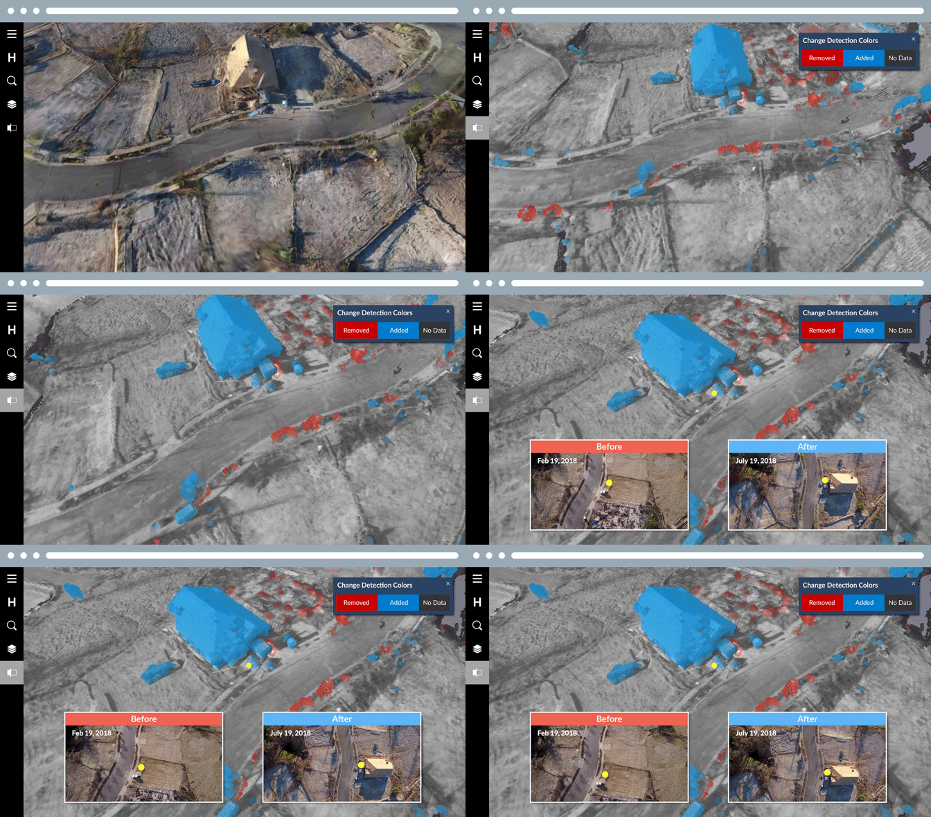
A living map automatically detecting changes to a residential neighborhood after the 2017 Santa Rosa fires.

A living map automatically detecting changes to a residential neighborhood after the 2017 Santa Rosa fires.

Living maps must ❤️ spreadsheets

The truth is most enterprise users don’t need pretty map visualizations on a daily basis, yet they do need the data locked away within those maps.

Therefore, a living map is less about pretty pictures and more about spreadsheets and tasks generated from maps.  Machine learning enables software to extract bite-sized information from large maps and automatically generate actionable information that can be delivered to enterprise users in a spreadsheet like experience.  By blending the power of spreadsheets with the visualization of maps into a single application mapping data will be made available to far more enterprise users.

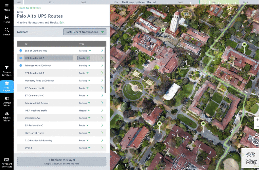
For example, UPS logistic planners don’t need to look at a new map of Palo Alto each day, instead they need to know what changes have occurred (e.g. construction at delivery location) that will impact the efficiency of their Palo Alto routes.

How change detection is helping UPS workers navigate everday

How change detection is helping UPS workers navigate everyday

Living maps will replace static based satellite maps

Fueled by the growth of VLR sensors living maps like Hivemapper will replace static satellite-based maps. Just as we look back with nostalgia at paper based maps we’ll one day do the same for static satellite-based maps.

Say thanks for this article (3)
The community is supported by:
Become a sponsor
#Business
#Business #Events
SatSummit 2024 Reflections: The evolving landscape of Earth Observation
Avatar for Florian Fichtner
Florian Fichtner 05.22.2024
AWESOME 9
#Business #Featured #GeoDev #Ideas #News
Bee Maps: Creating a Buzz in the World of Fresh, Affordable, and Real-Time Mapping Solutions
Nikita Marwaha Kraetzig 11.5.2024
AWESOME 5
#Business #Events #Featured
The Future of Navigation: How Satellite Data Shapes Map Innovation
Avatar for Muthukumar Kumar
Muthukumar Kumar 10.29.2024
AWESOME 1
Next article
#Business #Environment #Ideas

What A Tiny Atlas Can Show About the State of the World during WWII

This old Atlas is basically a pure propaganda piece, both exaggerating and downplaying German power and influence in the past century.


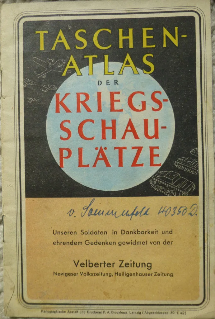
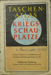
The Taschenatlas der Kriegsschauplätze shows the state of the world during World War II in January of 1942.  It was distributed by the newspapers Velberter Zeitung, Nevigeser Zeitung, and Heiligenhauser Zeitung (Zeitung = newspaper).  It likely came as an insert to a special edition of the paper.  Each page or double-page is a color map showing a different portion of the world.  Each map has statistics to accompany it, showing the area and population of each nation.


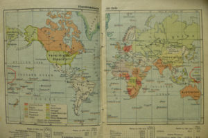
Map of the World

The first map is an overview map of the world.  It’s a wonderful example of cartographic propaganda.  It shows the lands controlled by the world’s largest colonizers, and a neutral color for countries not under a colonizer’s possession.  Using the Mercator projection, the further an area is from the equator, the more its size is exaggerated.  Germany’s colonies are conveniently all in the tropics, where there’s practically no size exaggeration at all.  With the size of Alaska, Canada, Greenland, and the Soviet Union so greatly exaggerated, the relative size of Germany’s colonies is downplayed, as if to say “Look, we don’t have as much land as any of these powers!”  Another interesting thing to note: all of Germany’s colonies in this map were actually given up in the Treaty of Versailles at the end of World War I nearly a quarter of a century prior to the publication of this map.  In the following maps there is mention of the “former colonies”, but in this map, the former colonies are simply part of the “Deutsches Reich”.

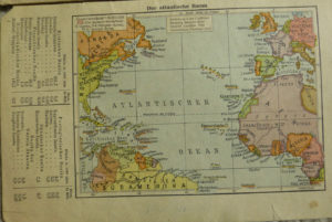
The Atlantic

Germany has a presence in both Atlantic and Pacific parts of the world—at least according to these maps. The colonies that were surrendered 20+ years prior, are shown in the same color as Germany, though nominally this map acknowledges that they’re a “former German colonial possession” (Alter deutscher Kolonialbesitz). 

The one legend entry in the Atlantic area map is for former German colonies, but the symbolization for the former colonies is only slightly different than the symbolization for Germany (Deutsches Reich) itself; it being finely hatched red instead of the solid red for Germany.  The former colonies shown here are Cameroon (which is shown as it’s largest colonial extent, rather than the borders at that point in time) and Togo.  Although the map is labelled as the Atlantic area (Der atlantische Raum), it’s only a small part of the North Atlantic (from roughly 55 North latitude to 8 South latitude).  Had the cartographers shown a bit more of Africa, they could have also shown German Southwest Africa, now known as Namibia.  Interestingly, at the very edge of the map they show Portuguese West Africa, which they called Angola in the previous map.  Perhaps they were unsure of which name to use?

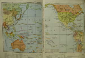
The Pacific

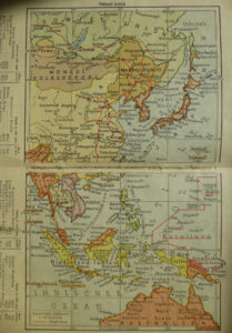
In the Pacific area map, Manchuria (Mandschukuo) is depicted as an independent country, but to me, the color looks awfully close to the color used for Japan within the thick brown outline.  It may be a subtle way of showing the relation between Manchuria and Japan (Manchuria being a puppet state of the Japanese Empire).  What isn’t shown however are the areas of China occupied by Japan directly.  Being German allies, I would have thought that they might try to exaggerate Japan’s land claims as they did their own.  I guess not.

The state between Mongolia and the Soviet Union, Tannu-Tuwa, was a republic which was officially recognized, according to Wikipedia, by only Mongolia and the Soviet Union.  It’s interesting then that this German map shows Tannu-Tuwa as an independent state.

German New Guinea is shown, but as with the other colonies, it hadn’t been controlled by Germany for more than 25 years.

Southeast Asia

In the Southeast Asia map, one can see a bit easier that Hainan and Formosa are both shown as Japanese, which I thought may be showing then-recent additions to the Japanese Empire, but actually, Taiwan (Formosa) and Hainan had both been under Japanese control for some time (since 1895 and 1939 respectively [though admittedly, 1939 is pretty recent for this map]).   There’s still no mention however of the Japanese-occupied areas of China on the coast.

The Japanese had actually invaded Kaiser Wilhelmsland (Here shown as German) in December 1941 along with the operations to bomb Hawai’i, and invade Guam, the Philippines, etc.  I wonder if there was a decision not to show the result of these invasions, or if they had happened recently enough that there wasn’t time to change the maps to show it.

Europe

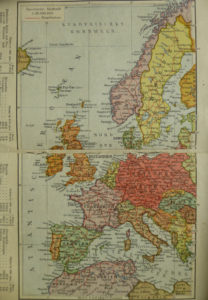
The map of Europe shows the quite large German Empire at the time, with certain areas with similar enough symbology to assume them subsections of the German Empire (The General Government in Poland, Alsace, and Northern Slovenia).  Though Luxembourg is shown as part of the German Empire, there nevertheless seems to be a border between it and Germany.  Because there’s no legend, I’m not really sure what the different depictions are trying to convey.  That is, Northern Slovenia and Alsace are thinly striped, the General Government is thickly striped, and Luxembourg has the same solid red as Germany, but has a border.  Are they all supposed to mean different things?  If so, what?  Yugoslavia is split, but not how I’ve usually seen (like in this map).  It seems like the parts annexed by non-German nations are all shown together as Serbia (Serbien).

East Africa

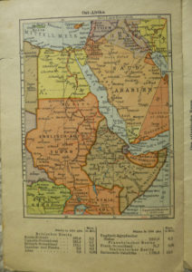
The East Africa map shows Northeast Africa as well as a portion of the Arabian Peninsula and the Middle east.  Though on the very edge of the map, one can make out the northern edge of what is now Tanzania.  It’s colored like the rest of the German Empire has been.  Tanzania is and was a former German colony, but at the time, Tanzania was a British colony.  Logically it should have had the same symbology as the rest of the British colonies on the map (English-Egyptian Sudan, Uganda, Kenya, etc.)


North Africa

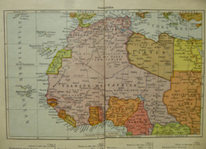
In the North Africa map, you can better see Cameroon (Kamerun) shown over spilling its then-current boundaries.  It’s showing the largest extent of the German colonies borders during World War I, exaggerating their presence in the area (or the fact that there’s a presence at all).

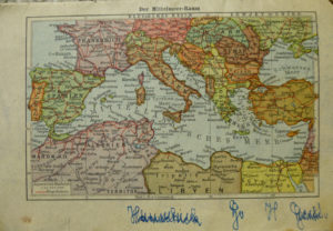
The Mediterranean

The final map is a map of the Mediterranean area.  Romania (Rumänien) is shown with its rather temporary 1941 borders after the loss of Bessarabia to the Soviet Union and Northern Transylvania to Hungary (Ungarn) after a Soviet ultimatum and an axis-mediated compromise between Romania and Hungary. (Both happening in the summer of 1940)

In a Nutshell

This is basically a pure propaganda piece.  It’s amusing to me that this atlas both exaggerates and downplays German power and influence.  Exaggeration in the form of showing all former colonies and any occupied territory as part of the empire.  Downplaying in the form of using a Mercator projection to show little ‘ole Germany with it’s few small tropical colonies compared to the giants of America (Alaska) Britain (Canada), Denmark (Greenland/Iceland), and the Soviet Union.

This blog was originally posted on Pachyderm Cartography.

Read on
Search