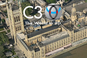
C3 Technologies – company with its origin in the Swedish aerospace and defense company Saab AB, is now applying previously classified, military image processing technology to the development of 3D maps as a platform for new social and commercial applications. And the effect is astonishing especially knowing that according to the company its generated automatically. It is a very promising 3D data capturing and visualization solution for the navigation and geographic information systems industries.
How do they do that?
C3 maps are assembled almost automatically using high resolution, spatial areal imaginary. So basically their
planes are outfitted with photogrammetric cameras pointing every direction and capturing overlapping images. Knowing the GPS position, angles, rotation and distance between cameras their are able to almost automatically generate 3D, photo realistic, stereo-graphic view on a captured area.
Previously similar data could be captured by LiDAR – remote sensing technology that uses laser scanning to collect height or elevation data. LiDAR is however pretty expensive technology. We don’t know the initial costs of the C3 technology but it seems very cost effective in use. Google Earth from the other side involves using Google SketchUp 3D modeling. That means that people are almost manually putting parts of maps together which is is very time ineffective.
Nokia OVI Maps 3D
C3 Technologies has partnered Nokia to deliver the first usable version of its mapping data with Ovi Maps 3D in the begging of 2011. Currently it features 20 cities with limited functionality: pan, zoom, changing view angle. Company claims however to have 100 city models already produced with 22 more scheduled for Spring 2011. With this functionality its just a gadget to play and to check the possibilities of C3 technology. But does it mean that Nokia will use this data in OVI Maps? I am looking forward to here something about it.
Google Earth killer?
Definitely not yet. The potential of Google Maps and Google Earth is not rooted in 3D view but in data that they have collected and interoperability with open standards (like KML). Row 3D without data about roads, streets, POIs ect. is not very useful.
But let’s concentrate on 3D view itself and compare two products: Google Earth and Nokia Ovi Maps 3D. I order to do that I decided to choose Sagrada Família, one of the most architecturally sophisticated church in the world, situated in Barcelona, Spain, designed by Catalan architect Antoni Gaudí in early XX century.
We can observe that C3 model is much more photo realistic. Shadows and amount of details is really impressive. We can see however that automatically generated 3D geometrical objects like towers or rooftops of building on the second plan are not perfectly represented and Google Earth has advantage in this field. There is as well difference is representation of trees and ground details between two models. In Google Earth they are flat and in C3 they are convex, however not really well represented.
I’m looking forward to see some more commercial applications of C3 3D maps and how they will develop. Both Google Earth and C3 models have their pros and cons. Maybe in a future we will witness fusion of both technologies.
source: C3 Techologies, Nokia OVI Maps 3D