
Couple of months ago Google introduced the News Lab, a new program to empower innovation at the intersection of technology and media. In order to do that Google has been releasing many cool datasets on Google Trends Datastore.
One of such an datasets (not yet available in the datastore) has been used by Google’s data editor Simon Rogers, who made a map and a visualization of flights that originated from the US on November 25 and 26, 2015. The map shows domestic and international flights that have been booked via Google Flights. The flights are color coded by airline.
The map uses CartoDB mapping engine.
source: Mashable


#Ideas


Next article
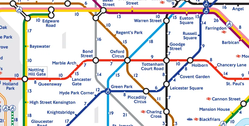
Browsing the web I found a really cool map concept. In August 2015 London has been hit by strikes of tube workers. Subway was closed for couple of days. The public transportation department reaction was really cool. They published a map showing walking times between stations.

Online pharmacy Treated.com decided to use the same concept but instead of time distance, the map shows the caloric distance between subway stops. Knowing the time distance and assuming that the average person burns just under four calories per minute of walking, guys at Treaded.com calculated approximately how many calories commuters will burn by walking home along the route instead of using the Tube.
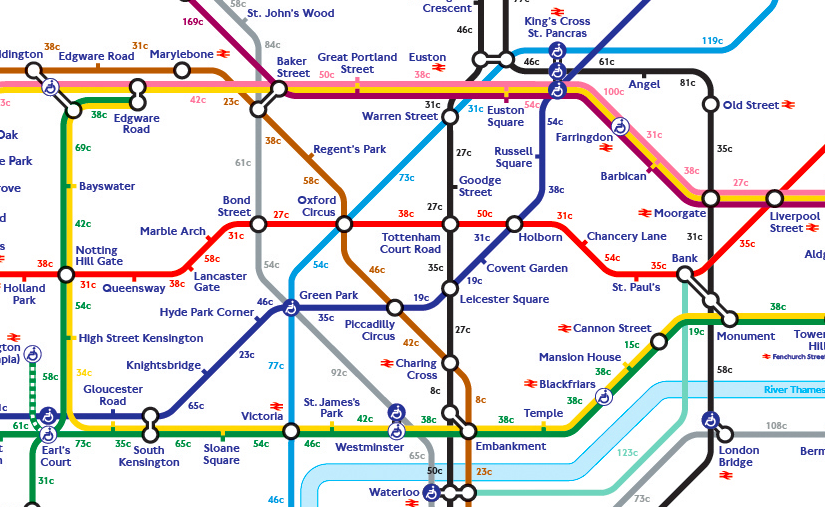
The longest route to walk would be between North Greenwich and Canning Town which would take 415 calories burned during 108 minute walk compared to the eight-minute Tube journey. Here is the full map:
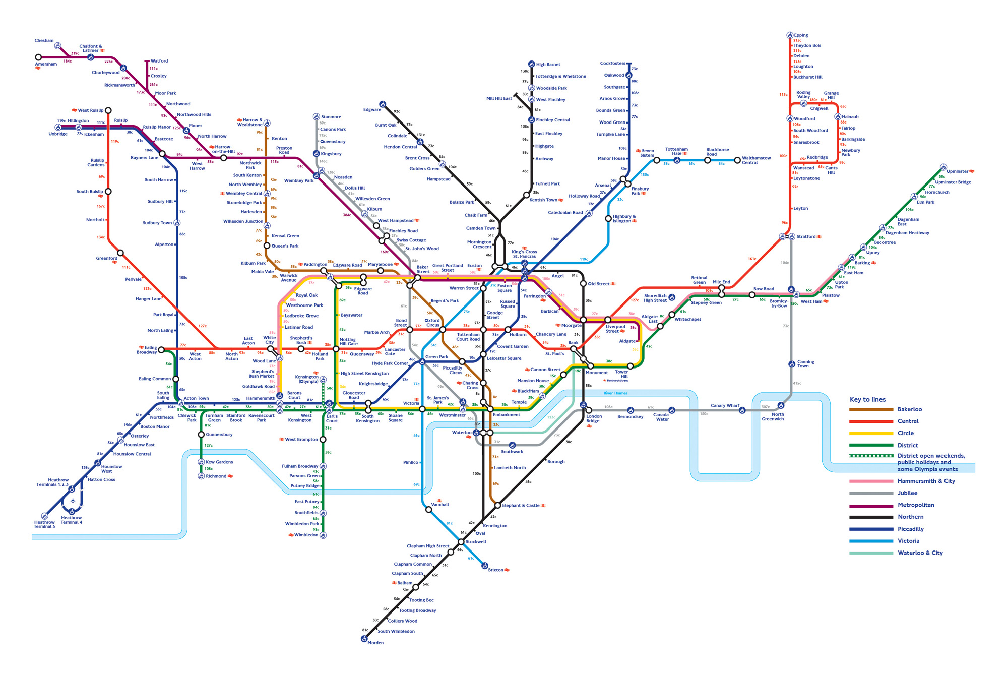
The map itself is not revolutionary in terms of graphics or methods of cartographic presentation but it shows that a cool concept and data can easily make a great map.

