#Ideas

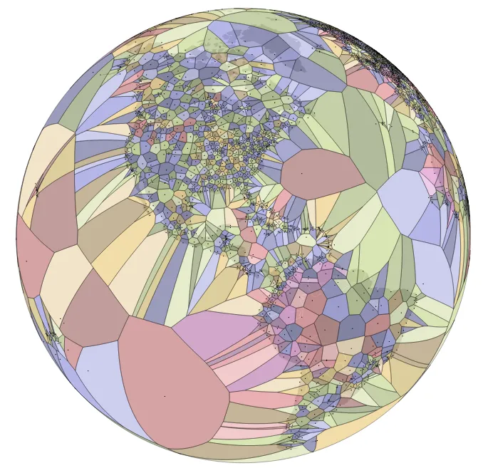
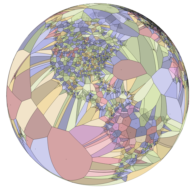
Political boundaries are just a human demarcation. Map of the world divided by airports.

The global political boundaries as we know them are just a human demarcation. In ontology they would be called ‘fiat‘ (artificial)  boundaries. The opposite type is called ‘bona fide‘ (natural) boundaries. It is funny that global borders are so engrained in our minds that it can be hard to look at the earth without dividing it into political regions.

Data visualization designer Jason Davies has been playing with the topic of boundaries for some time already. Jason is exploring mathematical functions to redraw the global boundaries according to different phenomena. In his latest map he used a spherical Voronoi diagrams to draw global airport map where each region is closer to a particular airport than any other.

From the algorithm we learn that the most remote airport in the world is Mataveri International Airport on Easter Island, which is 1,617 miles (2,602km) from the next nearest airport. Check out the map:
Global Airport Map Geoawesomenesssource: Jason Davis


Say thanks for this article (0)
The community is supported by:
Become a sponsor
#Ideas
#Business #Featured #GeoDev #Ideas #News
Bee Maps: Creating a Buzz in the World of Fresh, Affordable, and Real-Time Mapping Solutions
Nikita Marwaha Kraetzig 11.5.2024
AWESOME 4
#Fun #Ideas #People
‘You Are #Geoawesome’ Original Series: A Step-by-Step Guide
Sebastian Walczak 10.9.2024
AWESOME 0
#Business #Environment #Ideas #Satellites
China’s Smart Agriculture Boom Has Tech Potential but Requires Affordable Solutions
Nianhua Liu 05.9.2024
AWESOME 3
Next article
#Ideas

Interactive map shows global economical inequality

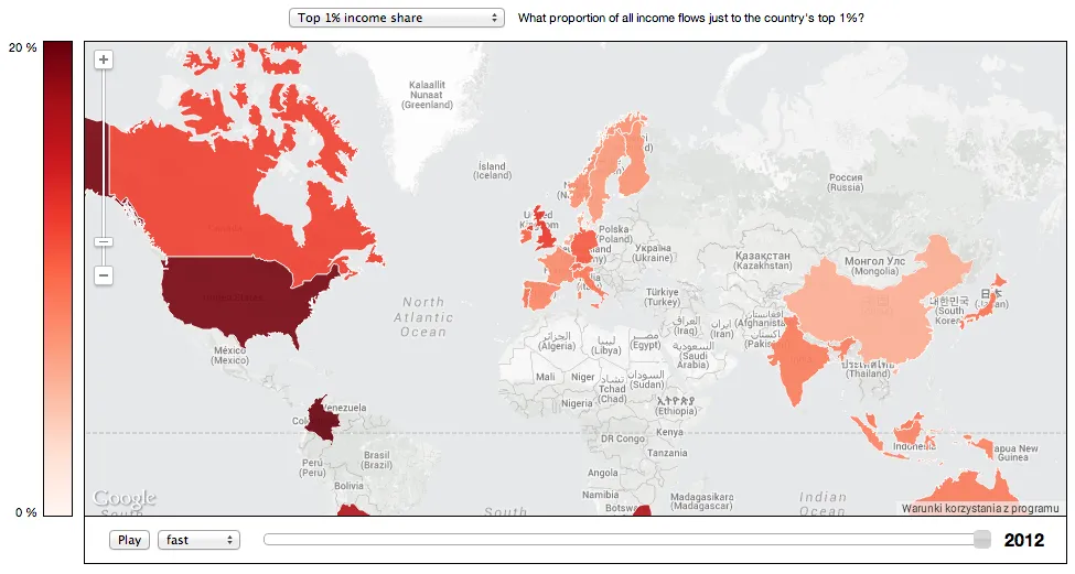
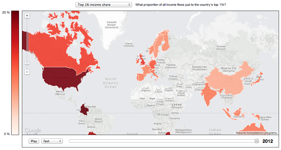
When you visualise data on the map it very often gives you a totally different perspective on the phenomena. Guys from CREATE Lab at Carnegie Mellon University did a really cool project using Google Maps API and The World Top Incomes Database (WTID) which has been cataloguing statistics on wealth across the globe (unfortunately the data is only available for around 30 countries). The effect is maybe not the most impressive in terms of the design but it has several cool features and it gives a lot of cool information.

Global inequality - Geoawesomeness

The map allows you to view the data over the last 100 years by using a slider or simply by pressing ‘the play’ button.  You can also click on the particular country to get the data from selected countries on a graph. The map allows for visualising 4 different indicators:

  • top 1% income share
  • top 10% income share
  • top 1%/ bottom 90% income
  • top 10%/ bottom 90% income

Especially last two are interesting. They show how many people in the bottom 90 percent have a combined income equal to one person in the top 1%. Check out the video to learn more on how to use the tool.

source: The Verge

Read on
Search