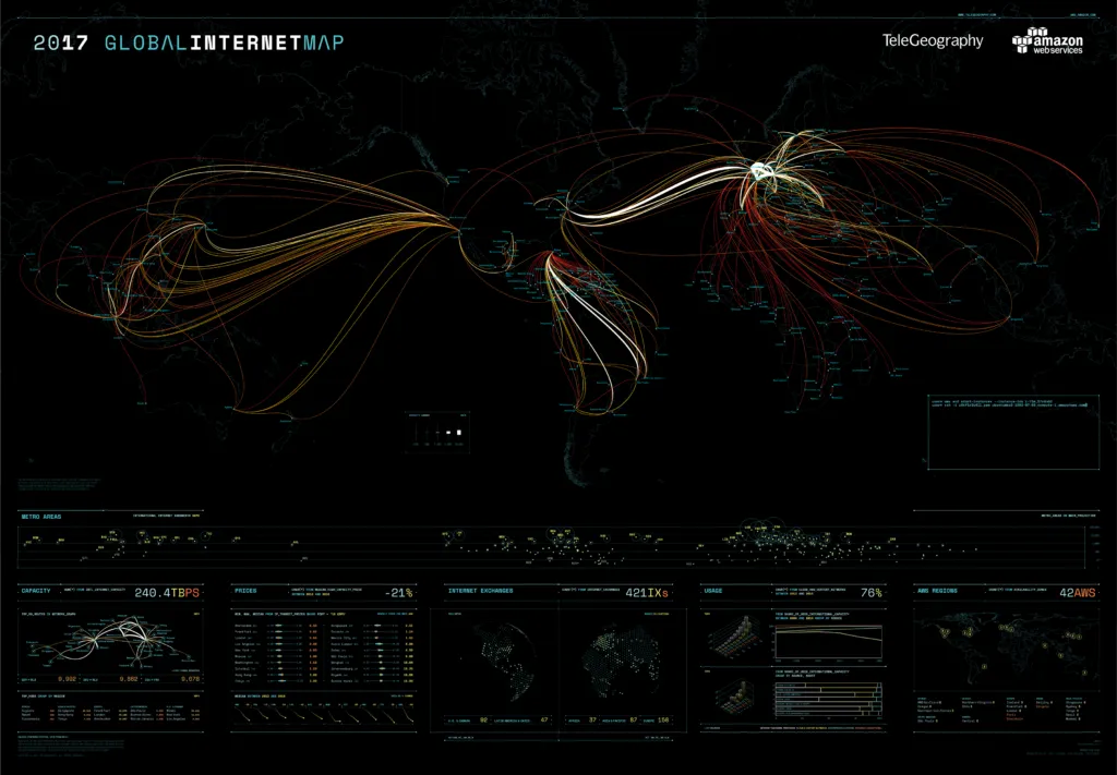
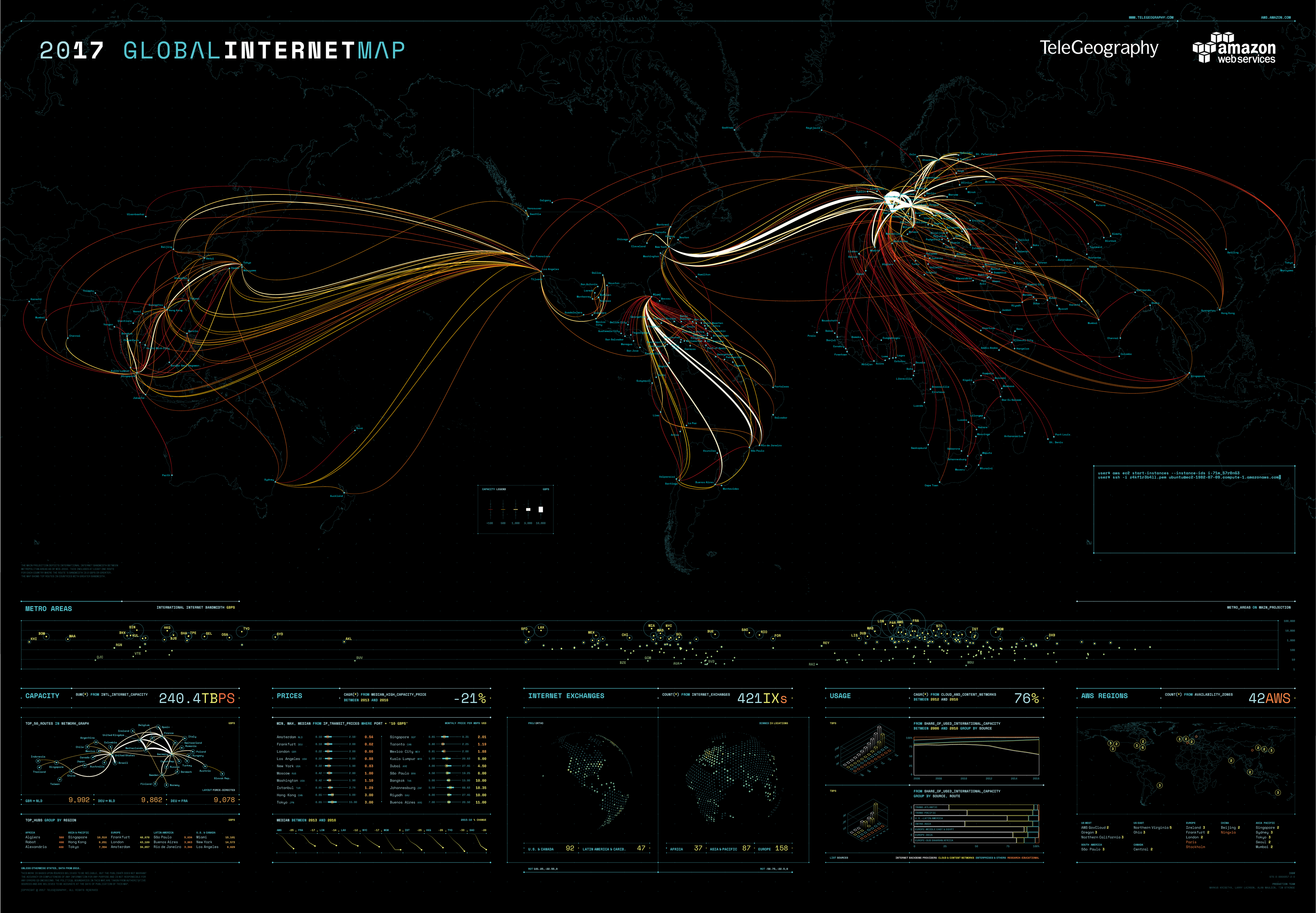
Sometimes you need a single look to know that you want something badly. When I saw the 2017 edition of TeleGeography’s Global Internet Map, it was love at first sight. I knew that I need to have it in my maps collection!
But if I want it so much, you must feel the same way! So we’ve reached out to TeleGeography and asked if we could organize sweepstakes to give you guys a chance to win it. And guess what? The amazing team at TeleGeography offered 10 map posters for our readers!
Giveaways!
You can win 5 these maps on Facebook and another 5 on Twitter. It’s very easy and you’ll find all the details on our Facebook and Twitter channels. The Sweepstakes runs until the end of the day on Friday, May 19th, 2017.
But let’s come back to the map itself because it’s one of the most beautiful map posters I’ve seen this year. The map visualized internet data gathered by a telecom data research firm called TeleGeography. The Tron-inspired visualization looks into Internet bandwidth and connectivity around the globe and it looks really great!
The map shows:
- Metro-to-metro area internet bandwidth
- Total internet bandwidth connected to major metro areas
- IP transit prices across major internet routes
- Where internet exchanges are clustered
- How internet bandwidth is used
Interestingly the map has a hidden side – it glows in the dark… One more reason to have it!
Check out more amazing maps from TeleGeography here.

