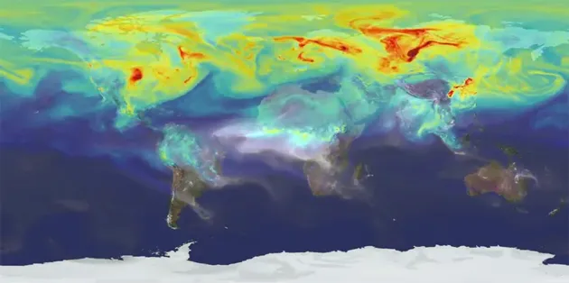
Cool visualization by NASA shows the annual CO2 emission cycle around the Earth. The visualization is based on data from NASA’s Orbiting Carbon Observatory–2 (OCO–2) which is a new remote-sensing satellite that studies CO2 and its global movements.
The study shows that most of the CO2 emissions are generated on the Northern Hemisphere which corresponds to the location of the most industrial centres. The gases travel around the world to be largely absorbed by new vegetation in the springtime. In the winter the emissions start to take over the planet again.
The visualization is narrated by the research meteorologist Bill Putman which all together creates a strong image showing that we’re still doing not enough to fight with the constant increase of CO2 emissions. Frankly speaking I was always very sceptical about our human impact on the global warming but when I learnt that 2014 was the warmest ever recorded I’ve realised that I might have been wrong and in deed we are impacting the climate change in a huge scale.
Watch the video here:
source: NASA


