#Business

Mapping glacier grief across the globe

A sense of constant loss is looming from the Arctic to the Antarctic. The glaciers are melting. And the facts detailing the mostly irreversible process are shocking: In the last three decades, the extent of Arctic sea ice has declined by about 10%, with most of the damage happening in the last 10 years. The famous snows of ice-capped behemoth Kilimanjaro have decreased by more than 80% since 1912. The laser altimeter data NASA collects from Greenland has repeatedly shown that the edges of the ice sheet are dwindling. In the Garhwal region of Indian Himalayas, the ice is melting at such an alarming pace that most central and eastern Himalayan glaciers are expected to completely vanish by 2035. Our planet is witnessing an unprecedented rise in global sea levels.

Last week, the guys from Maps Mania curated some maps that reveal the horrific reality of climate change:
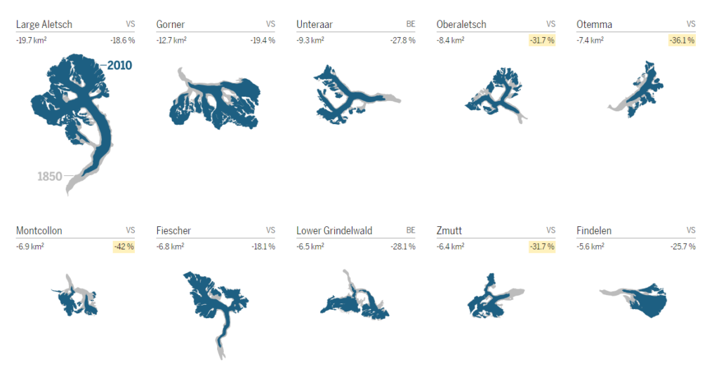
Half of Switzerland’s glacial surface melted between 1850 and 2016. Swiss newspaper Tages Anzeiger reports that last year the glaciers lost nearly 1 km³ of ice volume or about 900 billion liters of water. The newspaper has created a series of mini-maps that show the changes that have occurred in Switzerland’s 38 largest glaciers since 1850, as well as the glaciers that have completely melted. See the entire series here.
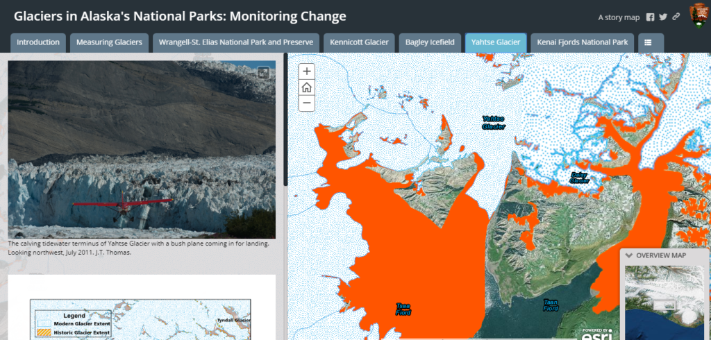
North America’s glaciers are doing no better in their fight against climate change. Each passing decade is witnessing greater rates of ice retreat than the previous one. In an Esri Story Map called Glaciers in Alaska’s National Parks: Monitoring Change, the National Park Service has taken USGS topo maps from 1951-1960 and compared them with the most recent satellite imagery available to the extent of change. The orange overlay shows how far the glacier used to extend previously.
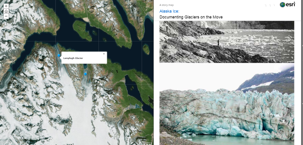
Another Story Map that shows the stark state of Alaska has been created by the USGS using its Repeat Photography initiative which contrasts historical pictures with modern photographs and studies the influence of climate change on glaciers.
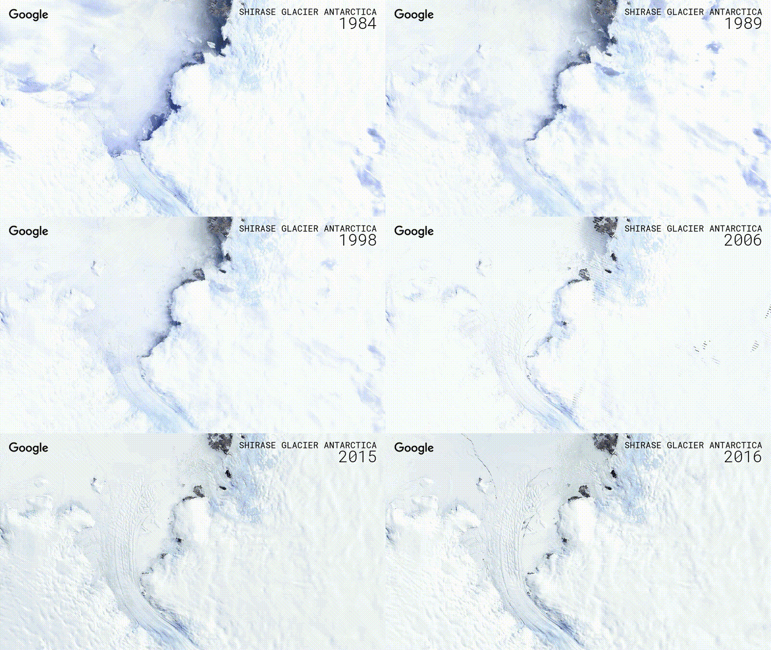
You can also see how glaciers around the world are receding by using Google Timelapse’s global, zoomable video which displays the changes on Earth over a period of 32 years. Timelapse is powered by more than 5 million satellite images captured by 5 different satellites over the last three decades. Simply search for any glacier in the world and see how it has changed.

Say thanks for this article (0)
The community is supported by:
Become a sponsor
#Business
#Business #Featured
Introducing Planet Insights Platform: Easier, Faster, and More Cost-Effective Insights
Avatar for Sponsored Article
Sponsored Article 06.14.2024
AWESOME 1
#Business #Fun #Ideas #People
History of GIS | Top 6 Figures in GIS and Geospatial
Nikita Marwaha Kraetzig 08.12.2024
AWESOME 2
#Business #Featured #GeoDev
Geo Addressing Decoded, Part 3: Diving into the Key Features of Precisely’s Geo Addressing System
Aleks Buczkowski 06.29.2024
AWESOME 4
Next article
#Business

This brilliant new map visualizes travel time, not latitudes and longitudes

Old pedestrian maps show travel time assuming that people move like flying crows: in a straight line

Most people use maps in their daily lives not to see the exact geographical location of a place, but to figure out how much time it’s going to take to get there. The time element dictates all kinds of decisions we make – should I take the metro or hail a cab to go to work, where should I grab lunch, is a day-trip enough to visit that new touristy spot? The physical space finds itself being translated into units of time, courtesy accurate geocoding and navigation algorithms.

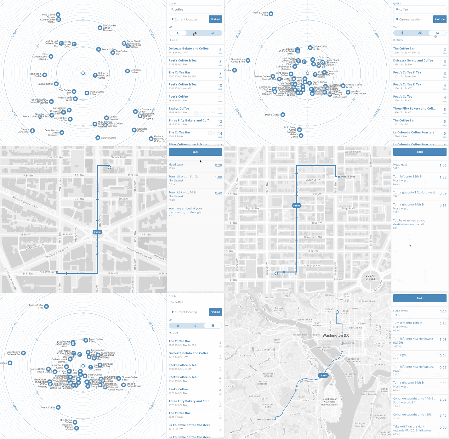
But when the length of the commute is so critical, why must we visualize the places around us in latitudes and longitudes? Why not cut to the chase and visualize our neighborhoods in travel time? For Mapbox’s Peter Liu, this question turned out to be an opportunity to see what a map of time would look like. He took search results from the Foursquare API and came up with the following:

As you can see, the map puts you, the user, at the center. Each place’s direction is preserved relative to where you are at the moment. Concentric circles flow outwards indicating the time it would take you to reach that place, depending upon the mode of transportation you choose: Walking, biking or driving.

“By removing literal geography, we now have a map that more closely reflects the way we think about our environment: a cluster of restaurants ‘five minutes that way’ versus ‘ten minutes the other.’ We can watch our surroundings literally expand and contract with different means of travel,” Liu explains in a blog post.

Unlike popular apps like Google Maps or Waze, which allow you to see the ETA to your destination, the time map is designed to help you in situations where you don’t know what your Point B is. So, if you are looking for a coffee shop in the vicinity, just search for ‘coffee’ and you will see the result arranged by the time it would take you to get there. Once you zero down on one place, you will be able to see the directions in the usual ‘left turn-right turn’ format.

The current version of the map is just a prototype, and Liu is working on adding streets to his concentric circles. But the product is basically plug-and-play, which means it can be integrated into any app or service and programmed to use that app or service’s search functionality to generate results.

Check out the live map here.

Read on
Search