Google Revealed New Look And Features Of Google Maps
 Yesterday, Google teased a brand-new redesign of its Maps, and it’s spectacular. Google has rebuilt Google Maps from “the ground up,” with a focus on the design and interactions directly within the map.
New interface
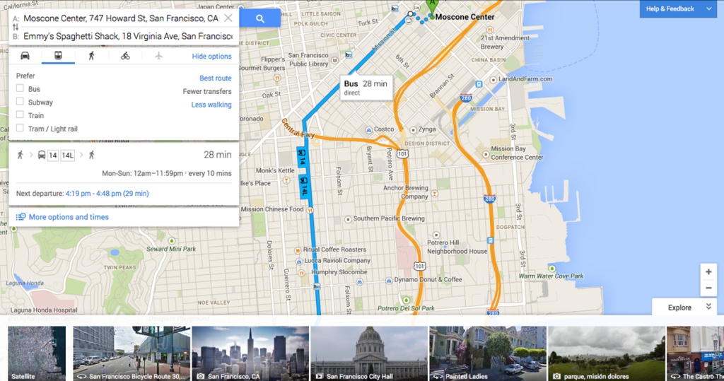
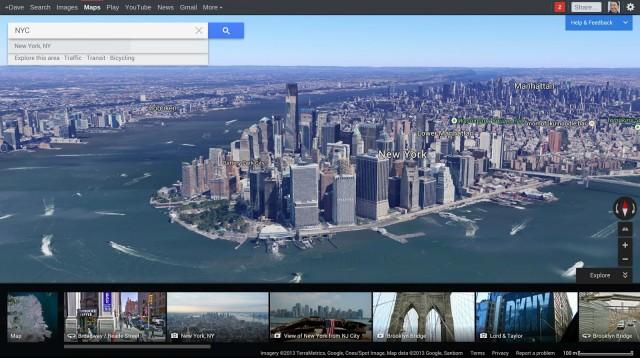
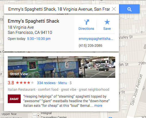 You can easily say that the desktop map looks totally different. It shows the map in full screen and integrates Google Earth and there is a number of small thumbnails at the bottom. The search is also redesigned – search box appears as a small widget in the upper-left side of the screen. Results for your search are displayed as points on the screen and they are more personalized. For instance, you can see that there’s a sushi restaurant near the park you’re currently walking through and the map also highlight restaurants reviewed by friends, as well as those that are highly rated, in general. Once you point at the venue it will show Google Now-like info cards with information, reviews and directions helping you plan your journey. Google says that the map will be also more personalized by highlighting important locations like your home, workplace and other customized search but we’ll learn about it later on.
Improved directions
But besides new look there are some important improvements to features – especially directions and transit. For drivers Google says it will re-route directions based on traffic conditions and view side by side how long each route takes to select the quickest and shortest one. For transit the search options will finally incorporate flights. For public transportation, you will be able visually compare trips based on number of transfers, walking distance and total travel time.
Mobile?
The update is also coming to Android and iOS, where users will be able to rate restaurants and view Zagat (restaurant rating start-up acquired by Google in 2011) reviews from within the app, as well as receive Google Offers. The app will include live traffic alerts and suggest new routes based on current road conditions, and an iPad version will finally arrive “this summer”.
The verdict
What else can be improved in Google Maps. Many thought that not much, but Google again proves that we were wrong. Everyone knows about personalization in Google search engine so that we receive only relevant content (relevant from the perspective of Google’s algorithms). But maps where always static the content has been filtered based on location and keywords. New Google Maps are supposed to be different, personalized, intuitive, Google Now-like. There are no details on when will it be officially launched but I think we are all waiting for it.
source: The Verge, Mashable,

