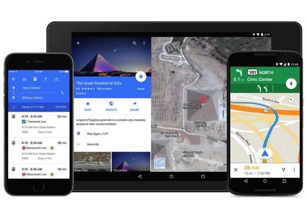
Google’s colorful new Material Design style is making its way to Maps in a few days. Announced in a blog post, the update brings a whole new look to the mapping app, as well as some new cool features.
The Material Design is Google’s new visual look annouced earlier this year which you might know from Google+ website and apps. The changes are not really dramatic. Maps still functions and is laid out largely the same way but it received stylish and colourful layout which makes the app more intuitive and simply more beautiful.
Google explained that the driving principle behind the new design decisions was to make it easier to use and discover certain features:
This new look is all about creating surfaces and shadows that echo the real world; with Google Maps’ new material feel, layers and buttons come to life so you know just where to touch to get directions, recommendations and imagery.
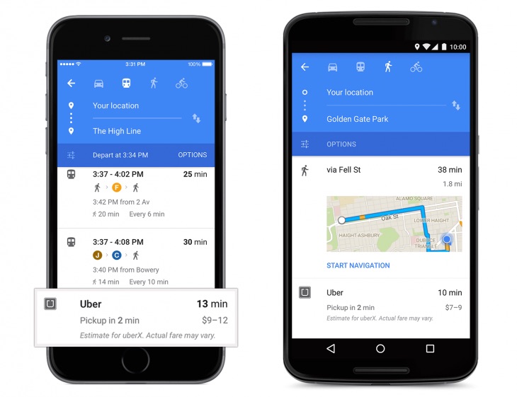 The new Google Maps app will also offer some new cool features. Back in May, Google built in an option that estimated how long it would take an Uber car to get you to a destination if you have an Uber app installed. The feature will now show you an estimated pickup time and price for the route versus the same journey by public transit, which should make it significantly more useful.
Google is also building in support for OpenTable, allowing you to book a reservation at any restaurant that supports it from right inside of Google Maps. That too should be a pretty helpful integration, making Maps a lot more powerful through Google’s willingness to lean on popular, third-party services for new functionality.

