 Maps were perhaps the first drawings that humans drew on the sands of time but it is amazing to notice that maps still hold a very special place in our digital world as well. Maps for representing billionaires on the planet, Maps for showing the internet network, Maps here and Maps there! It is amazing to see the recent trend of representation almost all information in the form of a Map!
The Internet is full of these “fun to look and discuss” maps and we at Geoawesomeness covered some of these interesting and “sometimes” controversial maps that were making waves on the Internet like the “Stereotype Map“, “Emotions Map” and so on. A Staff at the WashingtonPost decided to something more than that, he made a list of 40 Maps that explain our world. Surely the journalists’ these days love the concept of maps! If this trend continues, a degree in cartography could help you get a job at the media 🙂
Guessing what these “40 Maps” could be about? Well, I’ll let you experience the list firsthand and would be interesting to hear what your favourite map was and if you agree with the list? Whether you agree with the information in the map is a different story altogether, I don’t agree with some of the representation the maps are depicting. Oops Spoiler Alert! Let me hold my thoughts right there 🙂
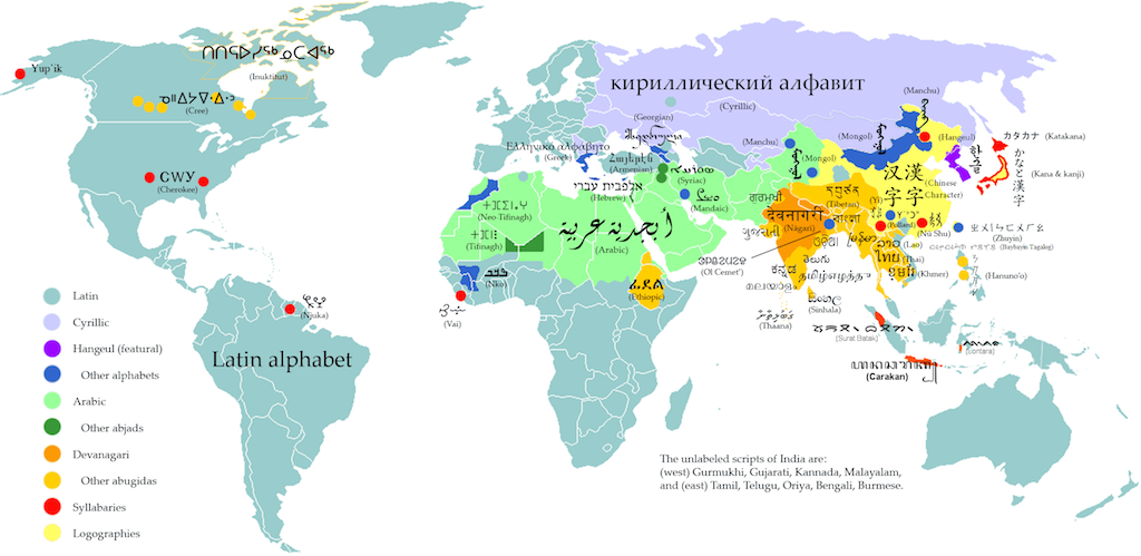
Here’s my favourite map in the list – “Writing systems map of the world”. There is something amazing about this map! If you consider the population of the world and this map together, it is amazing to see that the most diverse place on the planet happens to be the most populous part of this little blue ball that is circling the sun! Coincidence or a little bit more than that, could be an interesting piece of research!
What do you think? Let us know! Here’s the link to the article . 40 Maps that explain our world: bringing together geography & journalism!
Source: Washingtonpost


