Excel is really powerful tool for playing with big data (especially with Power Pivot plugin) however spatial visualization of this data requires going back and forth to GIS software, joining tables or geocoding. Doable but time-consuming. Starting from now Microsoft teases us with a tool that will make it much easier to show data on the map… Last week Microsoft is announced the public preview of project called “Geoflow for Excel”.
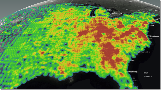
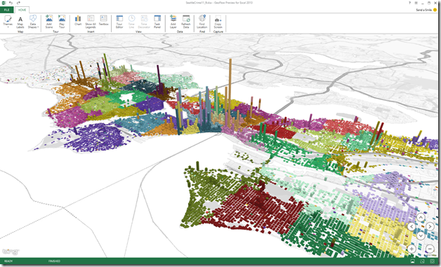
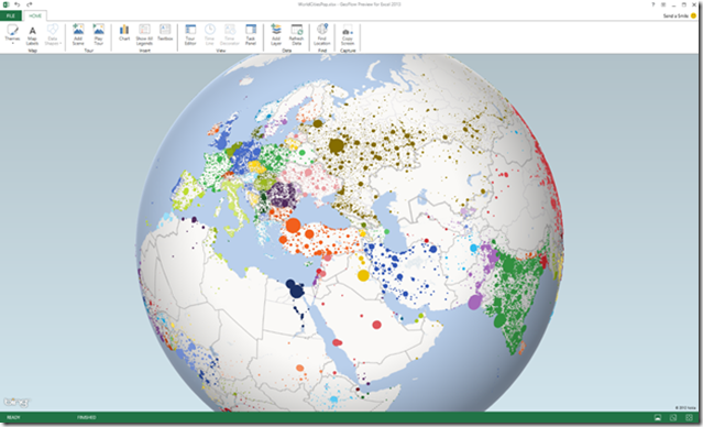
Essentially GeoFlow is a tool (Excel plugin) for visualizing geospatial and temporal data. It allows users to plot up to 1 million rows of data stored in an Excel workbook, including Excel Data Model or PowerPivot, on a Bing Maps. The data can be visualized as 3D columns, heat maps, and bubble visualizations, which is not perfect from cartographer’s point of view but enough to discover new insights based on visual analysis of data in space and time.
Check out couple of maps to see what can you do with GeoFlow:
Not bad at all. On Excel blog you can find some tutorials how to play with the tool.
Of course this is not the first time users of Excel can create maps. Last summer, Esri Maps for Office was announced as a new location analytics tool linking ArcGIS Online data to Excel. Users of other spreadsheets tools like Google Docs can leveraage similar functionality from Google Fusion Tables. However it’s about time that Microsoft finally makes some use of it’s Bing maps (which I personally never use). I will play with the tool and give you some more insights about it soon. Meanwhile check the video below:


