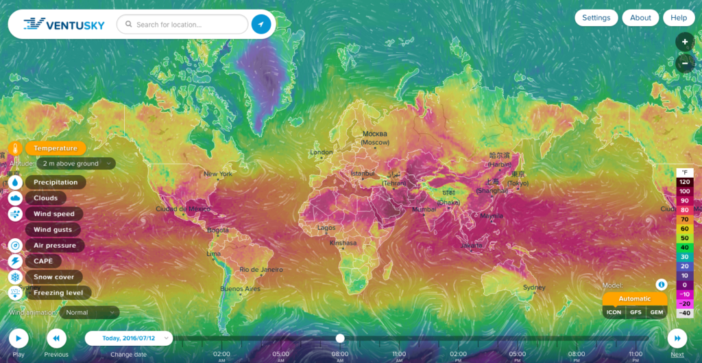
Weather maps are boring. Country level maps with cloud icons and temperature labels might be enough for most of the people but not for GeoGeeks. There is Windyty which is awesome but it’s developed primarily for skiers and surfers to know all about wind and snow forecasts.
Now there is a new project called VentuSky that takes everything awesome about streamline-based visualization and combines it with advanced weather forecasting algorithms. The service has been developed by a Czech company InMeteo specialised in weather forecasting.
The application allows users to view temperature, wind speed and direction, precipitation, air pressure, cloud and snow cover, and freezing level. You can view the forecast for 9 days ahead. Interestingly the web app allows you switch between three different meteorological forecasting models: the German National Meteorological Service institution’s Icon Model, NOAA’s Model GFS and the Canadian Meteorological Centre’s GEM Model (I guess that it’s for you to be able to choose the best weather;). We’ve reached out to InMeteo to learn a bit more about the technology behind the service:
“We have created our own map tiles, because current solutions (Google Maps, Mapbox, Bing etc.) are often expensive or slow. We don’t need so much detailed map for the weather visualisation. For the weather maps we are using a variant of a bicubic interpolation,. This is accurate, but on the other hand it is demanding on the CPU. It was difficult to keep the website smooth even on older computers.
Our website is creating from the ground in pure JS, html5 and CSS3 (backend is using PHP and C++). We are not using any third-party library for the visualisation (like Leaflet or jQuery) and it makes our solutions lightweight and fast.
We believe that this kind of visualisation is the future in the weather industry.”
What can I say… We agree that is the future of weather visualisation. Good job!


