Eliminating clouds in satellite imagery
Clouds are a wonderful thing as they bring precipitation and make our planet lush and liveable. On the other hand, if we are interested in details on the Earth’s surface rather than the atmosphere clouds are bothersome obstacles. For my study on drought, for instance, I used MODIS imagery and had to get rid of clouds as those pixels represent highly unreliable values.
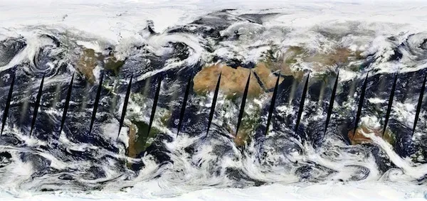
In the map at the bottom derived from MODIS images of NASA’s Aqua and Terra satellites you can see that global cloud cover is extensive. Particularly the intertropical convergence zone around the equator is marked by high convection and energy fluxes resulting in persistent cloudy conditions and only some weeks of clear sky during a year. What I find interesting here is that the areas around the poles apart from the white surface appear very cloudy. We have to take into consideration that the projection extends the poles endlessly enlarging the poles to a huge cloudy area. However, cloudy maps are not useful if the desired object of interest is the Earth’s surface.
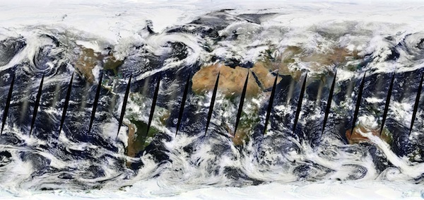
MODIS Terra composite for March 28th, 2013. Images: NASA LANCE-MODIS, courtesy of MapBox.
Cloud-free Maps
In order to obtain de-clouded maps until now for each region the clearest days were selected manually or automatically out of a large set of satellite imagery and stitched together. This process leaves seams where two image clash as they often come from different seasons. Also, on the global MODIS map sun-glint around the equator and no data areas (appearing as black holes) produce unwanted effects.
Specialists at MapBox have come up with a new method of eliminating clouds in satellite images. They used MODIS data captured between January 01 2011 and December 31 2012 (two terabites of data, remember that MODIS is installed onboard of NASA’s Terra and Aqua satellites that have been circling the globe twice a day for more than two decades producing a wealth of satellite data). They developed code for looking at the individual pixels and not whole regions, in order to extract the clearest days pixel wise. Those clearest pixels were averaged and finally used for the world map.
At the bottom I picked some ‘difficult’ areas to show the results of the de-clouding process. So far, the ‘cleaned’ world map is available for MODIS data. I think it would be great future work (for MapBox?) to apply that algorithm also to other satellites.

The image at the top shows a detail of Ecuador and north Peru. Close to the pacific coastline you can see the plains along the Pacific including the Ecuadorian city of Guayaquil. Immediately to the right of it lies the main ridgeline of the northern Andes, with the highest mountains on the eastern side of the range still peaked in snow. On the right hand the tropical rainforest in the Amazonian Basin appears lush green. A typical day in the Andes and Amazonian Basin, though, is marked by extensive cloud cover (bottom image). Source: MapBox
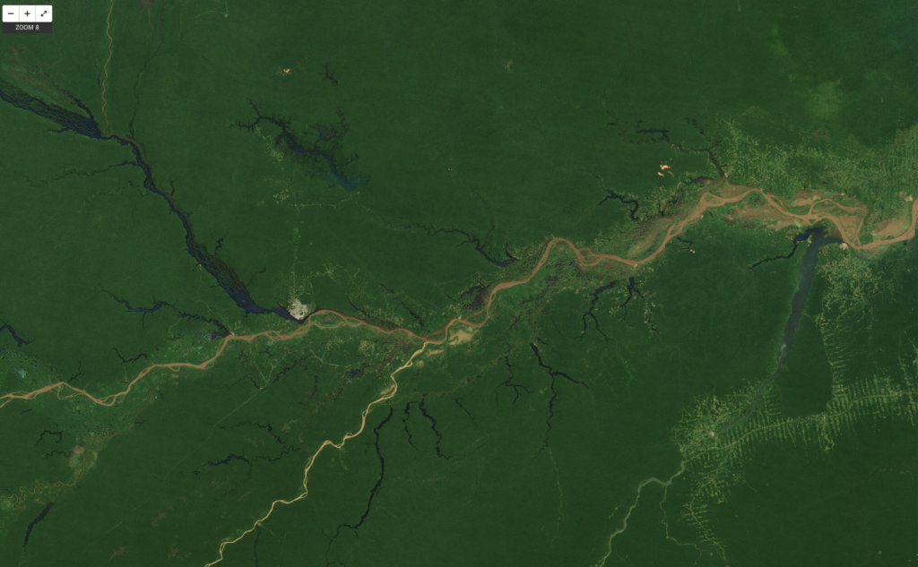
On the centre left is Manaus, Brazil (latitude −3, longitude −60), the economic capital of the central Amazon basin. To its north and east, on the north side of the Amazon, the small orange patches are the exposed soil of bauxite (aluminum) mines. On the south side of the Amazon are networks of logging roads. Source: MapBox
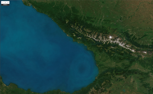
The eastern end of the Black Sea (latitude 42, longitude 40). The southern shore is Turkey; to the east are Armenia and Georgia. To the north, past the Caucasus mountains, is Russia – including the resort town of Sochi, which will host the 2014 Winter Olympics. The ring-like pattern in the sea is the Batumi Eddy, a circulating current rich in phytoplankton. Source: MapBox
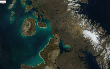
Baffin Island, in the Canadian arctic (latitude 67, longitude −75). The marsh in the central south of this view is Dewey Soper Migratory Bird Sanctuary, the largest goose colony in the world. Source: MapBox
Source: MapBox and Atlantic Cities
Did you like this post? Read more and subscribe to our monthly newsletter!


