Everyone who reads Geoawesomeness know that spatial visualization of data can give you new perspective on your analysis. Map is far much more informative than tables or database records and it provides a quick way to visually analyse complex and voluminous data. Most of you probably knows that it is not easy to make a really good map. When using GIS software first you need to geocode your data, than to add background data (if you have it) or WMS and WFS services (if you don’t have it), than you can perform spatial analysis and finally generate map. Due to the fact that GIS visualization effects are quiet limited (if any) at the end you need to export it to software like Adobe Illustrator and play with it for hours. At the end it looks good but it’s not interactive.
Google Earth KML
That’s way I’ve been fascinated by Google Earth’s KML (Keyhole Markup Language) for a while. It’s simple way of visualizing data in an awesome way. There are four main reasons why it’s so good. First of all it’s relatively easy to use, just a little bit of XML which shouldn’t be a problem even for an amateur. Second of all, it’s free which means that is free for both: you and your clients. Moreover it allows to visualize your data with Google Earth’s background. And finally it allows for cool interaction between your map and the user.
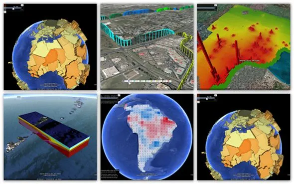
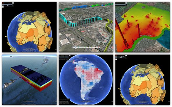
There are a lot of examples of great visualizations made with KML:
But in order to create visualizations at that level you need to write some code because it’s a little bit too complicated to do it manually. You can find online some simple software to generate basic things automatically but it’s not going to look cool.
Solution – Data Appeal
Now there is a solution for those who want to create cool, custom visualizations but have never seen nothing like XML. Data Appeal is the first online automatic KML generator with cool customizable features. The project is based on PhD research of its founder Nadia Amoroso and allows you to generate some cool visualizations with just a few clicks of a mouse. Data Appeal position themselves as a GIS software but I would classify them as a the first powerful geo-vizualization software is based on Google Earth.
It is really simple. First you have to prepare you data in excel, where you can automatically geocode them if you don’t have coordinates. Than you upload the file and you can move to simple and easy to use creator, where you can change shapes, colours, size, you can add legend and so on. Everything is nicely displayed online, but you can in any time download KML and use it directly on Google Earth. If you’d like you can share it on social media as well.
Check out the video to learn more about Data Appeal:
What you can do with it?
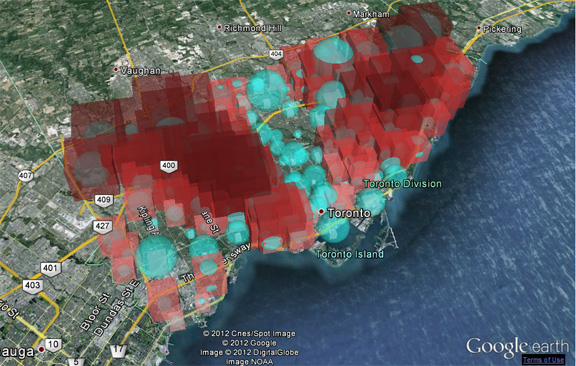
Right now the software is still a little bit limited but guys at Data Appeal told me that they’re working on new features, which they will launch soon. So what can you visualize with it right now? Basically geocoded points with assigned values. Those values are represented in hight and size of the shape that you choose e.g. prism, cone or bubble. With old school theory of cartography this would be considered redundant use of cartographical device, but actually on GE it looks awesome and gives users nice map experience. I like it. Soon they you’ll be able to visualize not only points but as well polygons and create a lot of other cool stuff.
Will it work for you?
I’ve been searching for a good KML generator for a while already, and I guess that Data Appeal is what I was looking for. The value of GE can be big if you know how to use it. When you work with non-GIS people it’s crucial to let them play with solutions they know. And everybody knows and uses Google Maps and Earth. Great job Data Appeal Team and keep on making your software even more awesome!
source: Data Appeal

