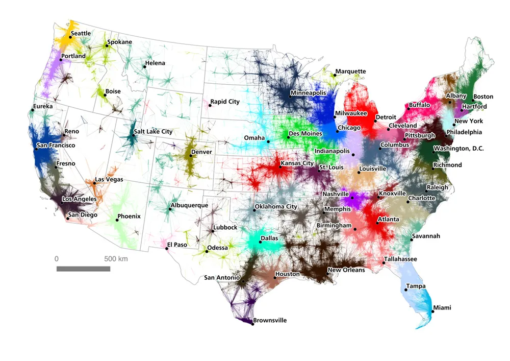
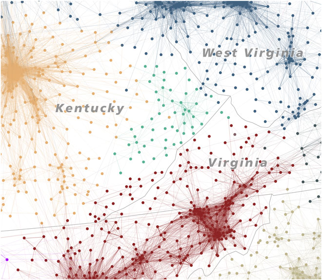
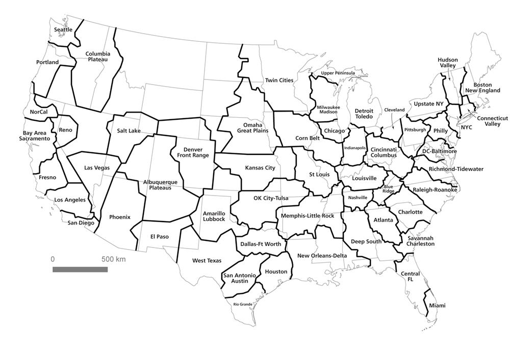
Over 130 million people in the US commute everyday. 50% of them travel 11 miles or more. A recent study conducted by researchers from the University of Sheffield looked closer into the commuting patterns and came up with this amazing map:
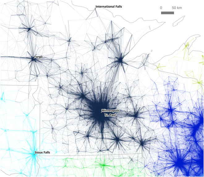
 It shows what are the commuting ranges of the largest cities in the US. The analysis identified multiple ‘megaregions’ created by a network of connected metropolitan areas. Interestingly the research showed that state borders have no influence on the patterns.
The data used in the project came from the American Community Survey that asked 3.5 million employees about their commuting behavior. Researchers than applied ‘the community partitioning’ algorithm developed by the MIT and cloud computing powered by Amazon Web Services. The effect of the analysis has been mapped out and revealed massive labour market areas across the US that form distinct megaregions.
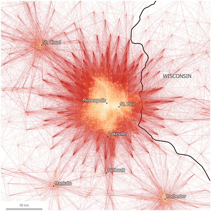
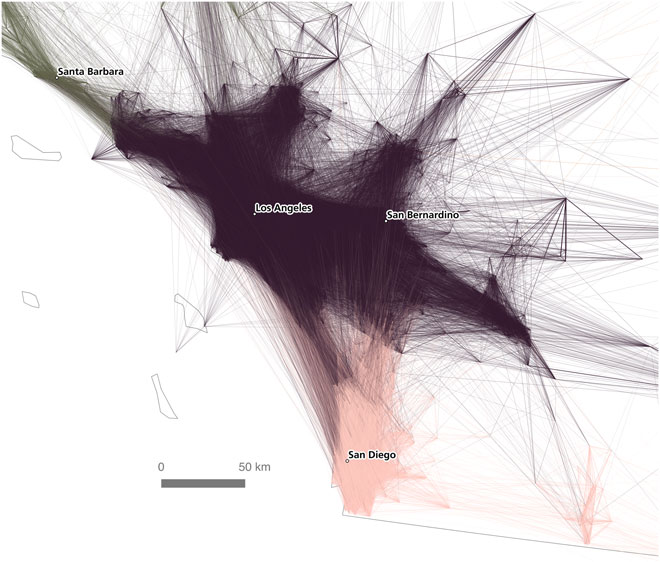
 The side effect of the project is a series of stunning maps. Take a look, they are amazing:


