The new iOS 10 has been released this week. Of course for us the most interesting part is the update to Apple Maps. Is it any better than the previous version? Check out our detailed step by step comparison.
Ok. Let’s start from the beginning. I’ve opened the Apple Maps app and searched for Paris. The difference is visible at the first glance. iOS 10 adds a new info tab at the bottom of the screen showing information, images, reviews and other options related to the place you’re searching for. Just above the tab on the right you can see a small incon with the real-time weather information. I must say it’s really cool, useful and intuitive. Also the “info” and “my location” icons have been moved. Previously taking a lot of space at the bottom of the screen, the icons have been moved to the right top which makes much more sense. Looking at the map itself there are not too many differences. Fonts and colors seem to be very similar with one difference, the size of the city name is much bigger it simply looks much better.
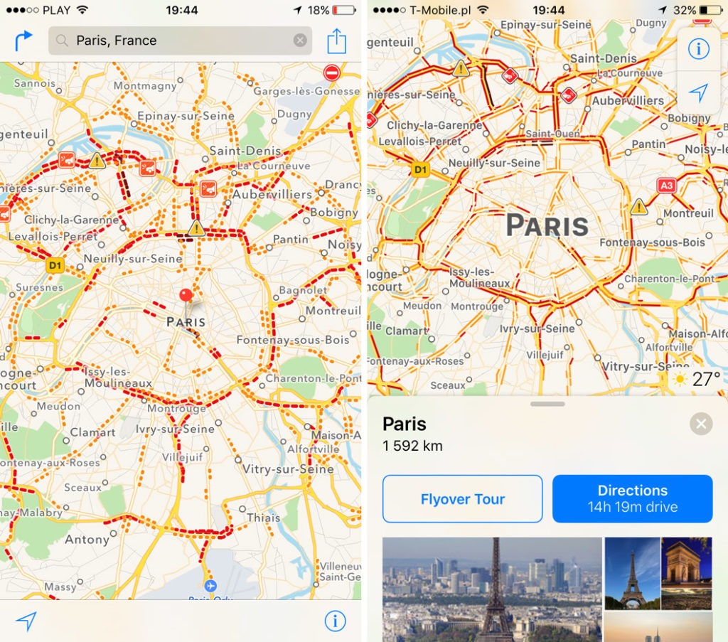
We can also see a significant change in how the traffic is presented. The small dots in iOS 9 turned out to be not readable. In iOS10 Apple designers followed the Google Maps way and presented traffic flows as a colorful stripes. When you click on the event icon, it becomes bigger and the details show on the data tab at the bottom. It reduced the number of clicks compared to iOS 9. Simple and cool.
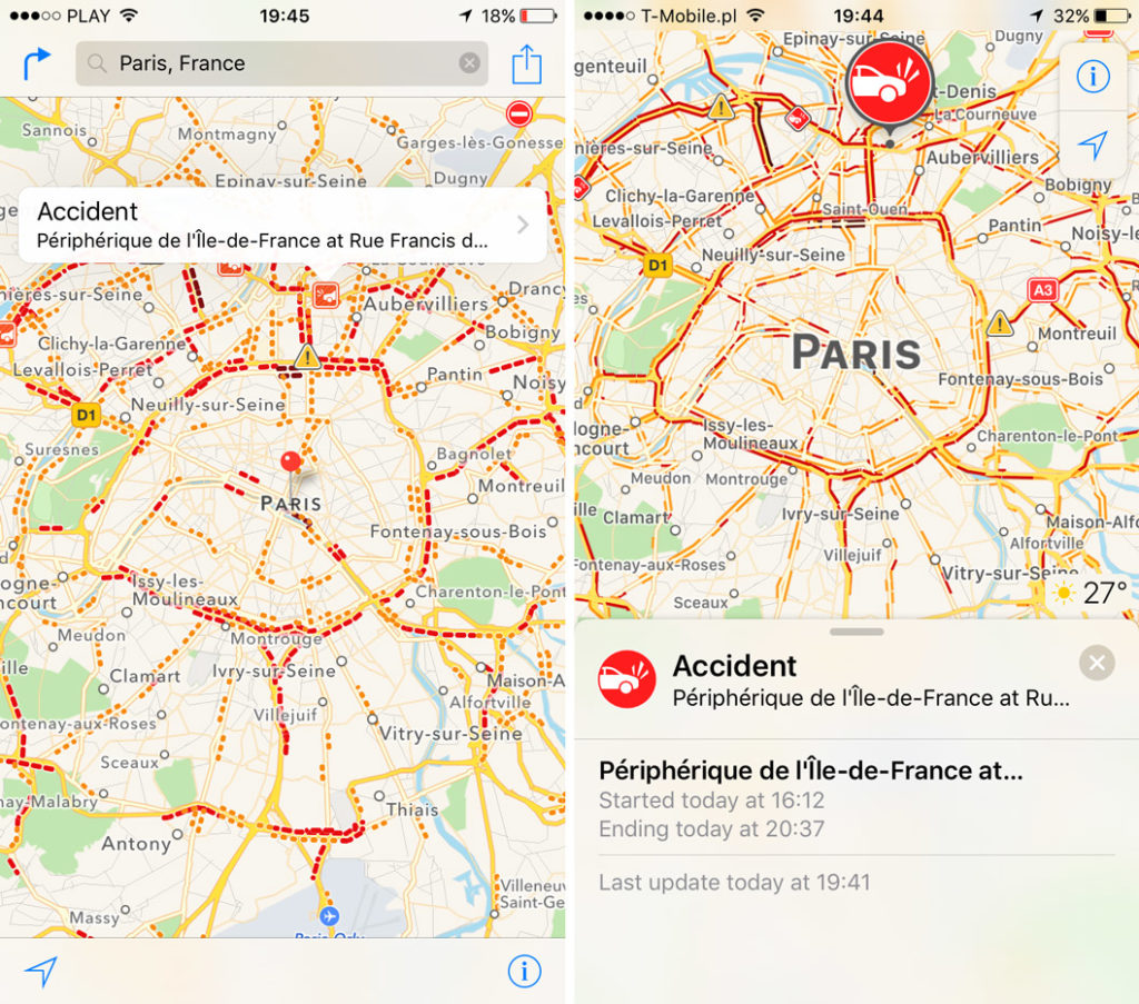 When you zoom in you can see that the map design had not been touched. Again when you click on any icon it becomes bigger and the data tab shows up.
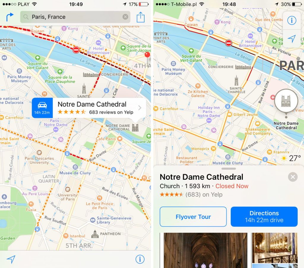
You can swipe through it and get nicely presented info. iOS 9 on the left also offered some information but presented in a more old-school way. 
Now lets move to the navigation. iOS 10 finally allows you to do the route planning from other origin than your location which was one of the missing features of iOS 9 and for me it means that iOS 10 becomes a mature navigation service. Transportation mode options have been moved from the top, to the bottom of the screen making it easily accessible on the larger iPhone screens. Uber and Lyft have been finally integrated within the app, which was a long awaited feature for many users.
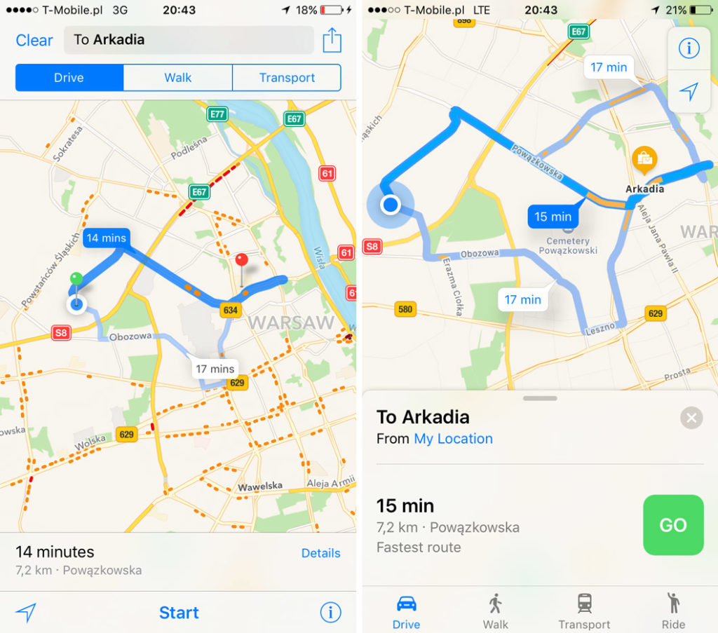
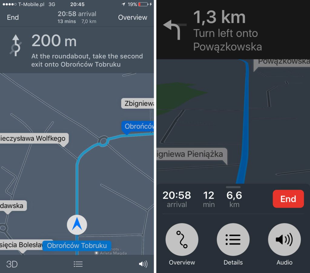
The big, green button to start the route shows the app has been clearly designed with driver in mind. It’s visible everywhere else. The fonts are bigger and more readable. The route data including estimated travel time, distance and arrival time has been moved to the bottom on the screen. I don’t really follow the idea behind putting there also a big red button to end the route. It just looks at you trying to make you want to push it.
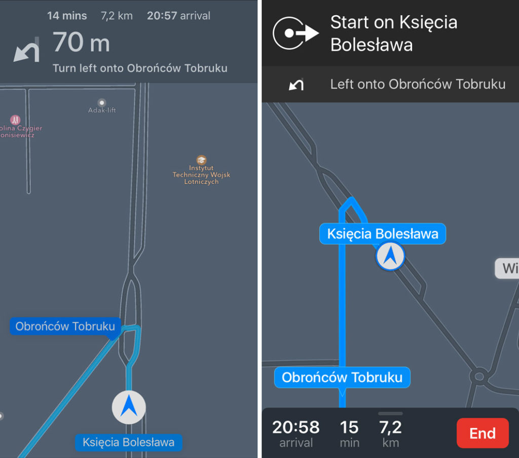
The driving instructions are shorter but the fonts are much bigger and very well readable. I really like it.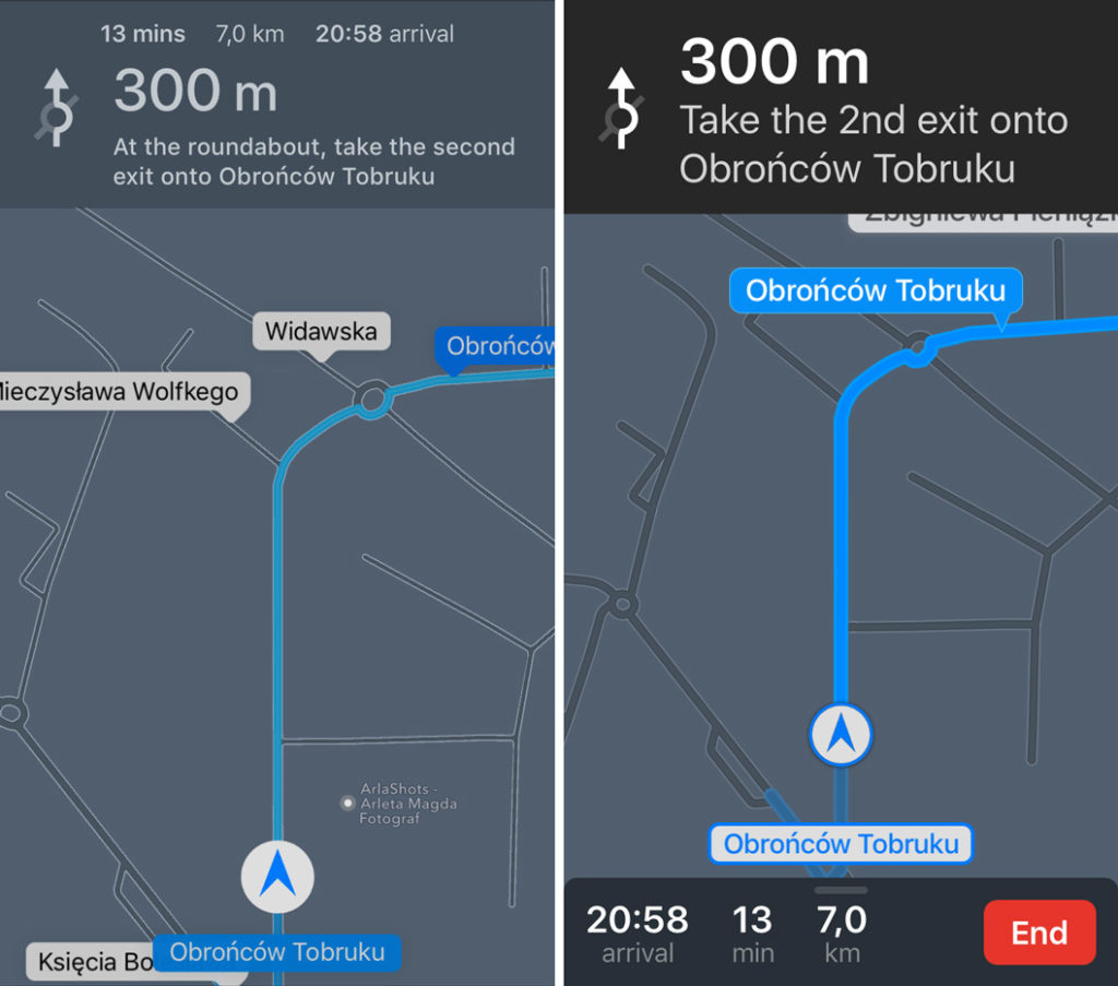
iOS 10 removed the option to change between the 3D and 2D map modes, it’s now fully automated. When you drive faster the app changes to 3D mode (the one with a perspective and a visible horizon) and when you slow down the map seamlessly changes to 2D mode. I must say that it works really well and I wouldn’t manually change it anyway but I expect that some users might have their preferences in that matter.
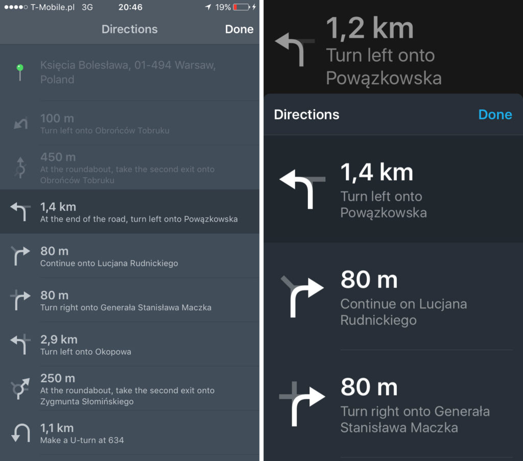
Route details option is also designed clearly for drivers in mind with big fonts and icons. iOS 10 removed past maneuvers from the list which also makes a lot of sense.
Also the route overview is much clearer. In order to resume you need to click the dedicated button at the bottom of the screen rather than a small option on the top. Small thing but makes a significant difference when driving.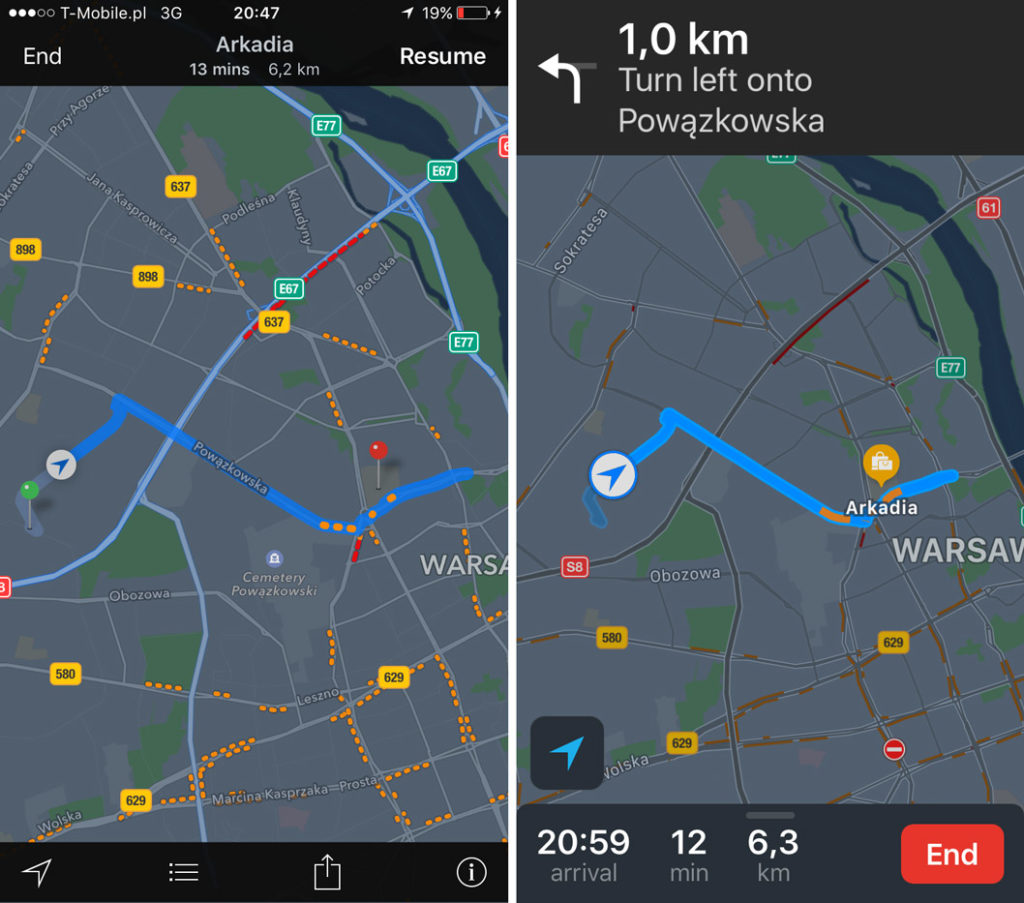
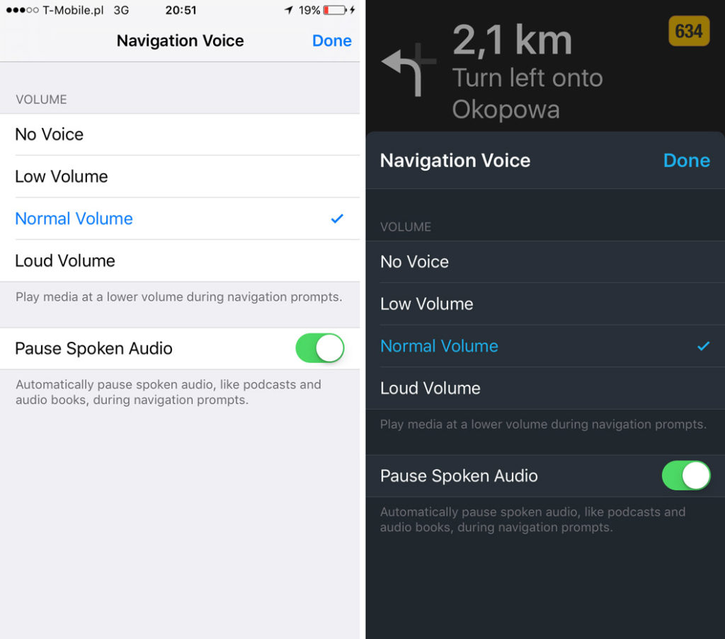
The last option are the audio settings. What’s really cool is that iOS 10 still shows you directions on the top of the screen compared to iOS 9. Again small but useful.
Conclusions
Apple Maps iOS 10 version is definitely a much more mature app than its predecessor. Apple designers finally realized that iPhone is a not a tiny 3.5″ screen device anymore and they moved all the important features to the bottom of the screen making it quickly and easily accessible. The fonts and the buttons got much bigger and easy to operate while driving. The new scrollable info tabs are also a great idea. They reduce the number of clicks to the minimum and they are easy to scroll through.
Finally with the integration of ride hailing services, Apple Maps become a real multimodal transit app that can be compared to Google Maps and HereWeGo. Is it better than its competitors? Not yet but the progress is huge!

