4 things I hate about new Google Maps
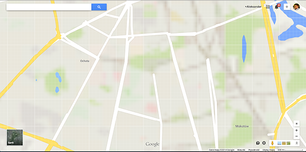
Last month Google finally rolled out new Google Maps to all users. After unveiling it as a ‘preview’ during its annual I/O conference last year, it became a default for everyone. I don’t want to give you a wrong impression – there are a lot of great stuff about new Google Maps. For example I really enjoy using the full screen design, and it’s great how the web and mobile design are similar, moreover I simply love the new iOS app and I’ve been using it as my major navigation app in Europe for some time already. Unfortunately there are as well a lot of terrible stuff about the web version of new Google Maps… here is what I have in mind:
1. THE SLOWEST THING ON THE PLANET
What I always loved about Google Maps was that it was so fast. I got used to checking the directions on my computer 2 seconds before leaving home or office… Now I have to wait 2 hours… The new version of Google Maps is so slow that I actually feel older when it finally loads. Google says it’s due to the new vector-based architecture which employs WebGL, a JavaScript API that renders 3D graphics inside a web browser. OK, I get that it’s the architecture of the future but it doesn’t work properly on my Haswell-equipped laptop (which not that slow) today!?
2. WHY CAN’T I FIND ANYTHING?
Another feature which I always loved about Google Maps was search. I was really smart, very fast and it simply worked the way you’d expected. Somehow the search in new Google Maps stopped working like it used to. Sometimes when I search for a street it shows me streets in different cities. I don’t really know what has changed but it doesn’t work that well anymore. I was often using it as a local search app to find cool places to go around. I had to switch to Foursquare.
3. WHERE IS MY TRAFFIC?
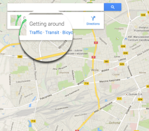 It’s true that the old design of Google Map was a little bit rough and based on XX-century interface but it was easy to find everything. Of course it’s a matter of getting used to it… but I hate that now I have to always search for that button ‘traffic’ or ‘public transportation’. In the new Google Maps it pops up when place cursor on the search box. Let’s be honest it tries to be smarter but I think it might be much less intuitive for a lot of users. At least for now.
4. STREET VIEW – ARE YOU THERE?
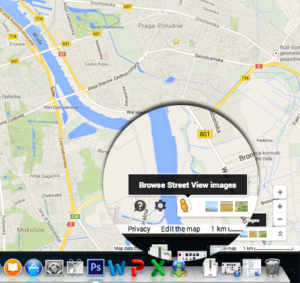 Street View is one of the greatest innovations in web mapping ever. Google improved the technology used by companies like Tele Atlas which where filming the road as a source for spatial data creation but Google did what it does best – took it to the different level – and gave that images back to people. I love Street View and I often used it before I go to the part of the city I don’t know. Why is such an important feature hidden in the right bottom of the map? I would also expect that it would be a continuation of the largest zoom (like it used to be in Google Earth. Somehow it seems that Google didn’t use the full potential of Street View.
What is your opinion about new Google Maps?
DID YOU LIKE THE POST?
SUBSCRIBE TO OUR WEEKLY NEWSLETTER
[wysija_form id=”1″]

