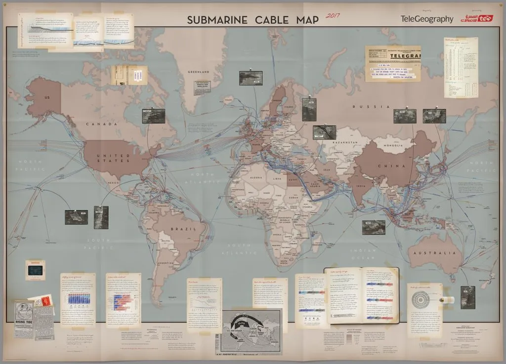
Every year TeleGeography, a telecom data research firm, releases a stunning map related to global communications. Each and every of them is a piece of art. The 2015 edition was styled like old maps from the Age of Discovery. Last year it had a modern design and looked like an infographic.
The 2017 edition has a new theme. The map is designed in the Indiana Jones style with a collection of artifacts, journal entries, and hand-drawn sketches and it looks great! What I love about TeleGeography mapping projects is that the top-notch design is not the purpose on its own. The aim on the map is to visualize information, not the other way around, and these guys really get it!
2017 Submarine Cable Map shows a lot of interesting data. It visualizes 293 active and planned submarine telecommunication cables that are connecting the world under the ocean, changes to submarine cable capacity on major global routes in the last 20 years, aerial “photos” of major submarine cable landing stations as well as countries with the largest number of submarine cable connections, giving them higher resiliency.
The map is really stunning and it is great to know that there are still serious organizations that believe that making maps is an art. Thanks for that TeleGeography!


