
This article is part of the “Tech for Earth” series exploring the intersection of technology, sustainability, and planetary intelligence.
As we enter 2026, satellite and space technologies have moved from specialized scientific tools to essential infrastructure underpinning the global economy. Recent developments from December 2025 and early January 2026 show how Earth observation data has become central to decision-making across industries, from agriculture and urban planning to climate response and disaster management.
New Satellite Missions and Global High-Precision Monitoring
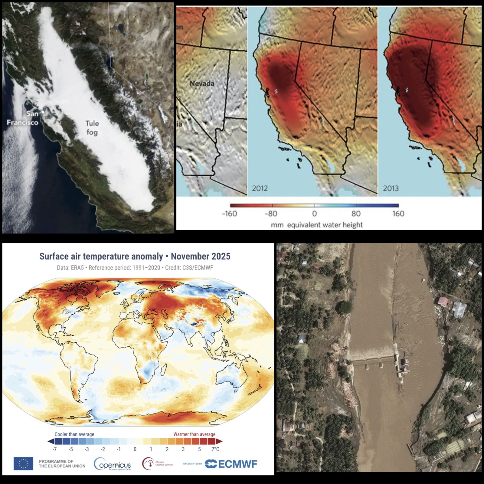
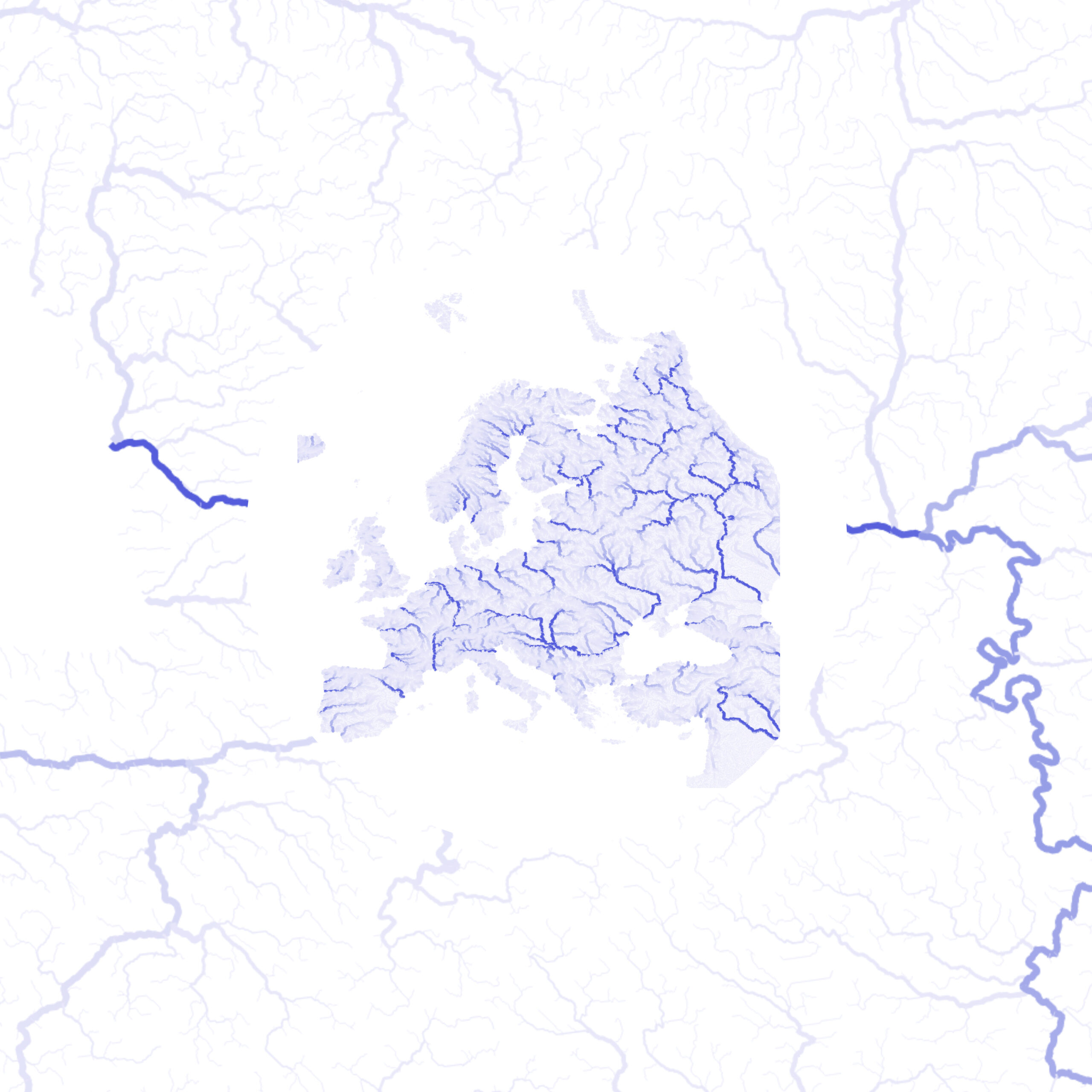
The final months of 2025 saw the launch and activation of several satellite missions. On December 16, 2025, the Copernicus Sentinel-6B delivered its first altimeter images, tracking sea-level variations in the North Atlantic with ultra-precision. Currently flying just 30 seconds behind its twin, Sentinel-6 Michael Freilich, the satellite has entered a “tandem phase” to allow for precise cross-calibration of sea-level measurements to within a fraction of a millimeter. This mission serves as the “gold-standard” reference for monitoring global sea-level rise, which is currently averaging 4.3 millimeters per year.
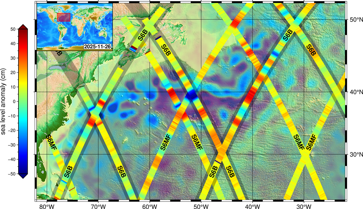
Altimeter measurement by Sentinel-6B and Sentinel-6 Michael Freilich
Meanwhile, the Sentinel-5 mission has begun a new era of air-quality monitoring, providing detailed maps of pollutants such as nitrogen dioxide and sulphur dioxide. In the commercial sector, Vantor’s WorldView Legion constellation is now fully operational, capable of collecting nearly 7 million square kilometers of imagery daily. Additionally, the NISAR mission has entered its science phase, deploying its 12-meter antenna to monitor river deltas and agricultural landscapes.
Mapping Innovations: 3D Models and Radical Narratives
Our ability to visualize the world has been revolutionized by the release of the GlobalBuildingAtlas, a dataset capturing 2.75 billion buildings in 3D. Developed by researchers at the Technical University of Munich (TUM), this atlas provides volumetric data that offers far more precise insights into urbanization and population density than traditional 2D maps.
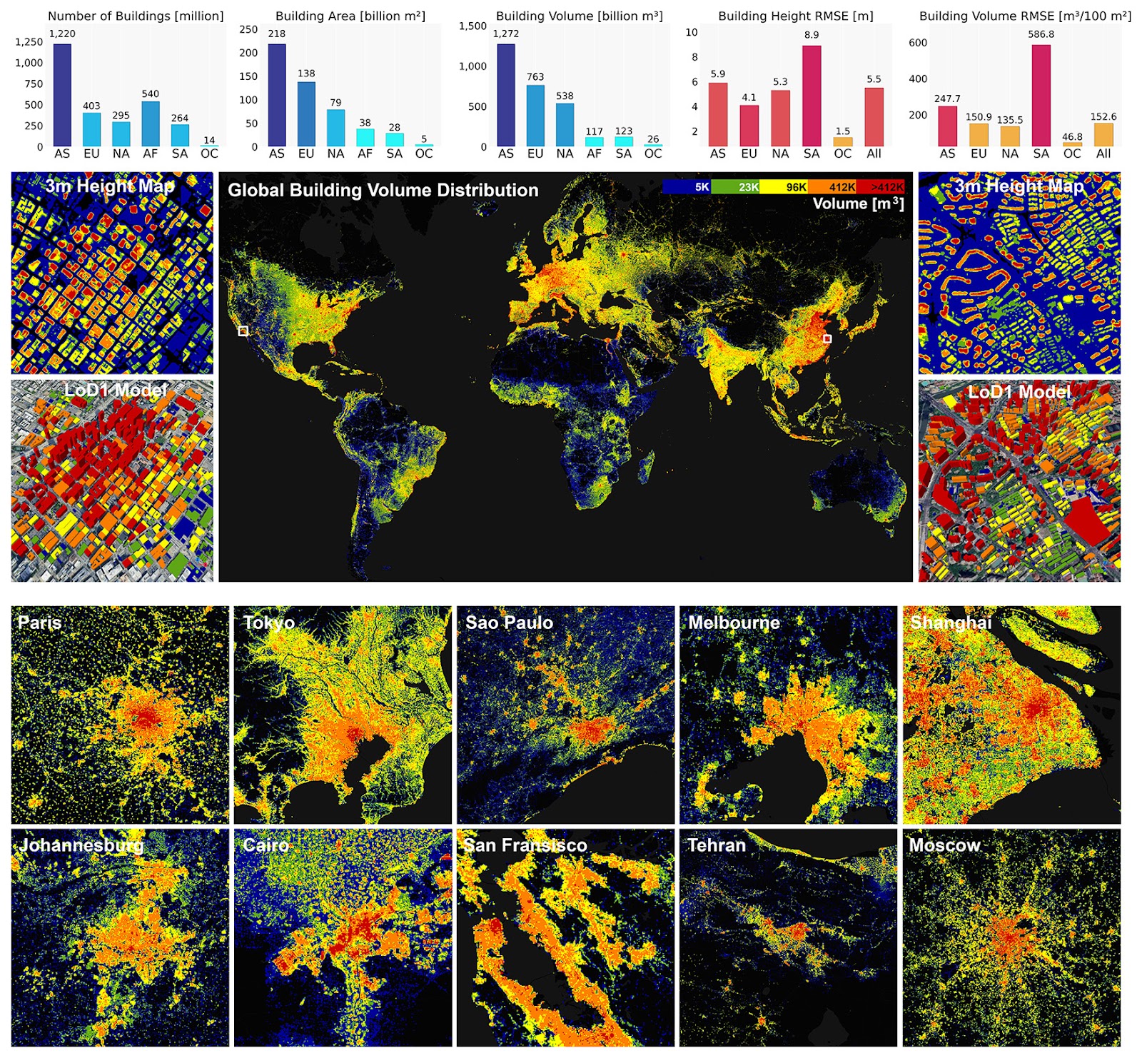
GlobalBuildingAtlas, overview
Parallel to these 3D advancements, the USGS has introduced the Seamless 1 Meter Digital Elevation Model (S1M), a nationwide dataset that merges trillions of lidar points to eliminate gaps and artifacts across project boundaries. Beyond technical precision, the “Equal Earth” movement, supported by the African Union, is gaining ground to replace the 16th-century Mercator projection with the Equal Earth projection, correcting historical distortions that shrink the true size of Africa. As explored in William Rankin’s new book, Radical Cartography, modern mapmaking is increasingly focusing on values like uncertainty and multiplicity to tell more robust stories of human experience.
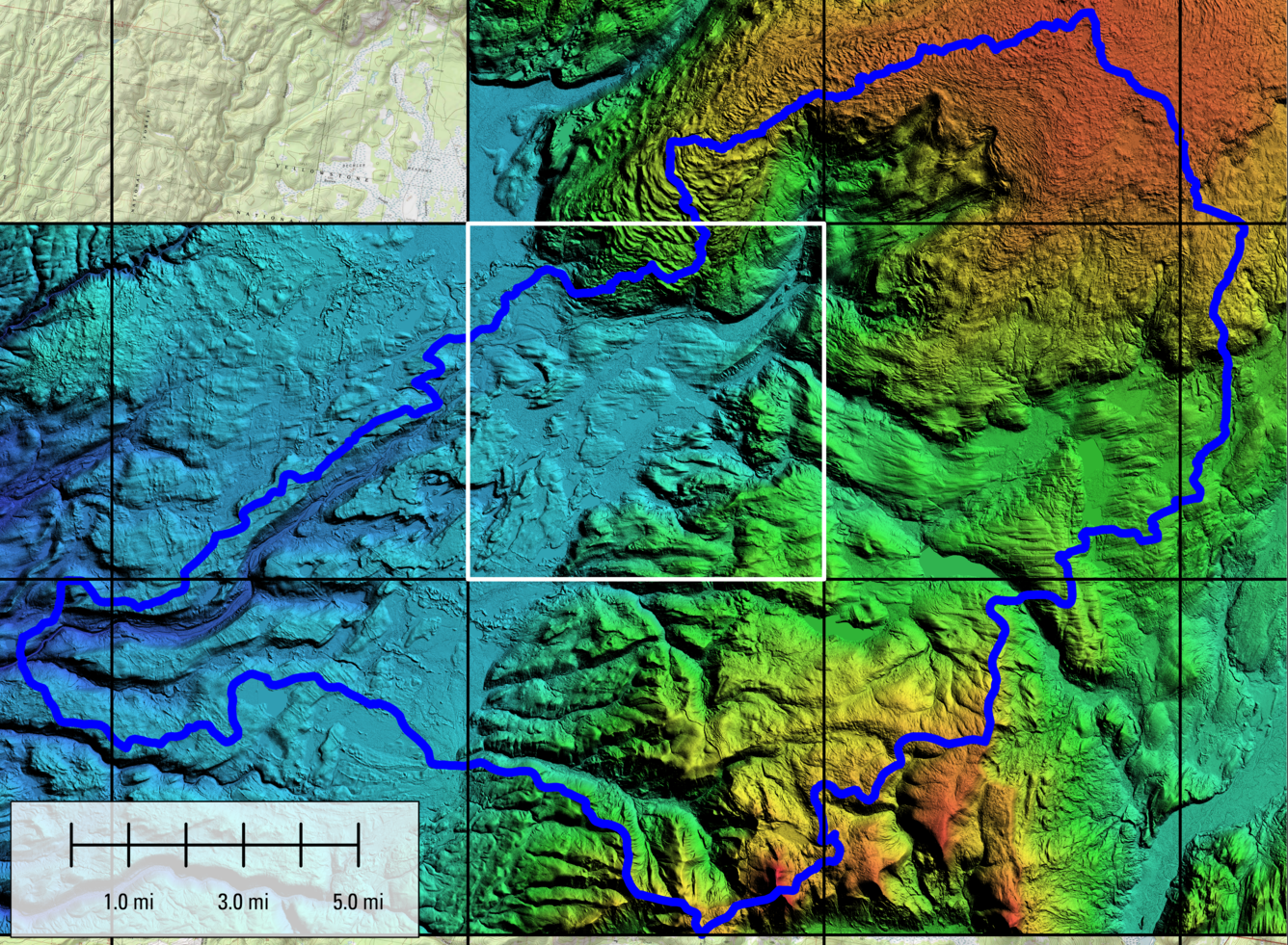
Seamless 1 Meter Digital Elevation Model (S1M)
The AI and Geospatial Revolution
Artificial intelligence has emerged as the “super trend” of 2026, integrating with satellite data to move from simple computer vision to true “machine understanding”.
- Health: GeoAI is now used to detect “green pools” for mosquito breeding and forecast emergency department surges.
- Agriculture: Tools like WorldCereal and Sen4Stat are leveraging Copernicus data to create customized crop-type maps and improve national agricultural statistics.
- National Security: Experts are proposing a National Geospatial-Intelligence Embedding Model (NGEM) that would unify radar, thermal, and text reports into a single searchable “latent space” for automated change detection.
Climate Monitoring: Records and Extremes
Environmental data from late 2025 confirms a warming planet. The Copernicus Climate Change Service (C3S) reports that 2025 is virtually certain to be the joint-second warmest year on record. This warming has been accompanied by extreme events:
- Persistent Fog: A massive 400-mile-long “tule fog” haunted California’s Central Valley for weeks, trapped by a temperature inversion and moist soil from heavy autumn rains.
- Devastating Floods: Cyclone Ditwah and Cyclone Senyar battered Southeast Asia, causing landslides and flooding that killed over 1,200 people across Indonesia, Sri Lanka, and Thailand.
- Groundwater Tracking: Missions like GRACE-FO continue to monitor the alarming depletion of major aquifers, such as the Central Valley aquifer, which has lost significant water volume over the past decade.
Climate Monitoring: Records and Extremes
Practical Applications: Property and Conservation
These high-tech tools are providing real-world solutions across various sectors:
- Infrastructure: Renewable Water Resources (ReWa) used a GIS data warehouse to manage 177 properties totaling 1,883 acres, facilitating property inspections and riparian restoration.
- Marine Protection: Scientists used ArcGIS Pro to map 52 critical species in the Mediterranean, supporting the creation of new marine protected areas in Greece.
- Field Operations: The latest ArcGIS Field Maps (version 25.3) introduced tasks and improved data capture, with AI-assisted data capture and Geospatial PDF support planned for 2026.
Conclusion: A Connected, Data-Driven Future
The innovations of 2025 and early 2026 demonstrate that we are moving toward a state of “sovereign space” and integrated intelligence. By combining satellite precision with AI-driven machine understanding, humanity is gaining the “decision advantage” necessary to manage resource depletion and climate volatility. As these technologies mature, they will continue to reshape how our societies communicate, move, and synchronize with the planet.
How do you like this article? Read more and subscribe to our monthly newsletter!

#Fun

Next article
What you are looking at is the QGIS Expression language. For a geospatial audience, the most useful way to understand it is as a lightweight, map-aware scripting language embedded directly inside QGIS. It allows you to generate geometry, symbols, styles, labels, and derived attributes dynamically, using both feature attributes and spatial properties such as geometry, slope, or aspect.
Conceptually, it sits between classical cartographic rules and full programming. It is more expressive than styling sliders or rule-based symbology, but far simpler than writing a Python plugin. Most importantly, expressions operate at render time. Geometry and appearance do not need to be stored permanently in the dataset; they are generated on the fly from rules you define.
This opens the door to procedural cartography: maps that are defined by behaviour rather than by fixed shapes.
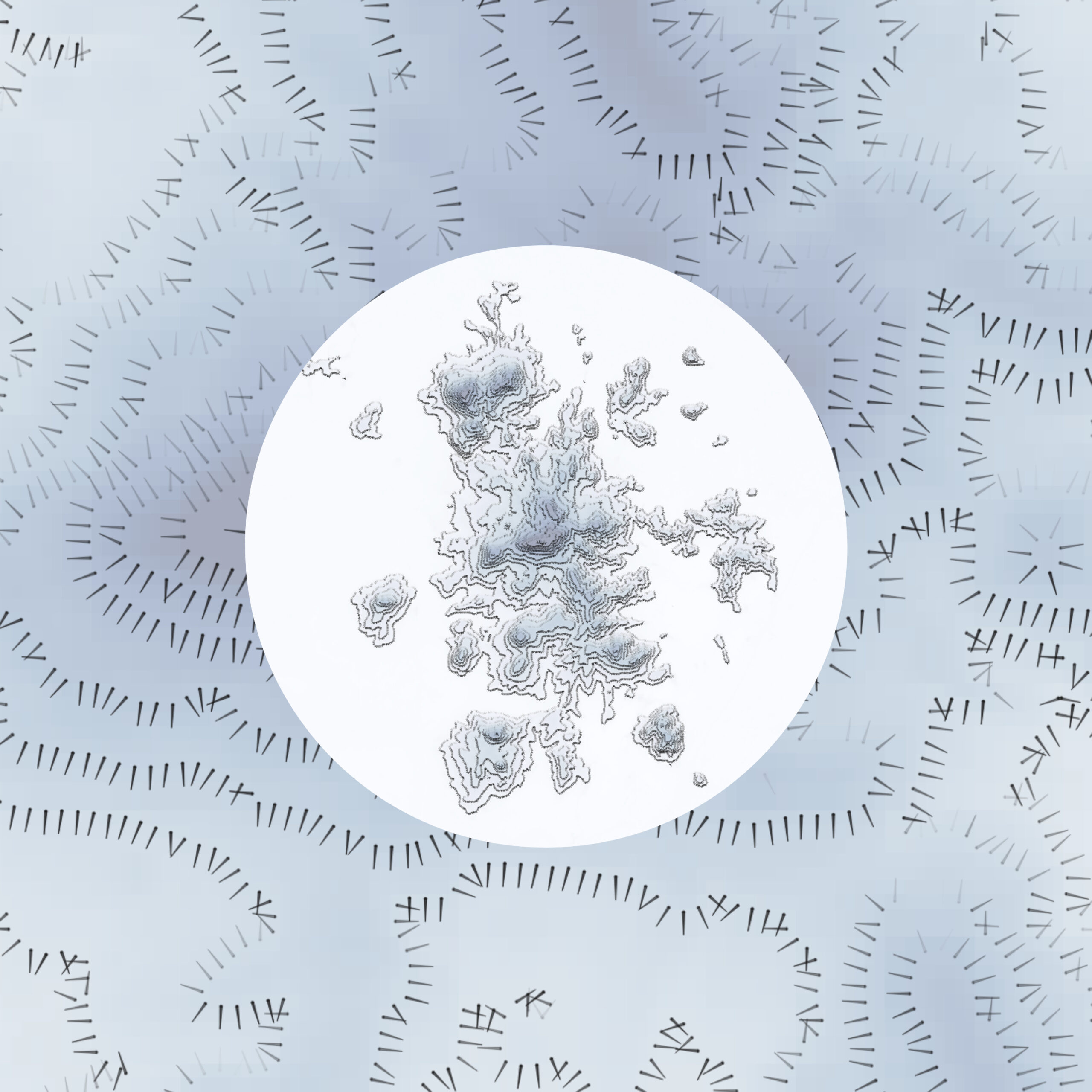
Hachures as a First Example: Geometry Generated from Terrain
The QGIS Hachure Map Generator plugin is a good illustration of this idea. Instead of merely symbolizing existing features, it uses expressions to generate new geometry at draw time. Hachures are short line segments whose length, spacing, and orientation encode terrain properties such as slope and aspect. In classical cartography this was a manual process. In QGIS, it becomes algorithmic.
A simplified version of a hachure-generating expression looks like this:
make_line(
$geometry,
project(
$geometry,
15 + 100 * “slope_1” / 90,
radians((“aspect_1” – 90) + rand(0, 8))
)
)
Here, make_line() constructs a line from two points. The first point is the feature’s geometry, often a point derived from a raster cell or centroid. The second point is computed using project(), which shifts the geometry by a given distance and direction.
The distance depends on the slope. Steeper slopes produce longer hachures. The direction is derived from aspect, rotated so the line points downslope, with a small random perturbation added via rand() to avoid visual regularity. The result is a field of lines that encodes terrain morphology rather than just elevation.
Visual emphasis can be further modulated by scaling opacity or width based on aspect orientation:
1 – abs(“aspect_1” – 180) / 180
This expression returns values close to 1 for south-facing slopes and closer to 0 for north-facing ones, allowing selective emphasis through line width or opacity. The key point is that geometry and styling are driven by physical terrain properties, not static design choices.
Flow and Movement Mapping
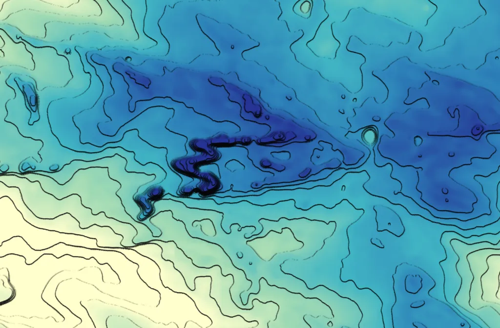
Flow maps are a natural application of expression-driven geometry in QGIS. When you have origin–destination lines or point features with attributes for direction and magnitude, you can create symbols that vary in width, color, and orientation based on your data.
Dataset source: HydroATLAS, HydroSHEDS – provides river networks and discharge values used for flow visualization.
- Line width by flow magnitude:
scale_linear(
“DIS_AV_CMS”,
min_flow,
max_flow,
min_width,
max_width
)
This scales the line thickness according to the discharge (DIS_AV_CMS) value, making larger flows visually more prominent.
- Line color based on magnitude:
You can apply a gradient from light to dark using your chosen palette:
with_variable(
‘val’,
“DIS_AV_CMS”,
color_rgb(
scale_linear(@val, 0, 500, 240, 39), — Red channel
scale_linear(@val, 0, 500, 238, 87), — Green channel
scale_linear(@val, 0, 500, 255, 245) — Blue channel
)
)
This maps low flow to light blue and high flow to dark blue, producing a continuous, data-driven color gradient.
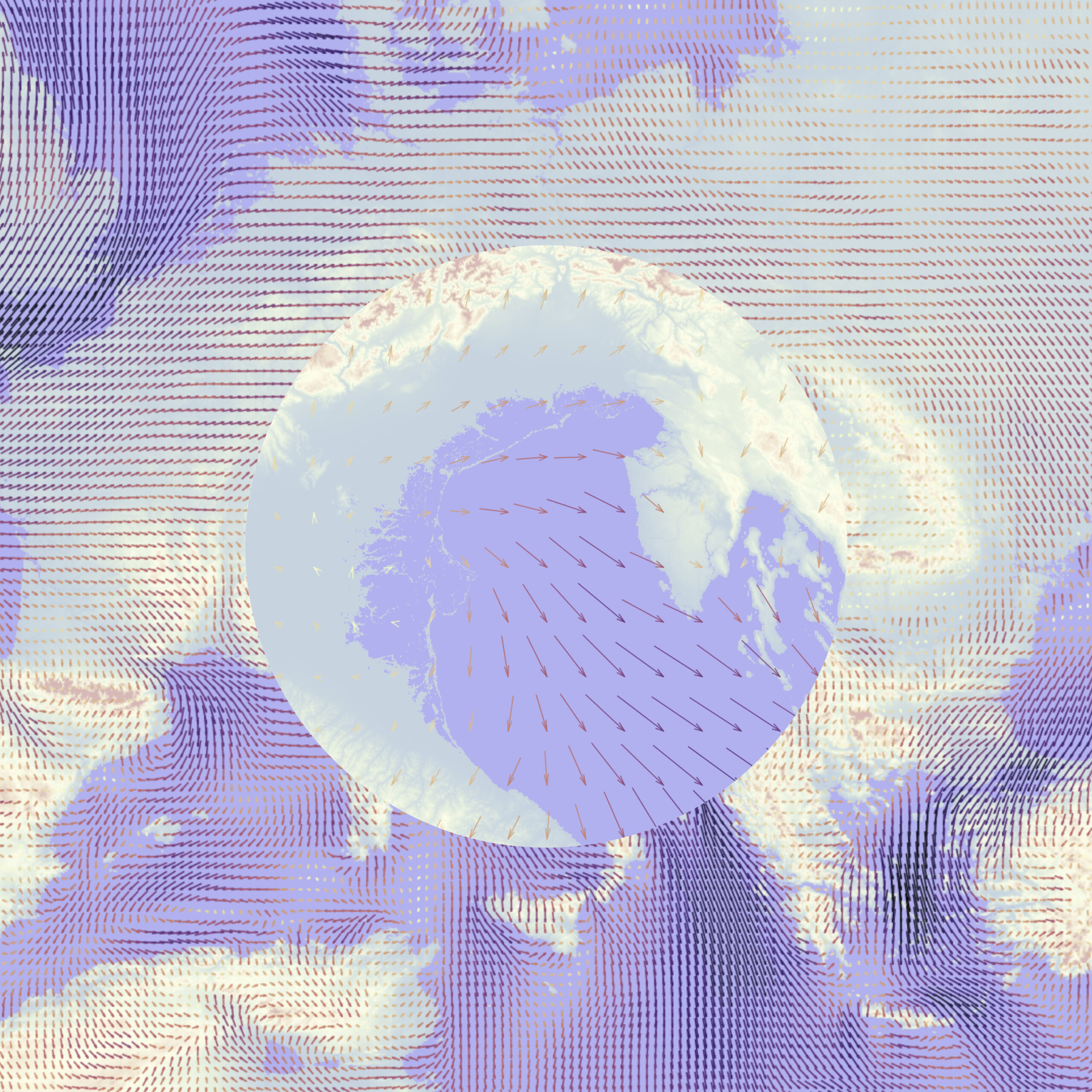
Wind and Current Visualization
Point-based vector fields, such as wind or ocean currents, can be effectively visualized by converting points into oriented arrows. Each arrow’s geometry can respond dynamically to the speed and direction values from the dataset, providing an intuitive representation of flow patterns. Using ERA data, the arrow length is scaled by the wind or current speed, and the orientation is derived from the direction field.
Here’s an example QGIS Geometry Generator expression for creating arrows from ERA dataset:
— Main vector line
with_variable(
‘main’,
make_line(
$geometry,
project(
$geometry,
0.05 * “speed”, — scales arrow length by speed
“direction” * pi()/180 — converts degrees to radians
)
),
— Arrowhead at the tip
collect_geometries(
@main,
make_line(
end_point(@main),
project(
end_point(@main),
0.01, — short length for narrow tip
“direction” * pi()/180 + pi()/12 — left wing
)
),
make_line(
end_point(@main),
project(
end_point(@main),
0.01,
“direction” * pi()/180 – pi()/12 — right wing
)
)
)
)
Procedural Cartography Inside QGIS
Taken together, these examples point to a broader practice that is emerging inside QGIS: procedural cartography. Expressions are used to generate dot densities, sketch-style strokes, irregular buffers, noise-based textures, and data-driven ornamentation. The ideas borrow from computer graphics and scientific visualization, but remain accessible to everyday GIS users.
No external scripting environment is required. Everything happens inside the styling and geometry tools that users already know.
The key idea for a geospatial audience is that the QGIS Expression language turns GIS layers into parametric objects. Geometry is no longer a fixed result stored on disk. Instead, you describe how geometry should behave in response to data. The underlying capability, however, is already available to any QGIS user willing to think a bit more like a cartographer and a bit more like a programmer.
Did you like this post? Follow us on our social media channels!
Read more and subscribe to our monthly newsletter!

