 Most cartographers neglect map legends. They put a lot of efforts in the projection and scale choice, data and pretty colors selection, but then they just want to add a powerful title and press the “share” button. That is a mistake, as the cartographical legend is the key to understand the map. It is like building a beautiful door and forgetting to put a keyhole on it. It sounds obvious to say, but it is a major communication issue found in very prestigious media maps, still today. When maps were made by hand, making the legend was part of a very artistic process. This article puts side by side recent maps made with computers and ancient ones, drawn by hand, on purpose, to illustrate better the importance of skills and knowledge over technology when it comes to mapping.
LEGEND RULES AND TYPES
One rule matters: every single element that is on the map must be in the legend. Every single symbol, color, shape, line styling that is not explicitly named on the map (so, that necessitates a reading key) has to be mentioned in the legend.
Other rules are secondary and have more to do with readability concerns. It is a lot clearer to group the legend elements, either by type (putting together lines, then points, then areas) or by theme – matching thematic layers of information GIS users know well (water: lines, areas and points; then vegetation: lines, areas, points; then human settlements, etc.). One last, but not least, rule that matters: unit of measurement must be visible (it is surprising to see how many mapper forget that one).
SEVERAL TYPES LEGENDS
Here is an example (The Guns of Gettysburg) of a legend grouped by types of elements and theme. Elevation is represented as areas, as well as boulders, woods, orchards and swamps, all grouped together in the left part of the legend. Points and lines are mixed together in the middle and right part of the legend, as the author prefered to group the columns thematically. The map is about a historical battle, which justifies the choice of grouping together physical obstacles (4th column from the left), roads and streets (3rd column from the left) and battle strategic places (last column on the right).
On this other example (from a map illustrating the Jamaican slave revolt in the 1760’s), there are points and lines, grouped together that way. Note that the map legend was named “explanation” a few centuries ago, which is probably the best word to describe what it should really be!
The next legend (below) is from The Conventional Symbols for Mine Maps (by Lester and Uren, from the Mining and Scientific Press). It is a fantastic and complex mix of points and lines (and this is only one board, there are two more, with topographic symbols). Two types of elements take several shapes here, as such as shafts, rooms and pillars are points, tunnels and pipes are lines.

Google Chart offers a great tool to make a “gradient legend” for which you can set up as many colors and ranges as you want to illustrate your topic on a map. On top of numerical values, you can add qualitative description words to put the emphasis on the colors and disambiguate things. On this kind of legend, only areas are represented. The legend on the right is a geological grid of rock types with associated colors and patterns. Again, only areas are represented here, as visualizing the distribution of geological set is the main purpose of a geological map.
This legend (below, on the left) illustrates a map of the Wellington Flight Center. The map elements are points only, here sorted by type of services people can find in the airport. The legend on the right is the key to a suicide map of Seattle from 1914 to 1925. Again, all the elements of the map are points, here sorted by the type of place the people committed suicide (at home, other than residence in Seattle, out of Seattle or unknown location). As it is a black and white map, the cartographer had to be inventive and to play with the symbols.
This legend of the Clinton County railroad network map from 1892 has lines only. Each railway is associated with abbreviations of each town name crossed by the train.
The following map represents “a year of shipping routes mapped by GPS” published in 2010 in Wired Science, so seeing only lines make sense. Instead of showing shipping type, tons or passengers count, the color gradation illustrates the number of journeys per route. The legend is then a color gradation sliced into ranges, from the less to the most frequented. It is a little misleading that the less visited routes are in dark colors here, as deep red usually indicates high density, but it is a matter of color choice, not a legend one.
THE MEDIA MAP GALLERY
Let’s look a three examples from the media. The following maps have been published recently and illustrate very well the extreme simplification of some mapping practices since computers made mapping tools available for all. As extraordinary as it is to see more maps and more data visualization initiatives in the media and elsewhere, lack of attention to details can lead to over-simplifications of things.
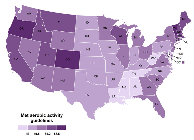
- The percentage of American who met the guidelines for aerobic exercise in 2013
That is one interesting map! The metric is still not clear to me after reading the article several times, but it seems to be based on the percentage of American people who reported meeting the guidelines for aerobic exercise for the past year. So we must assume the numbers on the legend are percentages. Basic rule for color gradation fitting percentages: always start at 0 and always end at 100%. The view here, excluding low and high values (probably because there are empty), is very misleading about the real distribution.
- The “revealing map of the world’s most and least ethnically diverse countries”
This very controversial map from the Washington Post illustrates the “ethnic diversity” of countries in the world. As if the topic was not touchy enough, the map below has a terrible legend, with no numbers whatsoever, very vague descriptive words (and a typo). Usually people put “more” and “less” at the two extremes, keeping the same adjective. Here we have to agree with “diverse” being the exact contrary of “homogenous”. Reading the article (several times as well), it seems that this map is based on “the odd that, on two random people called in a country, they would both say they have a different ethnical belonging than the other called person”… I am pretty sure you’ll get it better than I did.
 Source: The Washington Post
- The absolute Global Map: Facebook
This beautiful map is all over the place on the internet, as, of course, it has been massively shared on Facebook. The social network is so famous, so global, so universal that it does not need any key or explanation: everybody knows that this map showing connexions between people on Facebook. At least I hope so, because you won’t get any legend to help.

Source: Facebook, by Paul Butler
On this other map made from the first from fastcompany, the map maker had the kindness of writing the legend on the bottom right corner. The intention was probably to illustrate how Facebook leaves behind most of the dense areas in the world – so, most of the people.


