Forget me not: Google Maps finally brings Timeline feature to iOS
And Hansel said to Gretel, ‘Let us drop these breadcrumbs so that together we find our way home, because losing our way would be the most cruel of things.’
How many times have you struggled to remember the name of that quirky restaurant you drove past the other day? Or tried to convince your guilt-tripping mom that your last visit home wasn’t that long ago? Forgetful Apple users can now breathe easy with Google Maps rolling out the Your Timeline feature on iOS devices.
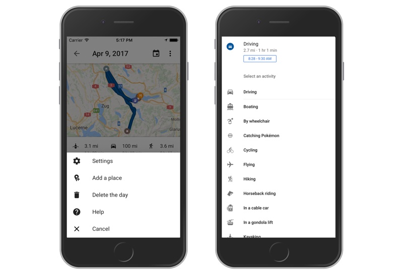
The feature, which has been available for Android and Web since 2015, allows users to see a daily snapshot of the places they have visited. If you feel that the auto-tagged location isn’t quite right, you may edit it. After all, it’s not your fault that the bar is next door to the dry cleaner!
You also get full control of what information shows up on your Timeline if somebody tries to get nosey with your iPhone or iPad. You may delete a specific date, or a range of dates, or even the entire history at any time.
Related read: Police can request your Location History from Google Maps Timeline
Another useful feature is that of customization of your modes of transport and activities. You can specify whether you were driving or cycling or hiking or catching a Pokémon! And if you are revisiting a landmark, or just looking at a place card, you should be able to see when you last visited that location.
That’s not all. If you opt for ‘Timeline emails’, you will get a monthly recap of all the places you have visited and the activities you enjoyed in the last 30 days. As Gerard Sanz, Product Manager, Google Maps, points out in the blog post detailing the Your Timeline rollout, “Sometimes you need a reminder to stop and smell the roses.”
PS: The latest update of Google Maps on iOS also lets you share your location with a friend directly from the iMessage app. A new Directions Widget has also been added in this update, which lets you see turn-by-turn directions without unlocking your phone screen. Handy, eh?


