#Business #Ideas

Finally! iOS 12 will bring Google Maps, Waze to Apple CarPlay

Ever since Apple launched CarPlay in 2014, the tech giant has tried to tie down its users in a monogamous relationship with Apple Maps. Not surprisingly, that has been a deal-breaker for many, with users forgoing Apple’s in-car infotainment system in favor of their favorite phone-based navigation app. But, things will soon change with the release of iPhone’s upcoming operating system iOS 12.

In what can only be called as a huge policy shift for Apple, CarPlay software is all set to extend support to third-party navigation apps like Google Maps, Waze, and Chinese navigation app Autonavi Navigation. The picture below shows the logos of these apps in the demo Apple gave at its WWDC event this week.

Apple is notorious for keeping a tight rein over its operating ecosystem and advocating its native apps. But Maps is hardly a product Apple can claim to be proud of.

Apple Maps’ disastrous release of 2012 notwithstanding, when Justin O’Beirne compared a San Francisco location on both Google and Apple Maps continuously from May 2016 to June 2017, he discovered that Apple had not only failed to populate its map with quality data, it had been pretty lazy with the user interface as well. Google, meanwhile, quietly turned its road map into a “place map” by giving prominence to the businesses in that location and taking the pain to make the data display as user-friendly as possible.

In that sense, opening up CarPlay is a wise move on Apple’s part to encourage more people to use the software more often. To be clear, it isn’t that CarPlay has not been offering any third-party support at all. A limited number of apps, such as Spotify, WhatsApp, VOX, Pandora, etc., have been enjoying CarPlay’s patronage for quite some time. But support for mapping and navigation apps was a big hole in the service that Apple refused to fill until now.


Say thanks for this article (0)
The community is supported by:
Become a sponsor
#Business
#Business #Events #Featured
The Future of Navigation: How Satellite Data Shapes Map Innovation
Avatar for Muthukumar Kumar
Muthukumar Kumar 10.29.2024
AWESOME 1
#Business
Geo Addressing Decoded Part 1: Why Does Geo Addressing Matter?
Aleks Buczkowski 04.16.2024
AWESOME 6
#Business #Featured
Global Top 100 Geospatial Companies 2025
GeoawesomeTeam 09.23.2024
AWESOME 5
Next article
#Business

Uber’s amazing geospatial data viz tool joins the open source community

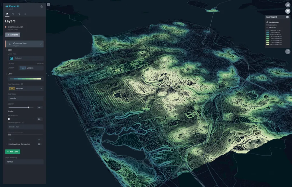
Imagine a geospatial data visualization tool that doesn’t require coding, works in the browser, doesn’t need to be installed, can render millions of GPS points in the blink of an eye, and is super-easy to use. That’s Uber’s kepler.gl geospatial tool for you in a nutshell.

Uber has always recognized location data as one of its biggest assets. It is what has governed the decision-making process across the board at the ride-hailing startup. Uber has used analytics of location big data to understand how many trips start at a particular location, determine the most convenient pickup points for its riders, find out the fastest routes, and even see how many drivers make interstate trips.

Naturally, Uber’s need for fast exploration of geospatial big data led to the birth of kepler.gl. Shan He, the architect behind kepler.gl, describes the platform as, “a data-agnostic, high-performance web-based application for visual exploration of large-scale geolocation data sets. Built on top of deck.gl, kepler.gl can render millions of points representing thousands of trips and perform spatial aggregations on the fly.”

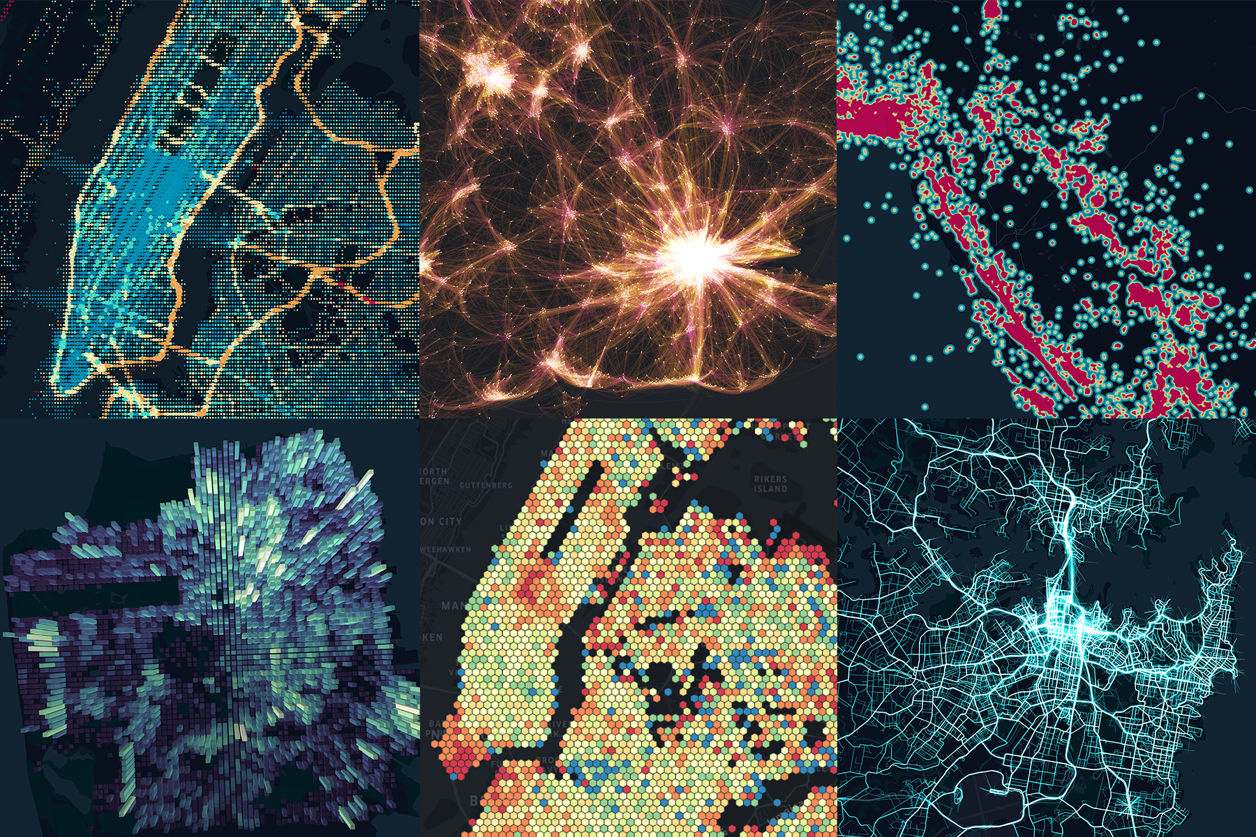
Last week, Uber made the kepler.gl toolbox open source. It comes preloaded with Mapbox and all you’ve got to do is drop in a CSV or a JSON file to have the tool up and running in seconds. It’s been reported to be even easier than Tableau by early users, and you can see some of the beautiful visualization types it would allow you to explore below:

kepler.gl’s point, arc, and heatmap layers (top) and grid, hexbin, and polygon layers (below) provide rich geospatial data analysis

Uber explains that all layer geometry calculations are GPU-accelerated, which has enabled a smooth rendering of millions of points and made kepler.gl a much more powerful web tool than traditional cartography software. There are plenty of filter options for you to play around with, including adding time playbacks to visualize spatiotemporal data, excluding outliers using histograms, and refining data to a smaller set for comparison.

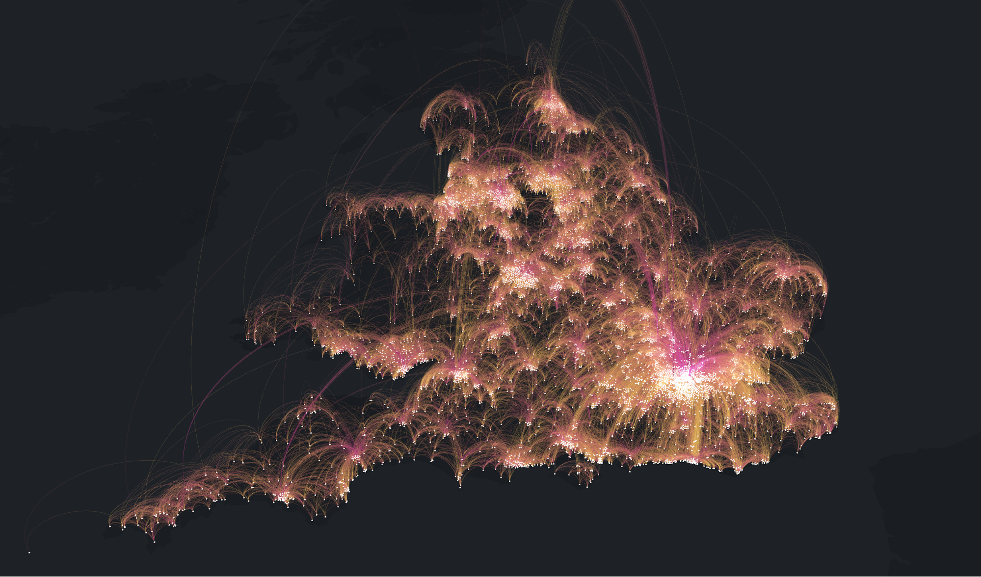
Below, you can see a sample origin-destination map created by the team at Uber using kepler.gl. Leveraging the commute data of residents in England and Wales, this map uses bi-color arcs to connect the residences (in yellow) and workplaces (in magenta).

We are hoping to see some really cool maps come out of this platform. You can get started on your first one here.

Read on
Search