#Featured #Ideas

Map shows how much sooner you’ll die because of air pollution

Air pollution is bad for your health. But you already knew that. What you probably didn’t know is that there’s a map out there which will tell you how many years of your life you are losing to high particulate pollution. The Air Quality-Life Index (AQLI) is an interactive tool which can tell people how much longer they could live by breathing clean air – one that meets the World Health Organization (WHO) standard of fine particulate matter.

Developed by the Energy Policy Institute at the University of Chicago (EPIC), the map is based on the data from a pair of studies which were conducted in China to gauge the impact of long-term air pollution on a person’s health. In particular, it builds on the findings that every additional 10 micrograms per cubic meter of PM10 reduces the life expectancy of a person by 0.6 years.
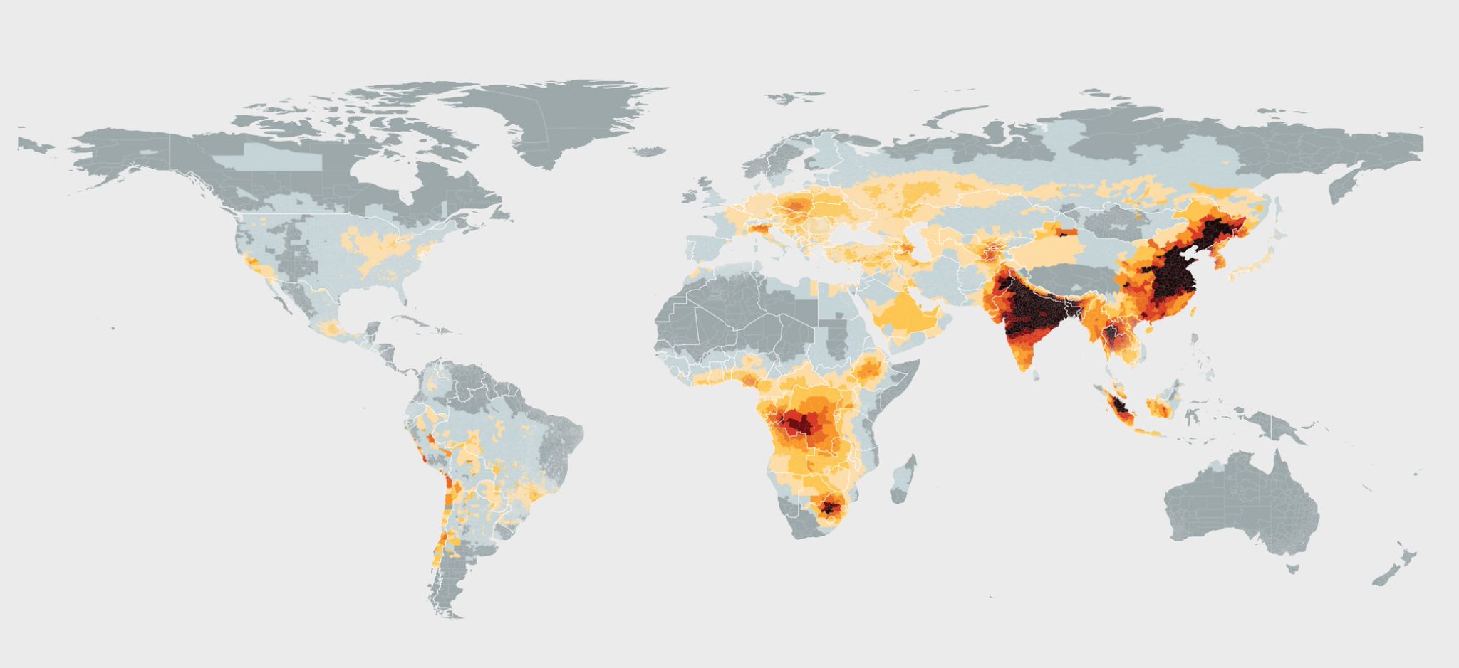
So, if a country like India were to bring its pollution levels into compliance with the global standards, the AQLI suggests people there could live longer for at least 4 years. “Some of the greatest gains would be seen in the country’s largest cities, such as Delhi. There, people could live 6 years longer if the country met its national standards, and 9 years longer if the country met WHO standards,” the study says.

Similarly, if China were to make its air cleaner, its citizens could easily add 3.5 years to their expected lifespan. South Africa and Chile’s efforts to reduce air pollution could result in their people living longer by 1.4 years, while both North and South Koreas could save a couple of life years per person by meeting WHO’s air quality standards.

Michael Greenstone, director at EPIC, explains that the impact of particulates on life expectancy is comparable to someone smoking cigarettes for several decades. Therefore, it is imperative for developing countries mentioned above to take immediate action to combat pollution. “The histories of the United States, parts of Europe, Japan and a handful of other countries teach us that air pollution can be reduced, but it requires robust policy and enforcement,” he says.

See the map here.

Say thanks for this article (0)
The community is supported by:
Become a sponsor
#Featured
#Featured #People
Create a More Inclusive and Diverse Geospatial Community with Akama Fund and Esri’s Geospatial Student Accelerator Scheme
Nikita Marwaha Kraetzig 03.13.2024
AWESOME 2
#Business #Featured
How 15 Centimeter Satellite Imagery is Changing the Mapping Game
Aleks Buczkowski 12.2.2024
AWESOME 5
#Business #Featured #GeoDev
Geo Addressing Decoded, Part 3: Diving into the Key Features of Precisely’s Geo Addressing System
Aleks Buczkowski 06.29.2024
AWESOME 4
Next article
#Ideas

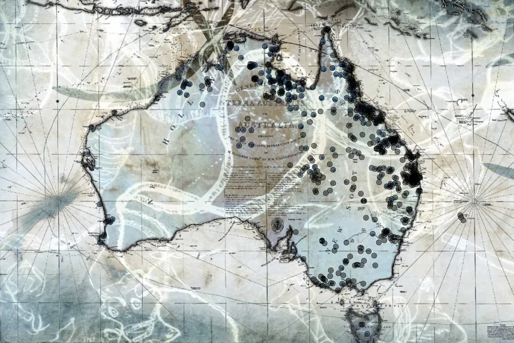
This map shows the bloody history of Australia’s frontier wars

Australian historian Lyndall Ryan was in her mid-twenties when she discovered the glaring gaps and inaccuracies in the documented history of her country’s Aboriginal people. At 38, she published her first book which chronicled the early history of the relationship between the Tasmanian Aborigines and the European settlers in the region.

Four years ago, Ryan received the Australian Research Council Grant to probe the 146-year-long bloody saga of the frontier wars fought between the indigenous Australian tribes and British colonists. At 74 today, she has come out with a digital story map that records more than 170 sites of Indigenous fatalities along with historical evidence, wherever available.

The thing is, this story map only lists the places where more than six people were slain, in accordance with the traditional definition of a frontier massacre. As such, the common figure quoted by historians for frontier war causalities till a few years ago has been 20,000 Aborigines for 2,000 Europeans. However, new academic research, which also takes smaller attacks into account, has indicated that the ratio of black to white deaths could be as high as 44 to one.

But there really is no way to corroborate that. In frontier wars, the assassins and victims usually know each other. Since these slayings take place in secret, the code of silence makes detection extremely difficult. “The perpetrators would remain silent. Even after the event, they were reluctant to talk about it. Some of them kept diaries and might record the event. Some of them would tell close friends on the grounds that they remain silent. And they themselves would not come clean,” Ryan explains in a video interview.

So, all the historical evidence available today comes from what can be called as ‘white people’s sources’ – diary entries and letters of the settlers, court records, newspaper clippings, photographs. Which is why Ryan has kept this project ongoing. She believes that there are over 500 massacre sites in total, and not even half of them have been discovered till now.

The historian is now inviting the general public to share any information they may have (including hearsay stories) about those gory times to add to her research. To contribute or to view the map, click here.

Read on
Search